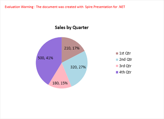
A pie chart helps show proportions and percentages between categories, by dividing a circle into proportional segments. This article will introduce how to create a pie chart that looks like the below screenshot in PowerPoint document using Spire.Presentation in C#.
Code Snippets:
Step 1: Initialize an instance of Presentation class.
Presentation ppt = new Presentation();
Step 2: Insert a Pie chart to the first slide by calling the AppendChart() method and set the chart title.
RectangleF rect1 = new RectangleF(40, 100, 550, 320);
IChart chart = ppt.Slides[0].Shapes.AppendChart(ChartType.Pie, rect1, false);
chart.ChartTitle.TextProperties.Text = "Sales by Quarter";
chart.ChartTitle.TextProperties.IsCentered = true;
chart.ChartTitle.Height = 30;
chart.HasTitle = true;
Step 3: Define some data.
string[] quarters = new string[] { "1st Qtr", "2nd Qtr", "3rd Qtr", "4th Qtr" };
int[] sales = new int[] { 210, 320, 180, 500 };
Step 4: Append data to ChartData, which represents a data table where the chart data is stored.
chart.ChartData[0, 0].Text = "Quarters";
chart.ChartData[0, 1].Text = "Sales";
for (int i = 0; i < quarters.Length; ++i)
{
    chart.ChartData[i + 1, 0].Value = quarters[i];
    chart.ChartData[i + 1, 1].Value = sales[i];
}
Step 5: Set category labels, series label and series data.
chart.Series.SeriesLabel = chart.ChartData["B1", "B1"];
chart.Categories.CategoryLabels = chart.ChartData["A2", "A5"];
chart.Series[0].Values = chart.ChartData["B2", "B5"];
Step 6: Add data points to series and fill each data point with different color.
for (int i = 0; i < chart.Series[0].Values.Count; i++)
{
    ChartDataPoint cdp = new ChartDataPoint(chart.Series[0]);
    cdp.Index = i;
    chart.Series[0].DataPoints.Add(cdp);

}
chart.Series[0].DataPoints[0].Fill.FillType = FillFormatType.Solid;
chart.Series[0].DataPoints[0].Fill.SolidColor.Color = Color.RosyBrown;
chart.Series[0].DataPoints[1].Fill.FillType = FillFormatType.Solid;
chart.Series[0].DataPoints[1].Fill.SolidColor.Color = Color.LightBlue;
chart.Series[0].DataPoints[2].Fill.FillType = FillFormatType.Solid;
chart.Series[0].DataPoints[2].Fill.SolidColor.Color = Color.LightPink;
chart.Series[0].DataPoints[3].Fill.FillType = FillFormatType.Solid;
chart.Series[0].DataPoints[3].Fill.SolidColor.Color = Color.MediumPurple;
Step 7: Set the data labels to display label value and percentage value.
chart.Series[0].DataLabels.LabelValueVisible = true;
chart.Series[0].DataLabels.PercentValueVisible = true;
Step 8: Save the file.
ppt.SaveToFile("PieChart.pptx", FileFormat.Pptx2010);
Full Code:
using Spire.Presentation;
using Spire.Presentation.Charts;
using Spire.Presentation.Drawing;
using System.Drawing;


namespace CreatePieChartInPowerPoint
{
    class Program
    {
        static void Main(string[] args)
        {

            Presentation ppt = new Presentation();

            RectangleF rect1 = new RectangleF(40, 100, 550, 320);
            IChart chart = ppt.Slides[0].Shapes.AppendChart(ChartType.Pie, rect1, false);
            chart.ChartTitle.TextProperties.Text = "Sales by Quarter";
            chart.ChartTitle.TextProperties.IsCentered = true;
            chart.ChartTitle.Height = 30;
            chart.HasTitle = true;

            string[] quarters = new string[] { "1st Qtr", "2nd Qtr", "3rd Qtr", "4th Qtr" };
            int[] sales = new int[] { 210, 320, 180, 500 };
            chart.ChartData[0, 0].Text = "Quarters";
            chart.ChartData[0, 1].Text = "Sales";
            for (int i = 0; i < quarters.Length; ++i)
            {
                chart.ChartData[i + 1, 0].Value = quarters[i];
                chart.ChartData[i + 1, 1].Value = sales[i];
            }

            chart.Series.SeriesLabel = chart.ChartData["B1", "B1"];
            chart.Categories.CategoryLabels = chart.ChartData["A2", "A5"];
            chart.Series[0].Values = chart.ChartData["B2", "B5"];

            for (int i = 0; i < chart.Series[0].Values.Count; i++)
            {
                ChartDataPoint cdp = new ChartDataPoint(chart.Series[0]);
                cdp.Index = i;
                chart.Series[0].DataPoints.Add(cdp);

            }
            chart.Series[0].DataPoints[0].Fill.FillType = FillFormatType.Solid;
            chart.Series[0].DataPoints[0].Fill.SolidColor.Color = Color.RosyBrown;
            chart.Series[0].DataPoints[1].Fill.FillType = FillFormatType.Solid;
            chart.Series[0].DataPoints[1].Fill.SolidColor.Color = Color.LightBlue;
            chart.Series[0].DataPoints[2].Fill.FillType = FillFormatType.Solid;
            chart.Series[0].DataPoints[2].Fill.SolidColor.Color = Color.LightPink;
            chart.Series[0].DataPoints[3].Fill.FillType = FillFormatType.Solid;
            chart.Series[0].DataPoints[3].Fill.SolidColor.Color = Color.MediumPurple;

            chart.Series[0].DataLabels.LabelValueVisible = true;
            chart.Series[0].DataLabels.PercentValueVisible = true;

            ppt.SaveToFile("PieChart.pptx", FileFormat.Pptx2010);
            System.Diagnostics.Process.Start("PieChart.pptx");
        }
    }
}