Chart (7)
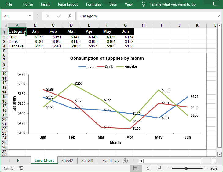
A line chart is a type of chart that displays information as a series of data points connected by straight line segments. It's particularly useful for showing changes over time. For example, if you're tracking monthly sales figures, a line chart can help you identify trends, peaks, and troughs. In this article, you will learn how to create a line chart in Excel in Python using Spire.XLS for Python.
Install Spire.XLS for Python
This scenario requires Spire.XLS for Python and plum-dispatch v1.7.4. They can be easily installed in your Windows through the following pip command.
pip install Spire.XLS
If you are unsure how to install, please refer to this tutorial: How to Install Spire.XLS for Python on Windows
Create a Simple Line Chart in Excel in Python
Spire.XLS for Python provides the Worksheet.Charts.Add(ExcelChartType.Line) method to add a simple line chart to an Excel worksheet. The following are the detailed steps:
- Create a Workbook instance.
- Get a specified worksheet using Workbook.Worksheets[] property.
- Add the chart data to specified cells and set the cell styles.
- Add a simple line chart to the worksheet using Worksheet.Charts.Add(ExcelChartType.Line) method.
- Set data range for the chart using Chart.DataRange property.
- Set the position, title, axis and other attributes of the chart.
- Save the result file using Workbook.SaveToFile() method.
- Python
from spire.xls import *
from spire.xls.common import *

# Create a Workbook instance
workbook = Workbook()

# Get the first sheet and set its name
sheet = workbook.Worksheets[0]
sheet.Name = "Line Chart"

# Add chart data to specified cells
sheet.Range["A1"].Value = "Category"
sheet.Range["A2"].Value = "Fruit"
sheet.Range["A3"].Value = "Drink"
sheet.Range["A4"].Value = "Pancake"

sheet.Range["B1"].Value = "Jan"
sheet.Range["B2"].NumberValue = 173
sheet.Range["B3"].NumberValue = 189
sheet.Range["B4"].NumberValue = 153

sheet.Range["C1"].Value = "Feb"
sheet.Range["C2"].NumberValue = 151
sheet.Range["C3"].NumberValue = 165
sheet.Range["C4"].NumberValue = 201

sheet.Range["D1"].Value = "Mar"
sheet.Range["D2"].NumberValue = 147
sheet.Range["D3"].NumberValue = 112
sheet.Range["D4"].NumberValue = 168

sheet.Range["E1"].Value = "Apr"
sheet.Range["E2"].NumberValue = 140
sheet.Range["E3"].NumberValue = 109
sheet.Range["E4"].NumberValue = 124

sheet.Range["F1"].Value = "May"
sheet.Range["F2"].NumberValue = 131
sheet.Range["F3"].NumberValue = 161
sheet.Range["F4"].NumberValue = 188

sheet.Range["G1"].Value = "Jun"
sheet.Range["G2"].NumberValue = 174
sheet.Range["G3"].NumberValue = 153
sheet.Range["G4"].NumberValue = 136

# Set cell styles
sheet.Range["A1:G1"].RowHeight = 20
sheet.Range["A1:G1"].Style.Color = Color.get_Black()
sheet.Range["A1:G1"].Style.Font.Color = Color.get_White()
sheet.Range["A1:G1"].Style.Font.IsBold = True
sheet.Range["A1:G1"].Style.Font.Size = 11
sheet.Range["A1:G1"].Style.VerticalAlignment = VerticalAlignType.Center
sheet.Range["A1:G1"].Style.HorizontalAlignment = HorizontalAlignType.Center
sheet.Range["B2:G4"].Style.NumberFormat = "\"$\"#,##0"

# Add a line chart to the worksheet
chart = sheet.Charts.Add(ExcelChartType.Line)

# Set data range for the chart
chart.DataRange = sheet.Range["A1:G4"]

# Set position of chart
chart.LeftColumn = 1
chart.TopRow = 6
chart.RightColumn = 12
chart.BottomRow = 27

# Set and format chart title
chart.ChartTitle = "Consumption of supplies by month"
chart.ChartTitleArea.IsBold = True
chart.ChartTitleArea.Size = 12

# Set the category axis of the chart
chart.PrimaryCategoryAxis.Title = "Month"
chart.PrimaryCategoryAxis.Font.IsBold = True
chart.PrimaryCategoryAxis.TitleArea.IsBold = True

# Set the value axis of the chart
chart.PrimaryValueAxis.Title = "Quantity"
chart.PrimaryValueAxis.HasMajorGridLines = False
chart.PrimaryValueAxis.TitleArea.TextRotationAngle = 90
chart.PrimaryValueAxis.MinValue = 100
chart.PrimaryValueAxis.TitleArea.IsBold = True

# Set series colors and data labels
for cs in chart.Series:
    cs.Format.Options.IsVaryColor = True
    cs.DataPoints.DefaultDataPoint.DataLabels.HasValue = True

# Set legend position
chart.Legend.Position = LegendPositionType.Top

# Save the document
workbook.SaveToFile("LineChart.xlsx", ExcelVersion.Version2016)
workbook.Dispose()
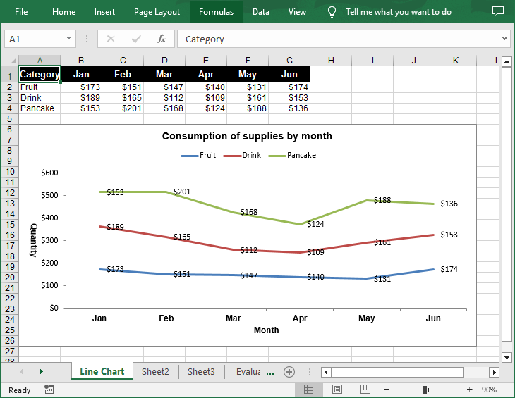
Create a Stacked Line Chart in Excel in Python
A stacked line chart stacks the values of each category on top of each other. This makes it easier to visualize how each data series contributes to the overall trend. The following are the steps to create a stacked line chart using Python:
- Create a Workbook instance.
- Get a specified worksheet using Workbook.Worksheets[] property.
- Add the chart data to specified cells and set the cell styles.
- Add a stacked line chart to the worksheet using Worksheet.Charts.Add(ExcelChartType.LineStacked) method.
- Set data range for the chart using Chart.DataRange property.
- Set the position, title, axis and other attributes of the chart.
- Save the result file using Workbook.SaveToFile() method.
- Python
from spire.xls import *
from spire.xls.common import *

# Create a Workbook instance
workbook = Workbook()

# Get the first sheet and set its name
sheet = workbook.Worksheets[0]
sheet.Name = "Line Chart"

# Add chart data to specified cells
sheet.Range["A1"].Value = "Category"
sheet.Range["A2"].Value = "Fruit"
sheet.Range["A3"].Value = "Drink"
sheet.Range["A4"].Value = "Pancake"

sheet.Range["B1"].Value = "Jan"
sheet.Range["B2"].NumberValue = 173
sheet.Range["B3"].NumberValue = 189
sheet.Range["B4"].NumberValue = 153

sheet.Range["C1"].Value = "Feb"
sheet.Range["C2"].NumberValue = 151
sheet.Range["C3"].NumberValue = 165
sheet.Range["C4"].NumberValue = 201

sheet.Range["D1"].Value = "Mar"
sheet.Range["D2"].NumberValue = 147
sheet.Range["D3"].NumberValue = 112
sheet.Range["D4"].NumberValue = 168

sheet.Range["E1"].Value = "Apr"
sheet.Range["E2"].NumberValue = 140
sheet.Range["E3"].NumberValue = 109
sheet.Range["E4"].NumberValue = 124

sheet.Range["F1"].Value = "May"
sheet.Range["F2"].NumberValue = 131
sheet.Range["F3"].NumberValue = 161
sheet.Range["F4"].NumberValue = 188

sheet.Range["G1"].Value = "Jun"
sheet.Range["G2"].NumberValue = 174
sheet.Range["G3"].NumberValue = 153
sheet.Range["G4"].NumberValue = 136

# Set cell styles
sheet.Range["A1:G1"].RowHeight = 20
sheet.Range["A1:G1"].Style.Color = Color.get_Black()
sheet.Range["A1:G1"].Style.Font.Color = Color.get_White()
sheet.Range["A1:G1"].Style.Font.IsBold = True
sheet.Range["A1:G1"].Style.Font.Size = 11
sheet.Range["A1:G1"].Style.VerticalAlignment = VerticalAlignType.Center
sheet.Range["A1:G1"].Style.HorizontalAlignment = HorizontalAlignType.Center
sheet.Range["B2:G4"].Style.NumberFormat = "\"$\"#,##0"

# Add a stacked line chart to the worksheet
chart = sheet.Charts.Add(ExcelChartType.LineStacked)

# Set data range for the chart
chart.DataRange = sheet.Range["A1:G4"]

# Set position of chart
chart.LeftColumn = 1
chart.TopRow = 6
chart.RightColumn = 12
chart.BottomRow = 27

# Set and format chart title
chart.ChartTitle = "Consumption of supplies by month"
chart.ChartTitleArea.IsBold = True
chart.ChartTitleArea.Size = 12

# Set the category axis of the chart
chart.PrimaryCategoryAxis.Title = "Month"
chart.PrimaryCategoryAxis.Font.IsBold = True
chart.PrimaryCategoryAxis.TitleArea.IsBold = True

# Set the value axis of the chart
chart.PrimaryValueAxis.Title = "Quantity"
chart.PrimaryValueAxis.HasMajorGridLines = False
chart.PrimaryValueAxis.TitleArea.TextRotationAngle = 90
chart.PrimaryValueAxis.TitleArea.IsBold = True

# Set series colors and data labels
for cs in chart.Series:
    cs.Format.Options.IsVaryColor = True
    cs.DataPoints.DefaultDataPoint.DataLabels.HasValue = True

# Set legend position
chart.Legend.Position = LegendPositionType.Top

# Save the document
workbook.SaveToFile("StackedLineChart.xlsx", ExcelVersion.Version2016)
workbook.Dispose()
Apply for a Temporary License
If you'd like to remove the evaluation message from the generated documents, or to get rid of the function limitations, please request a 30-day trial license for yourself.
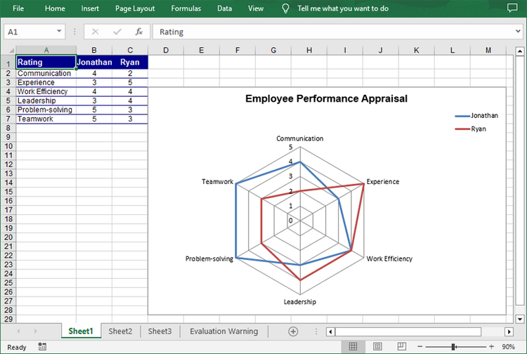
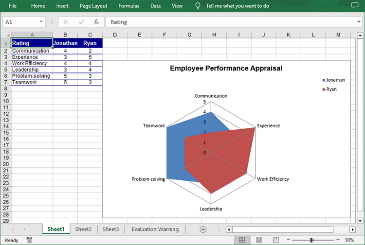
A radar chart, also known as a spider chart, is a graphical method of displaying multivariate data in two dimensions. Each spoke on the chart represents a different variable, and data points are plotted along these spokes. Radar charts are particularly useful for comparing the performance of different entities across several criteria. This article will demonstrate how to create a radar chart in Excel in Python using Spire.XLS for Python.
Install Spire.XLS for Python
This scenario requires Spire.XLS for Python and plum-dispatch v1.7.4. They can be easily installed in your Windows through the following pip command.
pip install Spire.XLS
If you are unsure how to install, please refer to this tutorial: How to Install Spire.XLS for Python on Windows
Create a Simple Radar Chart in Excel in Python
Spire.XLS for Python provides the Worksheet.Charts.Add(ExcelChartType.Radar) method to add a standard radar chart to an Excel worksheet. The following are the detailed steps:
- Create a Workbook instance.
- Get a specified worksheet using Workbook.Worksheets[] property.
- Add the chart data to specified cells and set the cell styles.
- Add a simple radar chart to the worksheet using Worksheet.Charts.Add(ExcelChartType.Radar) method.
- Set data range for the chart using Chart.DataRange property.
- Set the position, legend and title of the chart.
- Save the result file using Workbook.SaveToFile() method.
- Python
*from spire.xls import *
from spire.xls.common import *

# Create a Workbook instance
workbook = Workbook()

# Get the first worksheet
sheet = workbook.Worksheets[0]

# Add chart data to specified cells
sheet.Range["A1"].Value = "Rating"
sheet.Range["A2"].Value = "Communication"
sheet.Range["A3"].Value = "Experience"
sheet.Range["A4"].Value = "Work Efficiency"
sheet.Range["A5"].Value = "Leadership"
sheet.Range["A6"].Value = "Problem-solving"
sheet.Range["A7"].Value = "Teamwork"

sheet.Range["B1"].Value = "Jonathan"
sheet.Range["B2"].NumberValue = 4
sheet.Range["B3"].NumberValue = 3
sheet.Range["B4"].NumberValue = 4
sheet.Range["B5"].NumberValue = 3
sheet.Range["B6"].NumberValue = 5
sheet.Range["B7"].NumberValue = 5

sheet.Range["C1"].Value = "Ryan"
sheet.Range["C2"].NumberValue = 2
sheet.Range["C3"].NumberValue = 5
sheet.Range["C4"].NumberValue = 4
sheet.Range["C5"].NumberValue = 4
sheet.Range["C6"].NumberValue = 3
sheet.Range["C7"].NumberValue = 3

# Set font styles
sheet.Range["A1:C1"].Style.Font.IsBold = True
sheet.Range["A1:C1"].Style.Font.Size = 11
sheet.Range["A1:C1"].Style.Font.Color = Color.get_White()

# Set row height and column width
sheet.Rows[0].RowHeight = 20
sheet.Range["A1:C7"].Columns[0].ColumnWidth = 15

# Set cell styles
sheet.Range["A1:C1"].Style.Color = Color.get_DarkBlue()
sheet.Range["A2:C7"].Borders[BordersLineType.EdgeBottom].LineStyle = LineStyleType.Thin
sheet.Range["A2:C7"].Style.Borders[BordersLineType.EdgeBottom].Color = Color.get_DarkBlue()
sheet.Range["B1:C7"].HorizontalAlignment = HorizontalAlignType.Center
sheet.Range["A1:C7"].VerticalAlignment = VerticalAlignType.Center

# Add a radar chart to the worksheet
chart = sheet.Charts.Add(ExcelChartType.Radar)

# Set position of chart
chart.LeftColumn = 4
chart.TopRow = 4
chart.RightColumn = 14
chart.BottomRow = 29

# Set data range for the chart
chart.DataRange = sheet.Range["A1:C7"]
chart.SeriesDataFromRange = False

# Set and format chart title
chart.ChartTitle = "Employee Performance Appraisal"
chart.ChartTitleArea.IsBold = True
chart.ChartTitleArea.Size = 14
chart.PlotArea.Fill.Visible = False
chart.Legend.Position = LegendPositionType.Corner

# Save the result file
workbook.SaveToFile("CreateRadarChart.xlsx", ExcelVersion.Version2016)
workbook.Dispose()
Create a Filled Radar Chart in Excel in Python
A filled radar chart is a variation of a standard radar chart, with the difference that the area between each data point is filled with color. The following are the steps to create a filled radar chart using Python:
- Create a Workbook instance.
- Get a specified worksheet using Workbook.Worksheets[] property.
- Add the chart data to specified cells and set the cell styles.
- Add a filled radar chart to the worksheet using Worksheet.Charts.Add(ExcelChartType.RadarFilled) method.
- Set data range for the chart using Chart.DataRange property.
- Set the position, legend and title of the chart.
- Save the result file using Workbook.SaveToFile() method.
- Python
from spire.xls import *
from spire.xls.common import *

# Create a Workbook instance
workbook = Workbook()

# Get the first worksheet
sheet = workbook.Worksheets[0]

# Add chart data to specified cells
sheet.Range["A1"].Value = "Rating"
sheet.Range["A2"].Value = "Communication"
sheet.Range["A3"].Value = "Experience"
sheet.Range["A4"].Value = "Work Efficiency"
sheet.Range["A5"].Value = "Leadership"
sheet.Range["A6"].Value = "Problem-solving"
sheet.Range["A7"].Value = "Teamwork"

sheet.Range["B1"].Value = "Jonathan"
sheet.Range["B2"].NumberValue = 4
sheet.Range["B3"].NumberValue = 3
sheet.Range["B4"].NumberValue = 4
sheet.Range["B5"].NumberValue = 3
sheet.Range["B6"].NumberValue = 5
sheet.Range["B7"].NumberValue = 5

sheet.Range["C1"].Value = "Ryan"
sheet.Range["C2"].NumberValue = 2
sheet.Range["C3"].NumberValue = 5
sheet.Range["C4"].NumberValue = 4
sheet.Range["C5"].NumberValue = 4
sheet.Range["C6"].NumberValue = 3
sheet.Range["C7"].NumberValue = 3

# Set font styles
sheet.Range["A1:C1"].Style.Font.IsBold = True
sheet.Range["A1:C1"].Style.Font.Size = 11
sheet.Range["A1:C1"].Style.Font.Color = Color.get_White()

# Set row height and column width
sheet.Rows[0].RowHeight = 20
sheet.Range["A1:C7"].Columns[0].ColumnWidth = 15

# Set cell styles
sheet.Range["A1:C1"].Style.Color = Color.get_DarkBlue()
sheet.Range["A2:C7"].Borders[BordersLineType.EdgeBottom].LineStyle = LineStyleType.Thin
sheet.Range["A2:C7"].Style.Borders[BordersLineType.EdgeBottom].Color = Color.get_DarkBlue()
sheet.Range["B1:C7"].HorizontalAlignment = HorizontalAlignType.Center
sheet.Range["A1:C7"].VerticalAlignment = VerticalAlignType.Center

# Add a filled radar chart to the worksheet
chart = sheet.Charts.Add(ExcelChartType.RadarFilled)

# Set position of chart
chart.LeftColumn = 4
chart.TopRow = 4
chart.RightColumn = 14
chart.BottomRow = 29

# Set data range for the chart
chart.DataRange = sheet.Range["A1:C7"]
chart.SeriesDataFromRange = False

# Set and format chart title
chart.ChartTitle = "Employee Performance Appraisal"
chart.ChartTitleArea.IsBold = True
chart.ChartTitleArea.Size = 14
chart.PlotArea.Fill.Visible = False
chart.Legend.Position = LegendPositionType.Corner

# Save the result file
workbook.SaveToFile("FilledRadarChart.xlsx", ExcelVersion.Version2016)
workbook.Dispose()
Apply for a Temporary License
If you'd like to remove the evaluation message from the generated documents, or to get rid of the function limitations, please request a 30-day trial license for yourself.
Charts in Excel are powerful tools that transform raw data into visual insights, making it easier to identify trends and patterns. Often, you may need to manage or adjust these charts to better suit your needs. For instance, you might need to extract the data behind a chart for further analysis, resize a chart to fit your layout, move a chart to a more strategic location, or remove outdated charts to keep your workbook organized and clutter-free. In this article, you will learn how to extract, resize, move, and remove charts in Excel in Python using Spire.XLS for Python.
- Extract the Data Source of a Chart in Excel
- Resize a Chart in Excel
- Move a Chart in Excel
- Remove a Chart from Excel
Install Spire.XLS for Python
This scenario requires Spire.XLS for Python and plum-dispatch v1.7.4. They can be easily installed in your Windows through the following pip command.
pip install Spire.XLS
If you are unsure how to install, please refer to this tutorial: How to Install Spire.XLS for Python on Windows
Extract the Data Source of a Chart in Excel in Python
Spire.XLS for Python provides the Chart.DataRange property, which allows you to define or retrieve the cell range used as the data source for a chart. After retrieving this range, you can access the data it contains for further processing or analysis. The detailed steps are as follows.
- Create an object of the Workbook class.
- Load an Excel file using the Workbook.LoadFromFile() method.
- Access the worksheet containing the chart using the Workbook.Worksheets[index] property.
- Get the chart using the Worksheet.Charts[index] property.
- Get the cell range that is used as the data source of the chart using the Chart.DataRange property.
- Loop through the rows and columns in the cell range and get the data of each cell.
- Python
from spire.xls import *
from spire.xls.common import *

# Create a Workbook object
workbook = Workbook()
# Load an Excel file
workbook.LoadFromFile("ChartSample.xlsx")

# Get the worksheet containing the chart
sheet = workbook.Worksheets[0]

# Get the chart
chart = sheet.Charts[0]

# Get the cell range that the chart uses
cellRange = chart.DataRange

# Iterate through the rows and columns in the cell range
for i in range(len(cellRange.Rows)):
    for j in range(len(cellRange.Rows[i].Columns)):
        # Get the data of each cell
        print(cellRange[i + 1, j + 1].Value + "  ", end='')

    print("")

workbook.Dispose()
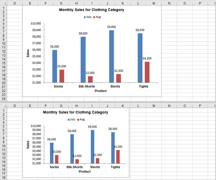
Resize a Chart in Excel in Python
Resizing a chart allows you to adjust its dimensions to fit specific areas of your worksheet or enhance its readability. With Spire.XLS for Python, you can adjust the chart's dimensions using the Chart.Width and Chart.Height properties. The detailed steps are as follows.
- Create an object of the Workbook class.
- Load an Excel file using the Workbook.LoadFromFile() method.
- Access the worksheet containing the chart using the Workbook.Worksheets[index] property.
- Get the chart using the Worksheet.Charts[index] property.
- Adjust the chart’s dimensions using the Chart.Width and Chart.Height properties.
- Save the result file using the Workbook.SaveToFile() method.
- Python
from spire.xls import *
from spire.xls.common import *

# Create a Workbook object
workbook = Workbook()
# Load an Excel file
workbook.LoadFromFile("ChartSample.xlsx")

# Get the worksheet containing the chart
sheet = workbook.Worksheets[0]

# Get the chart
chart = sheet.Charts[0]

# Resize the chart
chart.Width = 450
chart.Height = 300

# Save the result file
workbook.SaveToFile("ResizeChart.xlsx", ExcelVersion.Version2013)
workbook.Dispose()
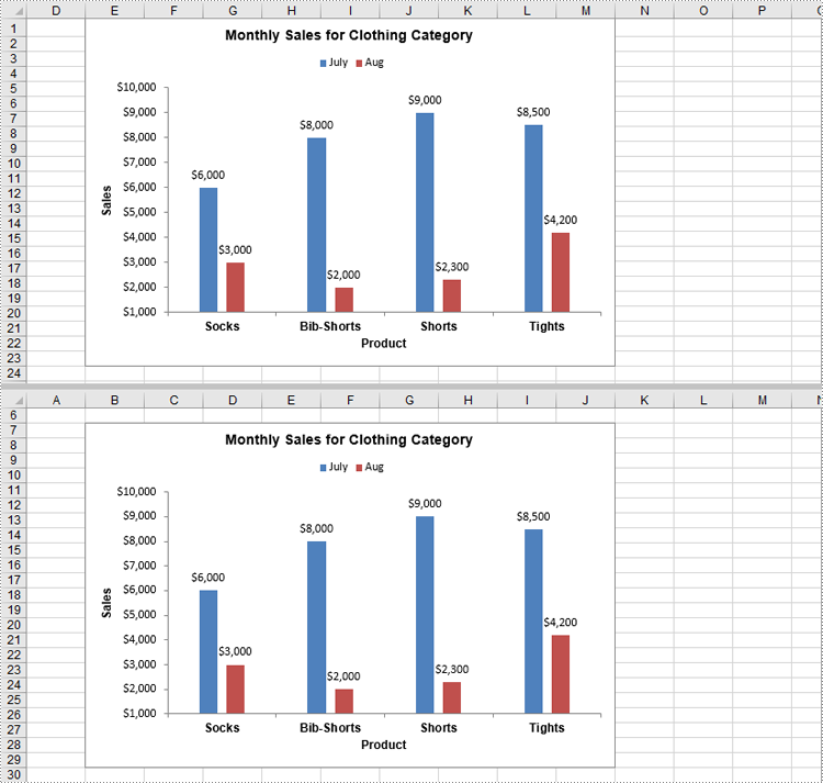
Move a Chart in Excel in Python
Moving a chart lets you reposition it for better alignment or to relocate it to another sheet. You can use the Chart.LeftColumn, Chart.TopRow, Chart.RightColumn, and Chart.BottomRow properties to specify the new position of the chart. The detailed steps are as follows.
- Create an object of the Workbook class.
- Load an Excel file using the Workbook.LoadFromFile() method.
- Access the worksheet containing the chart using the Workbook.Worksheets[index] property.
- Get the chart using the Worksheet.Charts[index] property.
- Set the new position of the chart using the Chart.LeftColumn, Chart.TopRow, Chart.RightColumn, and Chart.BottomRow properties.
- Save the result file using the Workbook.SaveToFile() method.
- Python
from spire.xls import *
from spire.xls.common import *

# Create a Workbook object
workbook = Workbook()
# Load an Excel file
workbook.LoadFromFile("ChartSample.xlsx")

# Get the worksheet containing the chart
sheet = workbook.Worksheets[0]

# Get the chart
chart = sheet.Charts[0]

# Set the new position of the chart
chart.LeftColumn = 1
chart.TopRow = 7
chart.RightColumn = 9
chart.BottomRow = 30

# Save the result file
workbook.SaveToFile("MoveChart.xlsx", ExcelVersion.Version2013)
workbook.Dispose()
Remove a Chart from Excel in Python
Removing unnecessary or outdated charts from your worksheet helps keep your document clean and organized. In Spire.XLS for Python, you can use the Chart.Remove() method to delete a chart from an Excel worksheet. The detailed steps are as follows.
- Create an object of the Workbook class.
- Load an Excel file using the Workbook.LoadFromFile() method.
- Access the worksheet containing the chart using the Workbook.Worksheets[index] property.
- Get the chart using the Worksheet.Charts[index] property.
- Remove the chart using the Chart.Remove() method.
- Save the result file using the Workbook.SaveToFile() method.
- Python
from spire.xls import *
from spire.xls.common import *

# Create a Workbook object
workbook = Workbook()
# Load an Excel file
workbook.LoadFromFile("ChartSample.xlsx")

# Get the worksheet containing the chart
sheet = workbook.Worksheets[0]

# Get the chart
chart = sheet.Charts[0]

# Remove the chart
chart.Remove()

# Save the result file
workbook.SaveToFile("RemoveChart.xlsx", ExcelVersion.Version2013)
workbook.Dispose()
Apply for a Temporary License
If you'd like to remove the evaluation message from the generated documents, or to get rid of the function limitations, please request a 30-day trial license for yourself.
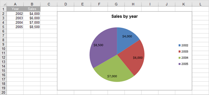
A pie chart is a circular statistical graphic that is divided into slices to illustrate numerical proportions. Each slice represents a category's contribution to the whole, making it an effective way to visualize relative sizes. In this article, you will learn how to create a standard pip chart, an exploded pip chart, and a pie of pie chart in Excel using Spire.XLS for Python.
- Create a Pie Chart in Excel
- Create an Exploded Pie Chart in Excel
- Create a Pie of Pie Chart in Excel
Install Spire.XLS for Python
This scenario requires Spire.XLS for Python and plum-dispatch v1.7.4. They can be easily installed in your Windows through the following pip command.
pip install Spire.XLS
If you are unsure how to install, please refer to this tutorial: How to Install Spire.XLS for Python on Windows
Create a Pie Chart in Excel in Python
To add a pie chart to a worksheet, use the Worksheet.Charts.Add(ExcelChartType.Pie) method, which returns a Chart object. You can then set various properties, such as DataRange, ChartTitle, LeftColumn, TopRow, and Series to define the chart's data, title, position, and series formatting.
Here are the steps to create a pie chart in Excel:
- Create a Workbook object.
- Retrieve a specific worksheet from the workbook.
- Insert values into the worksheet cells that will be used as chart data.
- Add a pie chart to the worksheet using Worksheet.Charts.Add(ExcelChartType.Pie) method.
- Set the chart data using Chart.DataRange property.
- Define the chart's position and size using Chart.LeftColumn, Chart.TopRow, Chart.RightColumn, and Chart.BottomRow properties.
- Set the chart title using Chart.ChartTitle property.
- Access and format the series through Chart.Series property.
- Save the workbook as an Excel file.
- Python
from spire.xls import *
from spire.xls.common import *

# Create a workbook
workbook = Workbook()

# Get the first sheet
sheet = workbook.Worksheets[0]

# Set values of the specified cells
sheet.Range["A1"].Value = "Year"
sheet.Range["A2"].Value = "2002"
sheet.Range["A3"].Value = "2003"
sheet.Range["A4"].Value = "2004"
sheet.Range["A5"].Value = "2005"
sheet.Range["B1"].Value = "Sales"
sheet.Range["B2"].NumberValue = 4000
sheet.Range["B3"].NumberValue = 6000
sheet.Range["B4"].NumberValue = 7000
sheet.Range["B5"].NumberValue = 8500

# Format the cells
sheet.Range["A1:B1"].RowHeight = 15
sheet.Range["A1:B1"].Style.Color = Color.get_DarkGray()
sheet.Range["A1:B1"].Style.Font.Color = Color.get_White()
sheet.Range["A1:B1"].Style.VerticalAlignment = VerticalAlignType.Center
sheet.Range["A1:B1"].Style.HorizontalAlignment = HorizontalAlignType.Center
sheet.Range["B2:B5"].Style.NumberFormat = "\"$\"#,##0"

# Add a pie chart
chart = sheet.Charts.Add(ExcelChartType.Pie)

# Set region of chart data
chart.DataRange = sheet.Range["B2:B5"]
chart.SeriesDataFromRange = False

# Set position of chart
chart.LeftColumn = 4
chart.TopRow = 2
chart.RightColumn = 12
chart.BottomRow = 20

# Set chart title
chart.ChartTitle = "Sales by year"
chart.ChartTitleArea.IsBold = True
chart.ChartTitleArea.Size = 12

# Get the first series
cs = chart.Series[0]

# Set category labels for the series
cs.CategoryLabels = sheet.Range["A2:A5"]

# Set values for the series
cs.Values = sheet.Range["B2:B5"]

# Show vales in data labels
cs.DataPoints.DefaultDataPoint.DataLabels.HasValue = True

# Save the workbook to an Excel file
workbook.SaveToFile("output/PieChart.xlsx", ExcelVersion.Version2016)

# Dispose resources
workbook.Dispose()
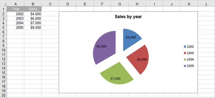
Create an Exploded Pie Chart in Excel in Python
An exploded pie chart is a variation of the standard pie chart where one or more slices are separated or "exploded" from the main chart. To create an exploded pie chart, you can use the Worksheet.Charts.Add(ExcelChartType.PieExploded) method.
The steps to create an exploded pip chart in Excel are as follows:
- Create a Workbook object.
- Retrieve a specific worksheet from the workbook.
- Insert values into the worksheet cells that will be used as chart data.
- Add an exploded pie chart to the worksheet using Worksheet.Charts.Add(ExcelChartType. PieExploded) method.
- Set the chart data using Chart.DataRange property.
- Define the chart's position and size using Chart.LeftColumn, Chart.TopRow, Chart.RightColumn, and Chart.BottomRow properties.
- Set the chart title using Chart.ChartTitle property.
- Access and format the series through Chart.Series property.
- Save the workbook as an Excel file.
- Python
from spire.xls import *
from spire.xls.common import *

# Create a workbook
workbook = Workbook()

# Get the first sheet
sheet = workbook.Worksheets[0]

# Set values of the specified cells
sheet.Range["A1"].Value = "Year"
sheet.Range["A2"].Value = "2002"
sheet.Range["A3"].Value = "2003"
sheet.Range["A4"].Value = "2004"
sheet.Range["A5"].Value = "2005"
sheet.Range["B1"].Value = "Sales"
sheet.Range["B2"].NumberValue = 4000
sheet.Range["B3"].NumberValue = 6000
sheet.Range["B4"].NumberValue = 7000
sheet.Range["B5"].NumberValue = 8500

# Format the cells
sheet.Range["A1:B1"].RowHeight = 15
sheet.Range["A1:B1"].Style.Color = Color.get_DarkGray()
sheet.Range["A1:B1"].Style.Font.Color = Color.get_White()
sheet.Range["A1:B1"].Style.VerticalAlignment = VerticalAlignType.Center
sheet.Range["A1:B1"].Style.HorizontalAlignment = HorizontalAlignType.Center
sheet.Range["B2:B5"].Style.NumberFormat = "\"$\"#,##0"

# Add an exploded pie chart
chart = sheet.Charts.Add(ExcelChartType.PieExploded)

# Set region of chart data
chart.DataRange = sheet.Range["B2:B5"]
chart.SeriesDataFromRange = False

# Set position of chart
chart.LeftColumn = 4
chart.TopRow = 2
chart.RightColumn = 12
chart.BottomRow = 20

# Set chart title
chart.ChartTitle = "Sales by year"
chart.ChartTitleArea.IsBold = True
chart.ChartTitleArea.Size = 12

# Get the first series
cs = chart.Series[0]

# Set category labels for the series
cs.CategoryLabels = sheet.Range["A2:A5"]

# Set values for the series
cs.Values = sheet.Range["B2:B5"]

# Show vales in data labels
cs.DataPoints.DefaultDataPoint.DataLabels.HasValue = True

# Save the workbook to an Excel file
workbook.SaveToFile("output/ExplodedPieChart.xlsx", ExcelVersion.Version2016)

# Dispose resources
workbook.Dispose()
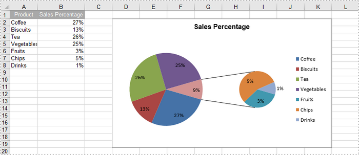
Create a Pie of Pie Chart in Excel in Python
A pie of pie chart is a specialized type of pie chart that allows for more detailed representation of data by providing a secondary pie chart for specific categories. To add a pip of pie chart to a worksheet, use the Worksheet.Charts.Add(ExcelChartType.PieOfPie) method.
The detailed steps to create a pie of pie chart in Excel are as follows:
- Create a Workbook object.
- Retrieve a specific worksheet from the workbook.
- Insert values into the worksheet cells that will be used as chart data.
- Add a pie of pie chart to the worksheet using Worksheet.Charts.Add(ExcelChartType.PieOfPie) method.
- Set the chart data, position, size, title using the properties under the Chart object.
- Access the first series using Chart.Series[0] property.
- Set the split value that determines what displays in the secondary pie using Series.Format.Options.SplitValue property.
- Save the workbook as an Excel file.
- Python
from spire.xls import *
from spire.xls.common import *

# Create a workbook
workbook = Workbook()

# Get the first sheet
sheet = workbook.Worksheets[0]

# Set values of the specified cells
sheet.Range["A1"].Value = "Product"
sheet.Range["A2"].Value = "Coffee"
sheet.Range["A3"].Value = "Biscuits"
sheet.Range["A4"].Value = "Tea"
sheet.Range["A5"].Value = "Vegetables"
sheet.Range["A6"].Value = "Fruits"
sheet.Range["A7"].Value = "Chips"
sheet.Range["A8"].Value = "Drinks"
sheet.Range["B1"].Value = "Sales Percentage"
sheet.Range["B2"].NumberValue = 0.27
sheet.Range["B3"].NumberValue = 0.13
sheet.Range["B4"].NumberValue = 0.26
sheet.Range["B5"].NumberValue = 0.25
sheet.Range["B6"].NumberValue = 0.03
sheet.Range["B7"].NumberValue = 0.05
sheet.Range["B8"].NumberValue = 0.01

# Autofit column width
sheet.AutoFitColumn(2)

# Format the cells
sheet.Range["A1:B1"].RowHeight = 15
sheet.Range["A1:B1"].Style.Color = Color.get_DarkGray()
sheet.Range["A1:B1"].Style.Font.Color = Color.get_White()
sheet.Range["A1:B1"].Style.VerticalAlignment = VerticalAlignType.Center
sheet.Range["A1:B1"].Style.HorizontalAlignment = HorizontalAlignType.Center
sheet.Range["B2:B8"].Style.NumberFormat = "0%"

# Add a pie of pie chart
chart = sheet.Charts.Add(ExcelChartType.PieOfPie)

# Set region of chart data
chart.DataRange = sheet.Range["B2:B58"]
chart.SeriesDataFromRange = False

# Set position of chart
chart.LeftColumn = 4
chart.TopRow = 2
chart.RightColumn = 12
chart.BottomRow = 20

# Chart title
chart.ChartTitle = "Sales Percentage"
chart.ChartTitleArea.IsBold = True
chart.ChartTitleArea.Size = 12

# Get the first series
cs = chart.Series[0]

# Set category labels for the series
cs.CategoryLabels = sheet.Range["A2:A8"]

# Set values for the series
cs.Values = sheet.Range["B2:B8"]

# Show vales in data labels
cs.DataPoints.DefaultDataPoint.DataLabels.HasValue = True

# Set the size of the secondary pie
cs.Format.Options.PieSecondSize = 50

# Set the split value, which determines what displays in the secondary pie
cs.Format.Options.SplitType = SplitType.Percent
cs.Format.Options.SplitValue = 10

# Save the workbook to an Excel file
workbook.SaveToFile("output/PieOfPieChart.xlsx", ExcelVersion.Version2016)

# Dispose resources
workbook.Dispose()
Apply for a Temporary License
If you'd like to remove the evaluation message from the generated documents, or to get rid of the function limitations, please request a 30-day trial license for yourself.
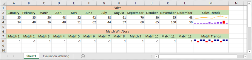
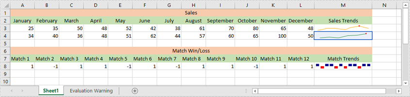
Sparklines in Excel are small, lightweight charts that fit inside individual cells of a worksheet. They are particularly useful for showing variations in data across rows or columns, allowing users to quickly identify trends without taking up much space. In this article, we'll demonstrate how to insert, modify, and delete sparklines in Excel in Python using Spire.XLS for Python.
- Insert a Sparkline in Excel in Python
- Modify a Sparkline in Excel in Python
- Delete Sparklines from Excel in Python
Install Spire.XLS for Python
This scenario requires Spire.XLS for Python and plum-dispatch v1.7.4. They can be easily installed in your Windows through the following pip command.
pip install Spire.XLS
If you are unsure how to install, please refer to this tutorial: How to Install Spire.XLS for Python on Windows
Insert a Sparkline in Excel in Python
Excel offers 3 main types of sparklines:
- Line Sparkline: Shows data trends as a line, similar to a miniature line graph.
- Column Sparkline: Displays data as vertical bars, emphasizing individual data points.
- Win/Loss Sparkline: Illustrates positive and negative values, useful for tracking binary outcomes like wins or losses.
Spire.XLS for Python supports inserting all of the above types of sparklines. Below are the detailed steps for inserting a sparkline in Excel using Spire.XLS for Python:
- Create an object of the Workbook class.
- Load an Excel file using Workbook.LoadFromFile() method.
- Get a specific worksheet using Workbook.Worksheets[index] property.
- Add a sparkline group to the worksheet using Worksheet.SparklineGroups.AddGroup() method.
- Specify the sparkline type, color, and data point color for the sparkline group.
- Add a sparkline collection to the group using SparklineGroup.Add() method, and then add a sparkline to the collection using SparklineCollection.Add() method.
- Save the resulting file using Workbook.SaveToFile() method.
- Python
from spire.xls import *
from spire.xls.common import *

# Create a Workbook object
workbook = Workbook()
# Load an Excel file
workbook.LoadFromFile("Sample.xlsx")

# Get the first worksheet in the workbook
sheet = workbook.Worksheets[0]

# Add a sparkline group to the worksheet
sparkline_group1 = sheet.SparklineGroups.AddGroup()
# Set the sparkline type to line
sparkline_group1.SparklineType = SparklineType.Line
# Set the sparkline color
sparkline_group1.SparklineColor = Color.get_Orange()
# Set the highest data point color
sparkline_group1.HighPointColor = Color.get_Red()
# Add a sparkline collection
sparklines1 = sparkline_group1.Add()
# Add a sparkline to the collection, define the data range for the sparkline and the target cell for displaying the sparkline
sparklines1.Add(sheet.Range["A3:L3"], sheet.Range["M3"])

# Add a sparkline group to the worksheet
sparkline_group2 = sheet.SparklineGroups.AddGroup()
# Set the sparkline type to column
sparkline_group2.SparklineType = SparklineType.Column
# Set the sparkline color
sparkline_group2.SparklineColor = Color.get_BlueViolet()
# Set the highest data point color
sparkline_group2.HighPointColor = Color.get_Red()
# Add a sparkline collection
sparklines2 = sparkline_group2.Add()
# Add a sparkline to the collection, define the data range for the sparkline and the target cell for displaying the sparkline
sparklines2.Add(sheet.Range["A4:L4"], sheet.Range["M4"])

# Add a sparkline group to the worksheet
sparkline_group3 = sheet.SparklineGroups.AddGroup()
# Set the sparkline type to stacked (win/loss)
sparkline_group3.SparklineType = SparklineType.Stacked
# Set the sparkline color
sparkline_group3.SparklineColor = Color.get_DarkBlue()
# Set the negative data point color
sparkline_group3.NegativePointColor = Color.get_Red()
# Add a sparkline collection
sparklines3 = sparkline_group3.Add()
# Add a sparkline to the collection, define the data range for the sparkline and the target cell for displaying the sparkline
sparklines3.Add(sheet.Range["A8:L8"], sheet.Range["M8"])

# Save the resulting workbook to file
workbook.SaveToFile("AddSparklines.xlsx", ExcelVersion.Version2016)
workbook.Dispose()
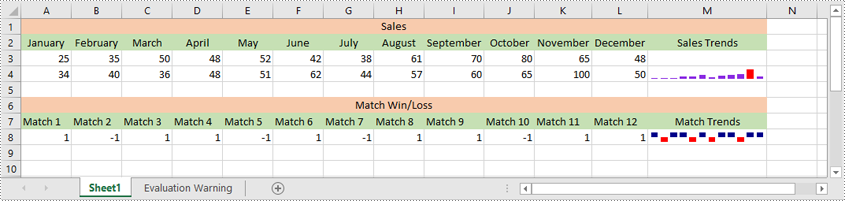
Modify a Sparkline in Excel in Python
After inserting a sparkline, you can modify its type, color, and data source to make it more effective at displaying the information you need.
The following steps explain how to modify a sparkline in Excel using Spire.XLS for Python:
- Create an object of the Workbook class.
- Load an Excel file using Workbook.LoadFromFile() method.
- Get a specific worksheet using Workbook.Worksheets[index] property.
- Get a specific sparkline group in the worksheet using Worksheet.SparklineGroups[index] property.
- Change the sparkline type and color for the sparkline group using SparklineGroup.SparklineType and SparklineGroup.SparklineColor properties.
- Get a specific sparkline in the group and change its data source using ISparklines.RefreshRanges() method.
- Save the resulting file using Workbook.SaveToFile() method.
- Python
from spire.xls import *
from spire.xls.common import *

# Create a Workbook object
workbook = Workbook()
# Load an Excel file that contains sparklines
workbook.LoadFromFile("AddSparklines.xlsx")

# Get the first worksheet in the workbook
sheet = workbook.Worksheets[0]

# Get the second sparkline group
sparklineGroup = sheet.SparklineGroups[1]
# Change the sparkline type
sparklineGroup.SparklineType = SparklineType.Line
# Change the sparkline color
sparklineGroup.SparklineColor = Color.get_ForestGreen()

# Change the data range of the sparkline
sparklines = sparklineGroup[0]
sparklines.RefreshRanges(sheet.Range["A4:F4"], sheet.Range["M4"])

# Save the resulting workbook to file
workbook.SaveToFile("ModifySparklines.xlsx", ExcelVersion.Version2016)
workbook.Dispose()
Delete Sparklines from Excel in Python
Spire.XLS for Python allows you to remove specific sparklines from a sparkline group and to remove the entire sparkline group from an Excel worksheet.
The following steps explain how to remove an entire sparkline group or specific sparklines from a sparkline group using Spire.XLS for Python:
- Create an object of the Workbook class
- Load an Excel file using Workbook.LoadFromFile() method.
- Get a specific worksheet using Workbook.Worksheets[index] property.
- Get a specific sparkline group in the worksheet using Worksheet.SparklineGroups[index] property.
- Delete the entire sparkline group using Worksheet.SparklineGroups.Clear() method. Or delete a specific sparkline using ISparklines.Remove() method.
- Save the resulting file using Workbook.SaveToFile() method.
- Python
from spire.xls import *
from spire.xls.common import *

# Create a Workbook object
workbook = Workbook()
# Load an Excel file that contains sparklines
workbook.LoadFromFile("AddSparklines.xlsx")

# Get the first worksheet in the workbook
sheet = workbook.Worksheets[0]

# Get the first sparkline group in the worksheet
sparklineGroup = sheet.SparklineGroups[0]
# Remove the first sparkline group from the worksheet
sheet.SparklineGroups.Clear(sparklineGroup)

# # Remove the first sparkline
# sparklines = sparklineGroup[0]
# sparklines.Remove(sparklines[0])

# Save the resulting workbook to file
workbook.SaveToFile("RemoveSparklines.xlsx", ExcelVersion.Version2016)
workbook.Dispose()
Apply for a Temporary License
If you'd like to remove the evaluation message from the generated documents, or to get rid of the function limitations, please request a 30-day trial license for yourself.
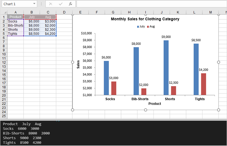
A bar chart is a type of graph that represents categorical data using rectangular bars. It is somewhat like a column chart, but with bars that extend horizontally from the Y-axis. The length of each bar corresponds to the value represented by a particular category or group, and changes, trends, or rankings can be quickly identified by comparing the lengths of the bars. In this article, you will learn how to create a clustered or stacked bar chart in Excel in Python using Spire.XLS for Python.
Install Spire.XLS for Python
This scenario requires Spire.XLS for Python and plum-dispatch v1.7.4. They can be easily installed in your Windows through the following pip command.
pip install Spire.XLS
If you are unsure how to install, please refer to this tutorial: How to Install Spire.XLS for Python on Windows
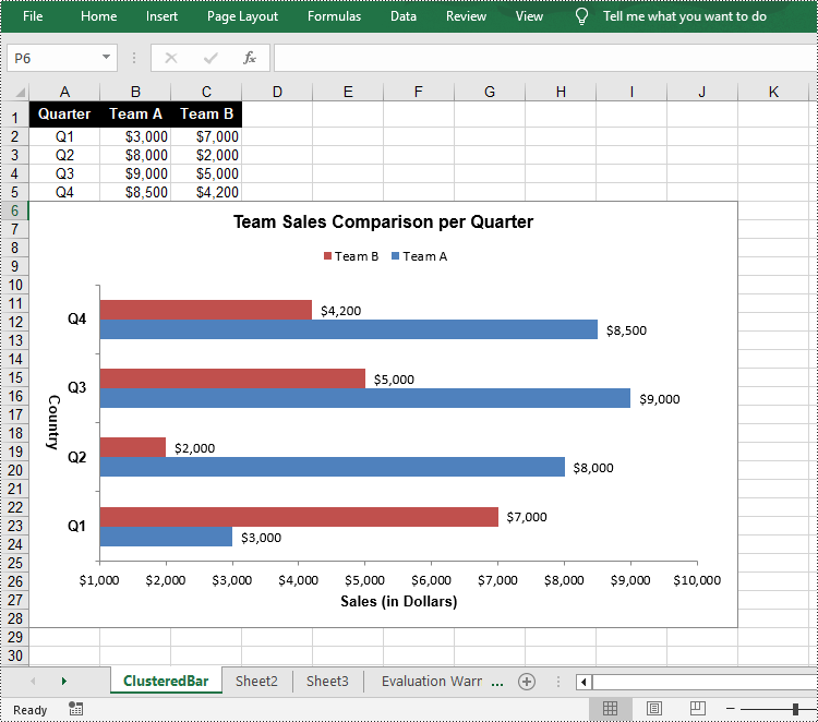
Create a Clustered Bar Chart in Excel in Python
The Worksheet.Chart.Add(ExcelChartType chartType) method provided by Spire.XLS for Python allows to add a chart to a worksheet. To add a clustered bar chart in Excel, you can set the chart type to BarClustered. The following are the steps.
- Create a Workbook object.
- Get a specific worksheet using Workbook.Worksheets[index] property.
- Add chart data to specified cells and set the cell styles.
- Add a clustered bar char to the worksheet using Worksheet.Chart.Add(ExcelChartType.BarClustered) method.
- Set data range for the chart using Chart.DataRange property.
- Set position, title, category axis and value axis for the chart.
- Save the result file using Workbook.SaveToFile() method.
- Python
from spire.xls import *

# Create a Workbook instance
workbook = Workbook()

# Get the first sheet and set its name
sheet = workbook.Worksheets[0]
sheet.Name = "ClusteredBar"

# Add chart data to specified cells
sheet.Range["A1"].Value = "Quarter"
sheet.Range["A2"].Value = "Q1"
sheet.Range["A3"].Value = "Q2"
sheet.Range["A4"].Value = "Q3"
sheet.Range["A5"].Value = "Q4"
sheet.Range["B1"].Value = "Team A"
sheet.Range["B2"].NumberValue = 3000
sheet.Range["B3"].NumberValue = 8000
sheet.Range["B4"].NumberValue = 9000
sheet.Range["B5"].NumberValue = 8500
sheet.Range["C1"].Value = "Team B"
sheet.Range["C2"].NumberValue = 7000
sheet.Range["C3"].NumberValue = 2000
sheet.Range["C4"].NumberValue = 5000
sheet.Range["C5"].NumberValue = 4200

# Set cell style
sheet.Range["A1:C1"].RowHeight = 18
sheet.Range["A1:C1"].Style.Color = Color.get_Black()
sheet.Range["A1:C1"].Style.Font.Color = Color.get_White()
sheet.Range["A1:C1"].Style.Font.IsBold = True
sheet.Range["A1:C1"].Style.VerticalAlignment = VerticalAlignType.Center
sheet.Range["A1:C1"].Style.HorizontalAlignment = HorizontalAlignType.Center
sheet.Range["A2:A5"].Style.HorizontalAlignment = HorizontalAlignType.Center
sheet.Range["B2:C5"].Style.NumberFormat = "\"$\"#,##0"

# Add a clustered bar chart to the sheet
chart = sheet.Charts.Add(ExcelChartType.BarClustered)

# Set data range of the chart
chart.DataRange = sheet.Range["A1:C5"]
chart.SeriesDataFromRange = False

# Set position of the chart
chart.LeftColumn = 1
chart.TopRow = 6
chart.RightColumn = 11
chart.BottomRow = 29

# Set and format chart title
chart.ChartTitle = "Team Sales Comparison per Quarter"
chart.ChartTitleArea.IsBold = True
chart.ChartTitleArea.Size = 12

# Set and format category axis
chart.PrimaryCategoryAxis.Title = "Country"
chart.PrimaryCategoryAxis.Font.IsBold = True
chart.PrimaryCategoryAxis.TitleArea.IsBold = True
chart.PrimaryCategoryAxis.TitleArea.TextRotationAngle = 90

# Set and format value axis
chart.PrimaryValueAxis.Title = "Sales (in Dollars)"
chart.PrimaryValueAxis.HasMajorGridLines = False
chart.PrimaryValueAxis.MinValue = 1000
chart.PrimaryValueAxis.TitleArea.IsBold = True

# Show data labels for data points
for cs in chart.Series:
    cs.Format.Options.IsVaryColor = True
    cs.DataPoints.DefaultDataPoint.DataLabels.HasValue = True

# Set legend position
chart.Legend.Position = LegendPositionType.Top

#Save the result file
workbook.SaveToFile("ClusteredBarChart.xlsx", ExcelVersion.Version2016)
workbook.Dispose()
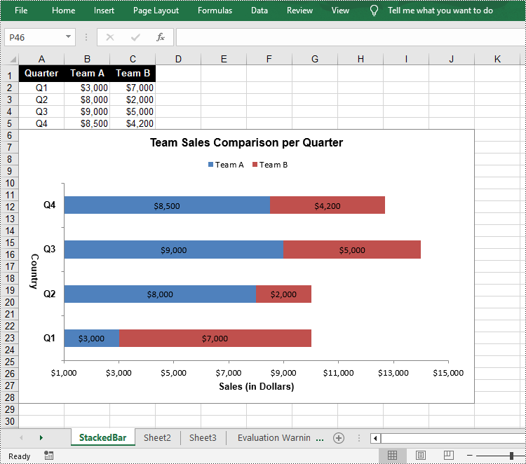
Create a Stacked Bar Chart in Excel in Python
To create a stacked bar chart, you just need to change the Excel chart type to BarStacked. The following are the steps.
- Create a Workbook object.
- Get a specific worksheet using Workbook.Worksheets[index] property.
- Add chart data to specified cells and set the cell styles.
- Add a clustered bar char to the worksheet using Worksheet.Chart.Add(ExcelChartType.BarStacked) method.
- Set data range for the chart using Chart.DataRange property.
- Set position, title, category axis and value axis for the chart.
- Save the result file using Workbook.SaveToFile() method.
- Python
from spire.xls import *

# Create a Workbook instance
workbook = Workbook()

# Get the first sheet and set its name
sheet = workbook.Worksheets[0]
sheet.Name = "StackedBar"

# Add chart data to specified cells
sheet.Range["A1"].Value = "Quarter"
sheet.Range["A2"].Value = "Q1"
sheet.Range["A3"].Value = "Q2"
sheet.Range["A4"].Value = "Q3"
sheet.Range["A5"].Value = "Q4"
sheet.Range["B1"].Value = "Team A"
sheet.Range["B2"].NumberValue = 3000
sheet.Range["B3"].NumberValue = 8000
sheet.Range["B4"].NumberValue = 9000
sheet.Range["B5"].NumberValue = 8500
sheet.Range["C1"].Value = "Team B"
sheet.Range["C2"].NumberValue = 7000
sheet.Range["C3"].NumberValue = 2000
sheet.Range["C4"].NumberValue = 5000
sheet.Range["C5"].NumberValue = 4200

# Set cell style
sheet.Range["A1:C1"].RowHeight = 18
sheet.Range["A1:C1"].Style.Color = Color.get_Black()
sheet.Range["A1:C1"].Style.Font.Color = Color.get_White()
sheet.Range["A1:C1"].Style.Font.IsBold = True
sheet.Range["A1:C1"].Style.VerticalAlignment = VerticalAlignType.Center
sheet.Range["A1:C1"].Style.HorizontalAlignment = HorizontalAlignType.Center
sheet.Range["A2:A5"].Style.HorizontalAlignment = HorizontalAlignType.Center
sheet.Range["B2:C5"].Style.NumberFormat = "\"$\"#,##0"

# Add a clustered bar chart to the sheet
chart = sheet.Charts.Add(ExcelChartType.BarStacked)

# Set data range of the chart
chart.DataRange = sheet.Range["A1:C5"]
chart.SeriesDataFromRange = False

# Set position of the chart
chart.LeftColumn = 1
chart.TopRow = 6
chart.RightColumn = 11
chart.BottomRow = 29

# Set and format chart title
chart.ChartTitle = "Team Sales Comparison per Quarter"
chart.ChartTitleArea.IsBold = True
chart.ChartTitleArea.Size = 12

# Set and format category axis
chart.PrimaryCategoryAxis.Title = "Country"
chart.PrimaryCategoryAxis.Font.IsBold = True
chart.PrimaryCategoryAxis.TitleArea.IsBold = True
chart.PrimaryCategoryAxis.TitleArea.TextRotationAngle = 90

# Set and format value axis
chart.PrimaryValueAxis.Title = "Sales (in Dollars)"
chart.PrimaryValueAxis.HasMajorGridLines = False
chart.PrimaryValueAxis.MinValue = 1000
chart.PrimaryValueAxis.TitleArea.IsBold = True

# Show data labels for data points
for cs in chart.Series:
    cs.Format.Options.IsVaryColor = True
    cs.DataPoints.DefaultDataPoint.DataLabels.HasValue = True

# Set legend position
chart.Legend.Position = LegendPositionType.Top

#Save the result file
workbook.SaveToFile("StackedBarChart.xlsx", ExcelVersion.Version2016)
workbook.Dispose()
Apply for a Temporary License
If you'd like to remove the evaluation message from the generated documents, or to get rid of the function limitations, please request a 30-day trial license for yourself.
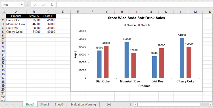
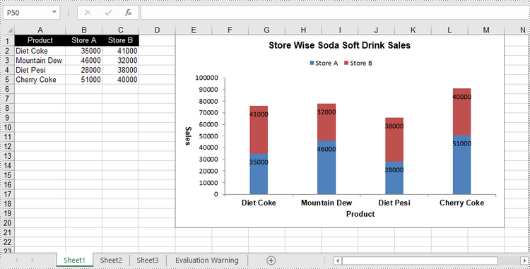
A clustered column chart and a stacked column chart are two variants of column chart. The clustered column chart enables straightforward comparison of values across different categories, while the stacked column chart displays both the total for each category and the proportion of its individual components. In this article, you will learn how to create clustered or stacked column charts in Excel in Python using Spire.XLS for Python.
Install Spire.XLS for Python
This scenario requires Spire.XLS for Python and plum-dispatch v1.7.4. They can be easily installed in your Windows through the following pip command.
pip install Spire.XLS
If you are unsure how to install, please refer to this tutorial: How to Install Spire.XLS for Python on Windows
Create a Clustered Column Chart in Excel in Python
To add a chart to a worksheet, use Worksheet.Chart.Add(ExcelChartType chartType) method. The ExcelChartType enumeration includes various chart types predefined in MS Excel. The following are the steps to add a clustered column chart in Excel using Spire.XLS for Python.
- Create a Workbook object.
- Get a specific worksheet through Workbook.Worksheets[index] property.
- Write data into the specified cells.
- Add a clustered column char to the worksheet using Worksheet.Chart.Add(ExcelChartType.ColumnClustered) method.
- Set the chart data through Chart.DataRange property.
- Set the position, title, and other attributes of the chart through the properties under the Chart object.
- Save the workbook to an Excel file using Workbook.SaveToFile() method.
- Python
from spire.xls import *
from spire.xls.common import *

# Create a Workbook object
workbook = Workbook()

# Get the first sheet
sheet = workbook.Worksheets[0]

# Set chart data
sheet.Range["A1"].Value = "Product"
sheet.Range["A2"].Value = "Diet Coke"
sheet.Range["A3"].Value = "Mountain Dew"
sheet.Range["A4"].Value = "Diet Pesi"
sheet.Range["A5"].Value = "Cherry Coke"

sheet.Range["B1"].Value = "Store A"
sheet.Range["B2"].NumberValue = 35000
sheet.Range["B3"].NumberValue = 46000
sheet.Range["B4"].NumberValue = 28000
sheet.Range["B5"].NumberValue = 51000
sheet.Range["C1"].Value = "Store B"
sheet.Range["C2"].NumberValue = 41000
sheet.Range["C3"].NumberValue = 32000
sheet.Range["C4"].NumberValue = 38000
sheet.Range["C5"].NumberValue = 40000

# Set cell style
sheet.Range["A1:C1"].RowHeight = 15
sheet.Range["A1:C1"].Style.Color = Color.get_Black()
sheet.Range["A1:C1"].Style.Font.Color = Color.get_White()
sheet.Range["A1:C1"].Style.VerticalAlignment = VerticalAlignType.Center
sheet.Range["A1:C1"].Style.HorizontalAlignment = HorizontalAlignType.Center
sheet.AutoFitColumn(1)

# Add a chart to the sheet
chart = sheet.Charts.Add(ExcelChartType.ColumnClustered)

# Set data range of chart
chart.DataRange = sheet.Range["A1:C5"]
chart.SeriesDataFromRange = False

# Set position of the chart
chart.LeftColumn = 5
chart.TopRow = 1
chart.RightColumn = 14
chart.BottomRow = 21

# Set chart title
chart.ChartTitle = "Store Wise Soda Soft Drink Sales"
chart.ChartTitleArea.IsBold = True
chart.ChartTitleArea.Size = 12

# Set axis title
chart.PrimaryCategoryAxis.Title = "Product"
chart.PrimaryCategoryAxis.Font.IsBold = True
chart.PrimaryCategoryAxis.TitleArea.IsBold = True
chart.PrimaryValueAxis.Title = "Sales"
chart.PrimaryValueAxis.HasMajorGridLines = False
chart.PrimaryValueAxis.TitleArea.IsBold = True
chart.PrimaryValueAxis.TitleArea.TextRotationAngle = 90

# Set series color, overlap, gap width and data labels
series = chart.Series
for i in range(len(series)):
    cs = series[i]
    cs.Format.Options.IsVaryColor = True
    cs.Format.Options.Overlap = -50
    cs.Format.Options.GapWidth = 350
    cs.DataPoints.DefaultDataPoint.DataLabels.HasValue = True

# Set legend position
chart.Legend.Position = LegendPositionType.Top

# Save the document
workbook.SaveToFile("ClusteredColumnChart.xlsx", ExcelVersion.Version2016)
Create a Stacked Column Chart in Excel in Python
The process of creating a stacked column chart is similar to that of creating a clustered column chart. The only difference is that you must change the Excel chart type from ColumnClustered to ColumnStacked.
- Create a Workbook object.
- Get a specific worksheet through Workbook.Worksheets[index] property.
- Write data into the specified cells.
- Add a clustered column char to the worksheet using Worksheet.Chart.Add(ExcelChartType.ColumnStacked) method.
- Set the chart data through Chart.DataRange property.
- Set the position, title, and other attributes of the chart through the properties under the Chart object.
- Save the workbook to an Excel file using Workbook.SaveToFile() method.
- Python
from spire.xls import *
from spire.xls.common import *

# Create a Workbook object
workbook = Workbook()

# Get the first sheet
sheet = workbook.Worksheets[0]

# Set chart data
sheet.Range["A1"].Value = "Product"
sheet.Range["A2"].Value = "Diet Coke"
sheet.Range["A3"].Value = "Mountain Dew"
sheet.Range["A4"].Value = "Diet Pesi"
sheet.Range["A5"].Value = "Cherry Coke"
sheet.Range["B1"].Value = "Store A"
sheet.Range["B2"].NumberValue = 35000
sheet.Range["B3"].NumberValue = 46000
sheet.Range["B4"].NumberValue = 28000
sheet.Range["B5"].NumberValue = 51000
sheet.Range["C1"].Value = "Store B"
sheet.Range["C2"].NumberValue = 41000
sheet.Range["C3"].NumberValue = 32000
sheet.Range["C4"].NumberValue = 38000
sheet.Range["C5"].NumberValue = 40000

# Set cell style
sheet.Range["A1:C1"].RowHeight = 15
sheet.Range["A1:C1"].Style.Color = Color.get_Black()
sheet.Range["A1:C1"].Style.Font.Color = Color.get_White()
sheet.Range["A1:C1"].Style.VerticalAlignment = VerticalAlignType.Center
sheet.Range["A1:C1"].Style.HorizontalAlignment = HorizontalAlignType.Center
sheet.AutoFitColumn(1)

# Add a chart to the sheet
chart = sheet.Charts.Add(ExcelChartType.ColumnStacked)

# Set data range of chart
chart.DataRange = sheet.Range["A1:C5"]
chart.SeriesDataFromRange = False

# Set position of the chart
chart.LeftColumn = 5
chart.TopRow = 1
chart.RightColumn = 14
chart.BottomRow = 21

# Set chart title
chart.ChartTitle = "Store Wise Soda Soft Drink Sales"
chart.ChartTitleArea.IsBold = True
chart.ChartTitleArea.Size = 12

# Set axis title
chart.PrimaryCategoryAxis.Title = "Product"
chart.PrimaryCategoryAxis.Font.IsBold = True
chart.PrimaryCategoryAxis.TitleArea.IsBold = True
chart.PrimaryValueAxis.Title = "Sales"
chart.PrimaryValueAxis.HasMajorGridLines = False
chart.PrimaryValueAxis.TitleArea.IsBold = True
chart.PrimaryValueAxis.TitleArea.TextRotationAngle = 90

# Set series color, gap width and data labels
series = chart.Series
for i in range(len(series)):
    cs = series[i]
    cs.Format.Options.IsVaryColor = True
    cs.Format.Options.GapWidth = 270
    cs.DataPoints.DefaultDataPoint.DataLabels.HasValue = True
    cs.DataPoints.DefaultDataPoint.DataLabels.Position = DataLabelPositionType.Inside

# Set legend position
chart.Legend.Position = LegendPositionType.Top

# Save the document
workbook.SaveToFile("StackedColumnChart.xlsx", ExcelVersion.Version2016)
Apply for a Temporary License
If you'd like to remove the evaluation message from the generated documents, or to get rid of the function limitations, please request a 30-day trial license for yourself.