Um gráfico de colunas agrupadas e um gráfico de colunas empilhadas são duas variantes do gráfico de colunas. O gráfico de colunas agrupadas permite uma comparação direta de valores entre diferentes categorias, enquanto o gráfico de colunas empilhadas exibe o total de cada categoria e a proporção de seus componentes individuais. Neste artigo, você aprenderá como criar gráficos de colunas agrupadas ou empilhadas no Excel em Python usando Spire.XLS for Python.
- Crie um gráfico de colunas agrupadas no Excel em Python
- Crie um gráfico de colunas empilhadas no Excel em Python
Instale Spire.XLS for Python
Este cenário requer Spire.XLS for Python e plum-dispatch v1.7.4. Eles podem ser facilmente instalados em seu VS Code por meio do seguinte comando pip.
pip install Spire.XLS
Se você não tiver certeza de como instalar, consulte este tutorial: Como instalar Spire.XLS for Python no código VS
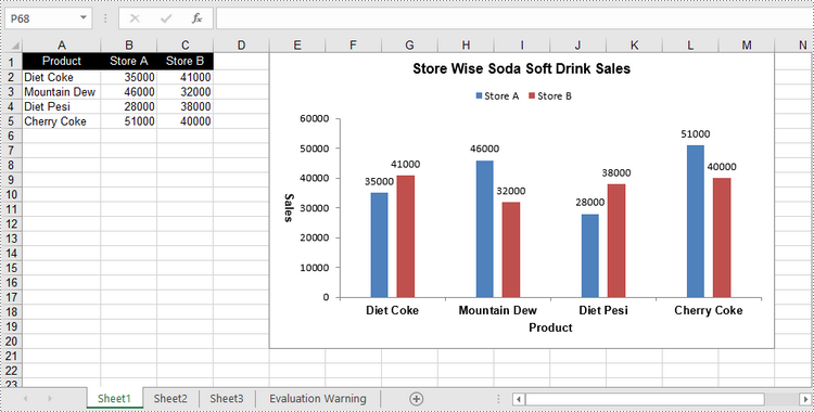
Crie um gráfico de colunas agrupadas no Excel em Python
Para adicionar um gráfico a uma planilha, use o método Worksheet.Chart.Add(ExcelChartType chartType). A enumeração ExcelChartType inclui vários tipos de gráficos predefinidos no MS Excel. A seguir estão as etapas para adicionar um gráfico de colunas agrupadas no Excel usando Spire.XLS for Python.
- Crie um objeto Pasta de Trabalho.
- Obtenha uma planilha específica por meio da propriedade Workbook.Worksheets[index].
- Grave dados nas células especificadas.
- Adicione um caractere de coluna clusterizada à planilha usando o método Worksheet.Chart.Add(ExcelChartType.ColumnClustered).
- Defina os dados do gráfico através da propriedade Chart.DataRange.
- Defina a posição, o título e outros atributos do gráfico por meio das propriedades do objeto Gráfico.
- Salve a pasta de trabalho em um arquivo Excel usando o método Workbook.SaveToFile().
- Python
from spire.xls import *
from spire.xls.common import *

# Create a Workbook object
workbook = Workbook()

# Get the first sheet
sheet = workbook.Worksheets[0]

# Set chart data
sheet.Range["A1"].Value = "Product"
sheet.Range["A2"].Value = "Diet Coke"
sheet.Range["A3"].Value = "Mountain Dew"
sheet.Range["A4"].Value = "Diet Pesi"
sheet.Range["A5"].Value = "Cherry Coke"

sheet.Range["B1"].Value = "Store A"
sheet.Range["B2"].NumberValue = 35000
sheet.Range["B3"].NumberValue = 46000
sheet.Range["B4"].NumberValue = 28000
sheet.Range["B5"].NumberValue = 51000
sheet.Range["C1"].Value = "Store B"
sheet.Range["C2"].NumberValue = 41000
sheet.Range["C3"].NumberValue = 32000
sheet.Range["C4"].NumberValue = 38000
sheet.Range["C5"].NumberValue = 40000

# Set cell style
sheet.Range["A1:C1"].RowHeight = 15
sheet.Range["A1:C1"].Style.Color = Color.get_Black()
sheet.Range["A1:C1"].Style.Font.Color = Color.get_White()
sheet.Range["A1:C1"].Style.VerticalAlignment = VerticalAlignType.Center
sheet.Range["A1:C1"].Style.HorizontalAlignment = HorizontalAlignType.Center
sheet.AutoFitColumn(1)

# Add a chart to the sheet
chart = sheet.Charts.Add(ExcelChartType.ColumnClustered)

# Set data range of chart
chart.DataRange = sheet.Range["A1:C5"]
chart.SeriesDataFromRange = False

# Set position of the chart
chart.LeftColumn = 5
chart.TopRow = 1
chart.RightColumn = 14
chart.BottomRow = 21

# Set chart title
chart.ChartTitle = "Store Wise Soda Soft Drink Sales"
chart.ChartTitleArea.IsBold = True
chart.ChartTitleArea.Size = 12

# Set axis title
chart.PrimaryCategoryAxis.Title = "Product"
chart.PrimaryCategoryAxis.Font.IsBold = True
chart.PrimaryCategoryAxis.TitleArea.IsBold = True
chart.PrimaryValueAxis.Title = "Sales"
chart.PrimaryValueAxis.HasMajorGridLines = False
chart.PrimaryValueAxis.TitleArea.IsBold = True
chart.PrimaryValueAxis.TitleArea.TextRotationAngle = 90

# Set series color, overlap, gap width and data labels
series = chart.Series
for i in range(len(series)):
    cs = series[i]
    cs.Format.Options.IsVaryColor = True
    cs.Format.Options.Overlap = -50
    cs.Format.Options.GapWidth = 350
    cs.DataPoints.DefaultDataPoint.DataLabels.HasValue = True

# Set legend position
chart.Legend.Position = LegendPositionType.Top

# Save the document
workbook.SaveToFile("ClusteredColumnChart.xlsx", ExcelVersion.Version2016)
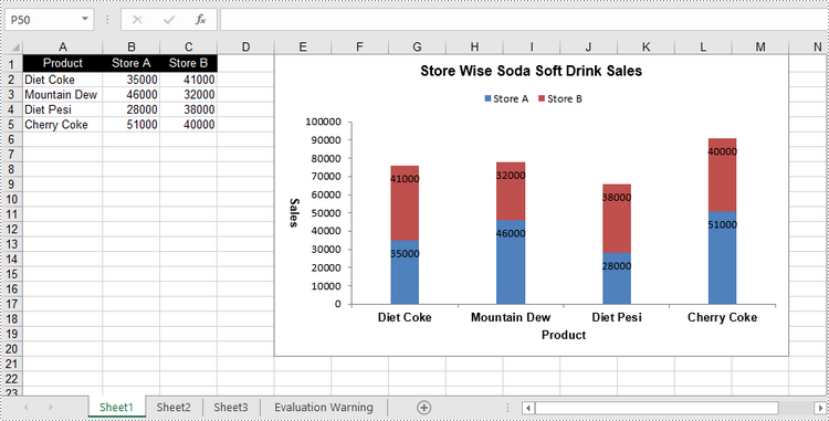
Crie um gráfico de colunas empilhadas no Excel em Python
O processo de criação de um gráfico de colunas empilhadas é semelhante ao de criação de um gráfico de colunas agrupadas. A única diferença é que você deve alterar o tipo de gráfico do Excel de ColumnClustered para ColumnStacked.
- Crie um objeto Pasta de Trabalho.
- Obtenha uma planilha específica por meio da propriedade Workbook.Worksheets[index].
- Grave dados nas células especificadas.
- Adicione um caractere de coluna clusterizada à planilha usando o método Worksheet.Chart.Add(ExcelChartType.ColumnStacked).
- Defina os dados do gráfico através da propriedade Chart.DataRange.
- Defina a posição, o título e outros atributos do gráfico por meio das propriedades do objeto Gráfico.
- Salve a pasta de trabalho em um arquivo Excel usando o método Workbook.SaveToFile().
- Python
from spire.xls import *
from spire.xls.common import *

# Create a Workbook object
workbook = Workbook()

# Get the first sheet
sheet = workbook.Worksheets[0]

# Set chart data
sheet.Range["A1"].Value = "Product"
sheet.Range["A2"].Value = "Diet Coke"
sheet.Range["A3"].Value = "Mountain Dew"
sheet.Range["A4"].Value = "Diet Pesi"
sheet.Range["A5"].Value = "Cherry Coke"
sheet.Range["B1"].Value = "Store A"
sheet.Range["B2"].NumberValue = 35000
sheet.Range["B3"].NumberValue = 46000
sheet.Range["B4"].NumberValue = 28000
sheet.Range["B5"].NumberValue = 51000
sheet.Range["C1"].Value = "Store B"
sheet.Range["C2"].NumberValue = 41000
sheet.Range["C3"].NumberValue = 32000
sheet.Range["C4"].NumberValue = 38000
sheet.Range["C5"].NumberValue = 40000

# Set cell style
sheet.Range["A1:C1"].RowHeight = 15
sheet.Range["A1:C1"].Style.Color = Color.get_Black()
sheet.Range["A1:C1"].Style.Font.Color = Color.get_White()
sheet.Range["A1:C1"].Style.VerticalAlignment = VerticalAlignType.Center
sheet.Range["A1:C1"].Style.HorizontalAlignment = HorizontalAlignType.Center
sheet.AutoFitColumn(1)

# Add a chart to the sheet
chart = sheet.Charts.Add(ExcelChartType.ColumnStacked)

# Set data range of chart
chart.DataRange = sheet.Range["A1:C5"]
chart.SeriesDataFromRange = False

# Set position of the chart
chart.LeftColumn = 5
chart.TopRow = 1
chart.RightColumn = 14
chart.BottomRow = 21

# Set chart title
chart.ChartTitle = "Store Wise Soda Soft Drink Sales"
chart.ChartTitleArea.IsBold = True
chart.ChartTitleArea.Size = 12

# Set axis title
chart.PrimaryCategoryAxis.Title = "Product"
chart.PrimaryCategoryAxis.Font.IsBold = True
chart.PrimaryCategoryAxis.TitleArea.IsBold = True
chart.PrimaryValueAxis.Title = "Sales"
chart.PrimaryValueAxis.HasMajorGridLines = False
chart.PrimaryValueAxis.TitleArea.IsBold = True
chart.PrimaryValueAxis.TitleArea.TextRotationAngle = 90

# Set series color, gap width and data labels
series = chart.Series
for i in range(len(series)):
    cs = series[i]
    cs.Format.Options.IsVaryColor = True
    cs.Format.Options.GapWidth = 270
    cs.DataPoints.DefaultDataPoint.DataLabels.HasValue = True
    cs.DataPoints.DefaultDataPoint.DataLabels.Position = DataLabelPositionType.Inside

# Set legend position
chart.Legend.Position = LegendPositionType.Top

# Save the document
workbook.SaveToFile("StackedColumnChart.xlsx", ExcelVersion.Version2016)
Solicite uma licença temporária
Se desejar remover a mensagem de avaliação dos documentos gerados ou se livrar das limitações de função, por favor solicite uma licença de teste de 30 dias para você mesmo.