How to set the border color and styles for Excel Chart
The different border color and styles on the Excel Chart can distinguish the chart categories easily. Spire.XLS offers a property of LineProperties to enables developers to set the color and styles for the data point. This article is going to introduce the method of how to format data series for Excel charts in C# using Spire.XLS.
Note: Before Start, please download the latest version of Spire.XLS and add Spire.xls.dll in the bin folder as the reference of Visual Studio.
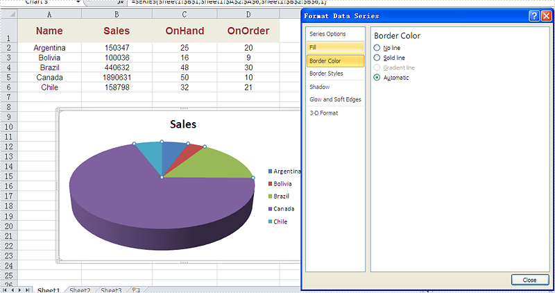
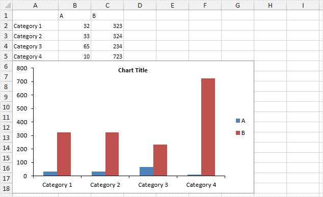
Firstly, please check the original screenshot of excel chart with the automatic setting for border.
Code Snippet of how to set the border color and border styles for Excel chart data series.
Step 1: Create a new workbook and load from file.
Workbook workbook = new Workbook();
workbook.LoadFromFile("sample.xlsx");
Step 2: Get the first worksheet from workbook and then get the first chart from the worksheet.
Worksheet ws = workbook.Worksheets[0];
Chart chart = ws.Charts[0];
Step 3: Set CustomLineWeight property for Series line.
(chart.Series[0].DataPoints[0].DataFormat.LineProperties as XlsChartBorder).CustomLineWeight = 1.5f;
Step 4: Set Color property for Series line.
(chart.Series[0].DataPoints[0].DataFormat.LineProperties as XlsChartBorder).Color = Color.Red;
Step 5: Save the document to file.
workbook.SaveToFile("result.xlsx", FileFormat.Version2013);
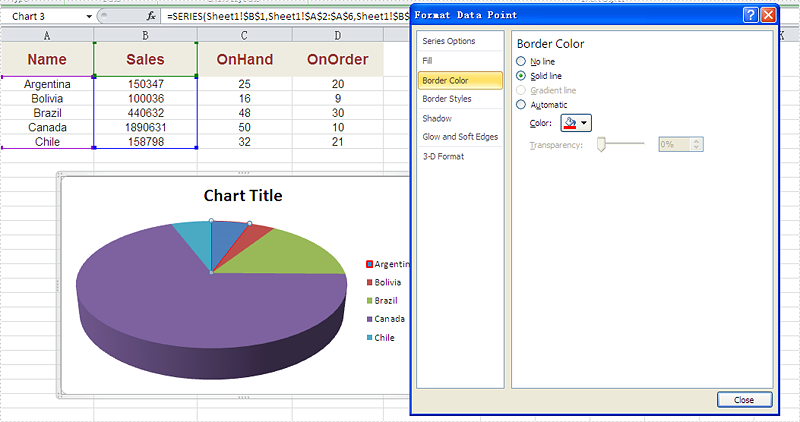
Effective screenshot after set the color and width of excel chart border.
Full codes:
using Spire.Xls;
using Spire.Xls.Charts;
using Spire.Xls.Core.Spreadsheet.Charts;
using System.Drawing;
namespace SetBoarderColor
{

    class Program
    {

        static void Main(string[] args)
        {
            Workbook workbook = new Workbook();
            workbook.LoadFromFile("sample.xlsx");
            Worksheet ws = workbook.Worksheets[0];
            Chart chart = ws.Charts[0];

            (chart.Series[0].DataPoints[0].DataFormat.LineProperties as XlsChartBorder).CustomLineWeight = 1.5f;
            (chart.Series[0].DataPoints[0].DataFormat.LineProperties as XlsChartBorder).Color = Color.Red;

            workbook.SaveToFile("result.xlsx", FileFormat.Version2013);


        }
    }
}
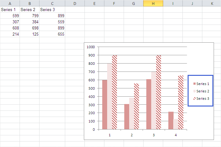
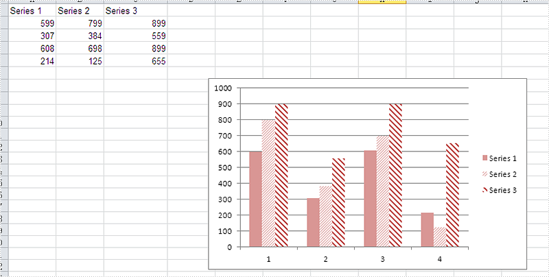
How to Adjust the Spaces between Bars in Excel Chart in C#, VB.NET
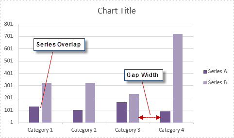
In MS Excel, the spaces between data bars have been defined as Series Overlap and Gap Width.
- Series Overlap: Spaces between data series within a single category.
- Gap Width: Spaces between two categories.
Check below picture, you'll have a better understanding of these two concepts. Normally the spaces are automatically calculated based on the date and chart area, the space may be very narrow or wide depending on how many date series you have in a fixed chart area. In this article, we'll introduce how to adjust the spaces between data bars using Spire.XLS.
Code Snippet:
Step 1: Initialize a new instance of Wordbook class and load the sample Excel file that contains some data in A1 to C5.
Workbook workbook = new Workbook();
workbook.LoadFromFile("sample.xlsx");
Step 2: Create a Column chart based on the data in cell range A1 to C5.
Worksheet sheet = workbook.Worksheets[0];
Chart chart = sheet.Charts.Add(ExcelChartType.ColumnClustered);
chart.DataRange = sheet.Range["A1:C5"];
chart.SeriesDataFromRange = false;
chart.PrimaryValueAxis.MajorGridLines.LineProperties.Color = Color.LightGray;
Step 3: Set chart position.
chart.LeftColumn = 5;
chart.TopRow = 7;
chart.RightColumn = 13;
chart.BottomRow = 21;
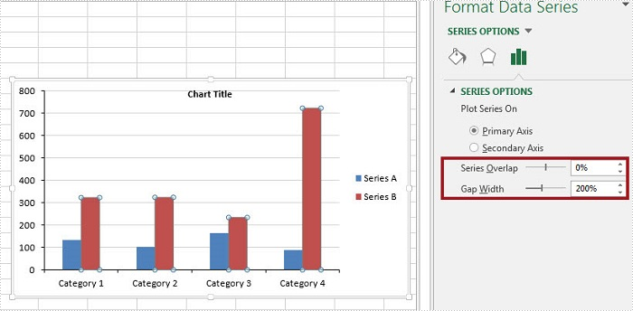
Step 4: The ChartSerieDataFormat class has two properties - GapWidth property and Overlap property to handle the Gap Width and Series Overlap respectively. The value of GapWidth varies from 0 to 500, and the value of Overlap varies from -100 to 100.
foreach (ChartSerie cs in chart.Series)
{
    cs.Format.Options.GapWidth = 200;
    cs.Format.Options.Overlap = 0;
}
Step 5: Save and launch the file.
workbook.SaveToFile("result.xlsx", ExcelVersion.Version2010);
System.Diagnostics.Process.Start("result.xlsx");
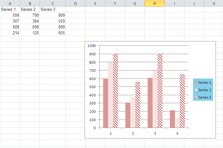
Output:
Full Code:
using Spire.Xls;
using Spire.Xls.Charts;
namespace AdjustSpaces
{

    class Program
    {

        static void Main(string[] args)
        {
            Workbook workbook = new Workbook();
            workbook.LoadFromFile("data.xlsx");

            Worksheet sheet = workbook.Worksheets[0];
            Chart chart = sheet.Charts.Add(ExcelChartType.ColumnClustered);
            chart.DataRange = sheet.Range["A1:C5"];
            chart.SeriesDataFromRange = false;
            chart.PrimaryValueAxis.MajorGridLines.LineProperties.Color = Color.LightGray;

            chart.LeftColumn = 5;
            chart.TopRow = 7;
            chart.RightColumn = 13;
            chart.BottomRow = 21;

            foreach (ChartSerie cs in chart.Series)
            {
                cs.Format.Options.GapWidth = 200;
                cs.Format.Options.Overlap = 0;
            }

            workbook.SaveToFile("result.xlsx", ExcelVersion.Version2010);
            System.Diagnostics.Process.Start("result.xlsx");

        }
    }
}
Imports Spire.Xls
Imports Spire.Xls.Charts
Namespace AdjustSpaces

	Class Program

		Private Shared Sub Main(args As String())
			Dim workbook As New Workbook()
			workbook.LoadFromFile("data.xlsx")

			Dim sheet As Worksheet = workbook.Worksheets(0)
			Dim chart As Chart = sheet.Charts.Add(ExcelChartType.ColumnClustered)
			chart.DataRange = sheet.Range("A1:C5")
			chart.SeriesDataFromRange = False
			chart.PrimaryValueAxis.MajorGridLines.LineProperties.Color = Color.LightGray

			chart.LeftColumn = 5
			chart.TopRow = 7
			chart.RightColumn = 13
			chart.BottomRow = 21

			For Each cs As ChartSerie In chart.Series
				cs.Format.Options.GapWidth = 200
				cs.Format.Options.Overlap = 0
			Next

			workbook.SaveToFile("result.xlsx", ExcelVersion.Version2010)
			System.Diagnostics.Process.Start("result.xlsx")

		End Sub
	End Class
End Namespace
How to Hide Gridlines in Excel Chart in C#, VB.NET
Gridlines are often added to charts to help improve the readability of the chart itself, but it is not a necessary to display the gridlines in every chart especially when we do not need to know the exact value of each data point from graphic. This article will present how to hide gridlines in Excel chart using Spire.XLS.
Code Snippet:
Step 1: Initialize a new instance of Workbook class and load a sample Excel file that contains some data in A1 to C5.
Workbook workbook = new Workbook();
workbook.LoadFromFile("data.xlsx");
Step 2: Create a Column chart based on the data in cell range A1 to C5.
Worksheet sheet = workbook.Worksheets[0];
Chart chart = sheet.Charts.Add(ExcelChartType.ColumnClustered);
chart.DataRange = sheet.Range["A1:C5"];
chart.SeriesDataFromRange = false;
Step 3: Set chart position.
chart.LeftColumn = 1;
chart.TopRow = 6;
chart.RightColumn = 8
chart.BottomRow = 19;
Step 4: Set the PrimaryValueAxis.HasMajorGridLines property to false.
chart.PrimaryValueAxis.HasMajorGridLines = false;
Step 5: Save and launch the file.
workbook.SaveToFile("result.xlsx", ExcelVersion.Version2010);
System.Diagnostics.Process.Start("result.xlsx");
Output:
Full Code:
using Spire.Xls;
namespace HideGridLine
{

    class Program
    {

        static void Main(string[] args)
        {
            Workbook workbook = new Workbook();
            workbook.LoadFromFile("data.xlsx");

            Worksheet sheet = workbook.Worksheets[0];
            Chart chart = sheet.Charts.Add(ExcelChartType.ColumnClustered);
            chart.DataRange = sheet.Range["A1:C5"];
            chart.SeriesDataFromRange = false;
            chart.LeftColumn = 1;
            chart.TopRow = 6;
            chart.RightColumn = 8;
            chart.BottomRow = 19;

            chart.PrimaryValueAxis.HasMajorGridLines = false;

            workbook.SaveToFile("result.xlsx", ExcelVersion.Version2010);
            System.Diagnostics.Process.Start("result.xlsx");
        }

    }
}
Imports Spire.Xls
Namespace HideGridLine

	Class Program

		Private Shared Sub Main(args As String())
			Dim workbook As New Workbook()
			workbook.LoadFromFile("data.xlsx")

			Dim sheet As Worksheet = workbook.Worksheets(0)
			Dim chart As Chart = sheet.Charts.Add(ExcelChartType.ColumnClustered)
			chart.DataRange = sheet.Range("A1:C5")
			chart.SeriesDataFromRange = False
			chart.LeftColumn = 1
			chart.TopRow = 6
			chart.RightColumn = 8
			chart.BottomRow = 19

			chart.PrimaryValueAxis.HasMajorGridLines = False

			workbook.SaveToFile("result.xlsx", ExcelVersion.Version2010)
			System.Diagnostics.Process.Start("result.xlsx")
		End Sub

	End Class
End Namespace
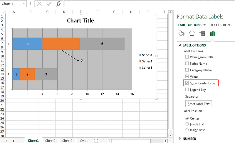
How to show the leader line on Excel chart in C#
The leader line on Excel chart is very helpful since it gives a visual connection between a data label and its corresponding data point. Spire.XLS offers a property of DataLabels.ShowLeaderLines to enable developers to show or hide the leader lines easily. This article will focus on demonstrating how to show the leader line on Excel stacked bar chart in C#.
Note: Before Start, please ensure that you have download the latest version of Spire.XLS (V7.8.64 or above) and add Spire.xls.dll in the bin folder as the reference of Visual Studio.
Here comes to the code snippet of how to show the leader line on Excel stacked bar chart in C#.
Step 1: Create a new excel document instance and get the first worksheet.
Workbook book = new Workbook();
Worksheet sheet = book.Worksheets[0];
Step 2: Add some data to the Excel sheet cell range.
sheet.Range["A1"].Value = "1";
sheet.Range["A2"].Value = "2";
sheet.Range["A3"].Value = "3";
sheet.Range["B1"].Value = "4";
sheet.Range["B2"].Value = "5";
sheet.Range["B3"].Value = "6";
Step 3: Create a bar chart and define the data for it.
Chart chart = sheet.Charts.Add(ExcelChartType.BarStacked);
chart.DataRange = sheet.Range["A1:B3"];
Step 4: Set the property of HasValue and ShowLeaderLines for DataLabels.
foreach (ChartSerie cs in chart.Series)
  {
    cs.DataPoints.DefaultDataPoint.DataLabels.HasValue = true;
    cs.DataPoints.DefaultDataPoint.DataLabels.ShowLeaderLines = true;
  }
Step 5: Save the document to file and set the excel version.
book.Version = ExcelVersion.Version2013;
book.SaveToFile("result.xlsx", FileFormat.Version2013);
Effective screenshots:
Full codes:
using Spire.Xls;
using Spire.Xls.Charts;
using Spire.Xls.Core.Spreadsheet.Charts;
using System.Drawing;
namespace ShowLeaderLine
{
    class Program
    {

        static void Main(string[] args)
        {
            Workbook book = new Workbook();
            Worksheet sheet = book.Worksheets[0];

            sheet.Range["A1"].Value = "1";
            sheet.Range["A2"].Value = "2";
            sheet.Range["A3"].Value = "3";
            sheet.Range["B1"].Value = "4";
            sheet.Range["B2"].Value = "5";
            sheet.Range["B3"].Value = "6";

            Chart chart = sheet.Charts.Add(ExcelChartType.BarStacked);
            chart.DataRange = sheet.Range["A1:B3"];

            foreach (ChartSerie cs in chart.Series)
            {
                cs.DataPoints.DefaultDataPoint.DataLabels.HasValue = true;
                cs.DataPoints.DefaultDataPoint.DataLabels.ShowLeaderLines = true;
            }

            book.Version = ExcelVersion.Version2013;
            book.SaveToFile("result.xlsx", FileFormat.Version2013);
        }

    }
}
How to Set the Background Color of Legend in an Excel Chart
There are many kinds of areas in a chart, such as chart area, plot area, legend area. Spire.XLS offers properties to set the performance of each area easily in C# and VB.NET. We have already shown you how to set the background color and image for chart area and plot area in C#. This article will show you how to set the background color for chart legend in C# with the help of Spire.XLS 7.8.43 or above.
Firstly, please check the original screenshot of excel chart with the automatic setting for chart legend.
Code Snippet of how to set the background color of legend in a Chart:
Step 1: Create a new workbook and load from file.
Workbook workbook = new Workbook();
workbook.LoadFromFile("sample.xlsx");
Step 2: Get the first worksheet from workbook and then get the first chart from the worksheet.
Worksheet ws = workbook.Worksheets[0];
Chart chart = ws.Charts[0];
Step 3: Change the background color of the legend in a chart and specify a Solid Fill of SkyBlue.
XlsChartFrameFormat x = chart.Legend.FrameFormat as XlsChartFrameFormat;
x.Fill.FillType = ShapeFillType.SolidColor;
x.ForeGroundColor = Color.SkyBlue;
Step 4: Save the document to file.
workbook.SaveToFile("result.xlsx",ExcelVersion.Version2010);
Effective screenshot after fill the background color for Excel chart legend:
Full codes:
using Spire.Xls;
using Spire.Xls.Core.Spreadsheet.Charts;
using System.Drawing;
namespace SetBackgroundColor
{
    class Program
    {

        static void Main(string[] args)
        {

            Workbook workbook = new Workbook();
            workbook.LoadFromFile("sample.xlsx");

            Worksheet ws = workbook.Worksheets[0];
            Chart chart = ws.Charts[0];

            XlsChartFrameFormat x = chart.Legend.FrameFormat as XlsChartFrameFormat;
            x.Fill.FillType = ShapeFillType.SolidColor;
            x.ForeGroundColor = Color.SkyBlue;

            workbook.SaveToFile("result.xlsx", ExcelVersion.Version2010);
        }
    }
}
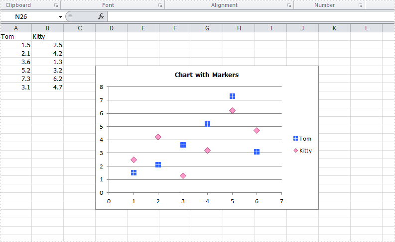
How to set customized data marker for charts in C#
The format of data marker in a line, scatter and radar chart can be changed and customized, which makes it more attractive and distinguishable. We could set markers' built-in type, size, background color, foreground color and transparency in Excel. This article is going to introduce how to achieve those features in C# using Spire.XLS.
Note: before start, please download the latest version of Spire.XLS and add the .dll in the bin folder as the reference of Visual Studio.
Step 1: Create a workbook with sheet and add some sample data.
            Workbook workbook = new Workbook();
            workbook.CreateEmptySheets(1);
            Worksheet sheet = workbook.Worksheets[0];
            sheet.Name = "Demo";
            sheet.Range["A1"].Value = "Tom";
            sheet.Range["A2"].NumberValue = 1.5;
            sheet.Range["A3"].NumberValue = 2.1;
            sheet.Range["A4"].NumberValue = 3.6;
            sheet.Range["A5"].NumberValue = 5.2;
            sheet.Range["A6"].NumberValue = 7.3;
            sheet.Range["A7"].NumberValue = 3.1;
            sheet.Range["B1"].Value = "Kitty";
            sheet.Range["B2"].NumberValue = 2.5;
            sheet.Range["B3"].NumberValue = 4.2;
            sheet.Range["B4"].NumberValue = 1.3;
            sheet.Range["B5"].NumberValue = 3.2;
            sheet.Range["B6"].NumberValue = 6.2;
            sheet.Range["B7"].NumberValue = 4.7;
Step 2: Create a Scatter-Markers chart based on the sample data.
            Chart chart = sheet.Charts.Add(ExcelChartType.ScatterMarkers);
            chart.DataRange = sheet.Range["A1:B7"];
            chart.PlotArea.Visible=false;
            chart.SeriesDataFromRange = false;
            chart.TopRow = 5;
            chart.BottomRow = 22;
            chart.LeftColumn = 4;
            chart.RightColumn = 11;
            chart.ChartTitle = "Chart with Markers";
            chart.ChartTitleArea.IsBold = true;
            chart.ChartTitleArea.Size = 10;
Step 3: Format the markers in the chart by setting the background color, foreground color, type, size and transparency.
            Spire.Xls.Charts.ChartSerie cs1 = chart.Series[0];
            cs1.DataFormat.MarkerBackgroundColor = Color.RoyalBlue;
            cs1.DataFormat.MarkerForegroundColor = Color.WhiteSmoke;
            cs1.DataFormat.MarkerSize = 7;
            cs1.DataFormat.MarkerStyle = ChartMarkerType.PlusSign;
            cs1.DataFormat.MarkerTransparencyValue = 0.8;

            Spire.Xls.Charts.ChartSerie cs2 = chart.Series[1];
            cs2.DataFormat.MarkerBackgroundColor = Color.Pink;
            cs2.DataFormat.MarkerSize = 9;
            cs2.DataFormat.MarkerStyle = ChartMarkerType.Diamond;
            cs2.DataFormat.MarkerTransparencyValue = 0.9;
Step 4: Save the document and launch to see effects.
            workbook.SaveToFile("S3.xlsx", ExcelVersion.Version2010);
            System.Diagnostics.Process.Start("S3.xlsx");
Effects:
Full Codes:
using System;
using System.Collections.Generic;
using System.Linq;
using System.Text;
using Spire.Xls;
using System.Drawing;

namespace ConsoleApplication2
{
    class Program
    {
        static void Main(string[] args)
        {

            Workbook workbook = new Workbook();
            workbook.CreateEmptySheets(1);
            Worksheet sheet = workbook.Worksheets[0];

            sheet.Name = "Demo";
            sheet.Range["A1"].Value = "Tom";
            sheet.Range["A2"].NumberValue = 1.5;
            sheet.Range["A3"].NumberValue = 2.1;
            sheet.Range["A4"].NumberValue = 3.6;
            sheet.Range["A5"].NumberValue = 5.2;
            sheet.Range["A6"].NumberValue = 7.3;
            sheet.Range["A7"].NumberValue = 3.1;
            sheet.Range["B1"].Value = "Kitty";
            sheet.Range["B2"].NumberValue = 2.5;
            sheet.Range["B3"].NumberValue = 4.2;
            sheet.Range["B4"].NumberValue = 1.3;
            sheet.Range["B5"].NumberValue = 3.2;
            sheet.Range["B6"].NumberValue = 6.2;
            sheet.Range["B7"].NumberValue = 4.7;

            Chart chart = sheet.Charts.Add(ExcelChartType.ScatterMarkers);
            chart.DataRange = sheet.Range["A1:B7"];
            chart.PlotArea.Visible=false;
            chart.SeriesDataFromRange = false;
            chart.TopRow = 5;
            chart.BottomRow = 22;
            chart.LeftColumn = 4;
            chart.RightColumn = 11;
            chart.ChartTitle = "Chart with Markers";
            chart.ChartTitleArea.IsBold = true;
            chart.ChartTitleArea.Size = 10;

            Spire.Xls.Charts.ChartSerie cs1 = chart.Series[0];
            cs1.DataFormat.MarkerBackgroundColor = Color.RoyalBlue;
            cs1.DataFormat.MarkerForegroundColor = Color.WhiteSmoke;
            cs1.DataFormat.MarkerSize = 7;
            cs1.DataFormat.MarkerStyle = ChartMarkerType.PlusSign;
            cs1.DataFormat.MarkerTransparencyValue = 0.8;

            Spire.Xls.Charts.ChartSerie cs2 = chart.Series[1];
            cs2.DataFormat.MarkerBackgroundColor = Color.Pink;
            cs2.DataFormat.MarkerSize = 9;
            cs2.DataFormat.MarkerStyle = ChartMarkerType.Diamond;
            cs2.DataFormat.MarkerTransparencyValue = 0.9;

            workbook.SaveToFile("S3.xlsx", ExcelVersion.Version2010);
            System.Diagnostics.Process.Start("S3.xlsx");
        }
    }
}
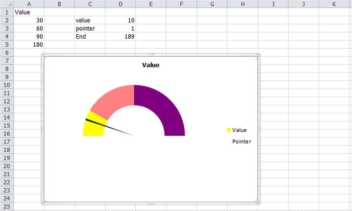
How to Create Gauge Chart in Excel in C#
A gauge chart (or speedometer chart) is a combination of doughnut chart and pie chart. It only displays a single value which is used to indicate how far you are from reaching a goal. In this article, you'll learn how to create a gauge chart in C# via Spire.XLS.
Here is the gauge chart that I'm going to create.
Code Snippet:
Step 1: Create a new workbook and add some sample data into the first sheet.
Workbook book = new Workbook();
Worksheet sheet = book.Worksheets[0];
sheet.Range["A1"].Value = "Value";
sheet.Range["A2"].Value = "30";
sheet.Range["A3"].Value = "60";
sheet.Range["A4"].Value = "90";
sheet.Range["A5"].Value = "180";
sheet.Range["C2"].Value = "value";
sheet.Range["C3"].Value = "pointer";
sheet.Range["C4"].Value = "End";
sheet.Range["D2"].Value = "10";
sheet.Range["D3"].Value = "1";
sheet.Range["D4"].Value = "189";
Step 2: Create a doughnut chart based on the data from A1 to A5. Set the chart position.
Chart chart = sheet.Charts.Add(ExcelChartType.Doughnut);
chart.DataRange = sheet.Range["A1:A5"];
chart.SeriesDataFromRange = false;
chart.HasLegend = true;
chart.LeftColumn = 2;
chart.TopRow = 7;
chart.RightColumn = 9;
chart.BottomRow = 25;
Step 3: Set format of Value series. Following code makes the graphic looks like a semi-circle.
var cs1 = (ChartSerie)chart.Series["Value"];
cs1.Format.Options.DoughnutHoleSize = 60;
cs1.DataFormat.Options.FirstSliceAngle = 270;
cs1.DataPoints[0].DataFormat.Fill.ForeColor = Color.Yellow;
cs1.DataPoints[1].DataFormat.Fill.ForeColor = Color.PaleVioletRed;
cs1.DataPoints[2].DataFormat.Fill.ForeColor = Color.DarkViolet;
cs1.DataPoints[3].DataFormat.Fill.Visible = false;
Step 4: Add a new series to the doughnut chart, set chart type as Pie, and set the data range for the series. Format the each data point in the series to make sure only the pointer category is visible in the graphic.
var cs2 = (ChartSerie)chart.Series.Add("Pointer", ExcelChartType.Pie);
cs2.Values = sheet.Range["D2:D4"];
cs2.UsePrimaryAxis = false;
cs2.DataPoints[0].DataLabels.HasValue= true;
cs2.DataFormat.Options.FirstSliceAngle = 270;
cs2.DataPoints[0].DataFormat.Fill.Visible = false;
cs2.DataPoints[1].DataFormat.Fill.FillType = ShapeFillType.SolidColor;
cs2.DataPoints[1].DataFormat.Fill.ForeColor = Color.Black;
cs2.DataPoints[2].DataFormat.Fill.Visible = false;
Step 5: Save and launch to view the effect.
book.SaveToFile("AddGaugeChart.xlsx", FileFormat.Version2010);
System.Diagnostics.Process.Start("AddGaugeChart.xlsx");
Full Code:
using Spire.Xls;
using Spire.Xls.Charts;
using System.Drawing;
namespace CreateGauge
{
    class Program
    {

        static void Main(string[] args)
        {
            Workbook book = new Workbook();
            Worksheet sheet = book.Worksheets[0];
            sheet.Range["A1"].Value = "Value";
            sheet.Range["A2"].Value = "30";
            sheet.Range["A3"].Value = "60";
            sheet.Range["A4"].Value = "90";
            sheet.Range["A5"].Value = "180";
            sheet.Range["C2"].Value = "value";
            sheet.Range["C3"].Value = "pointer";
            sheet.Range["C4"].Value = "End";
            sheet.Range["D2"].Value = "10";
            sheet.Range["D3"].Value = "1";
            sheet.Range["D4"].Value = "189";

            Chart chart = sheet.Charts.Add(ExcelChartType.Doughnut);
            chart.DataRange = sheet.Range["A1:A5"];
            chart.SeriesDataFromRange = false;
            chart.HasLegend = true;
            chart.LeftColumn = 2;
            chart.TopRow = 7;
            chart.RightColumn = 9;
            chart.BottomRow = 25;

            var cs1 = (ChartSerie)chart.Series["Value"];
            cs1.Format.Options.DoughnutHoleSize = 60;
            cs1.DataFormat.Options.FirstSliceAngle = 270;
            cs1.DataPoints[0].DataFormat.Fill.ForeColor = Color.Yellow;
            cs1.DataPoints[1].DataFormat.Fill.ForeColor = Color.PaleVioletRed;
            cs1.DataPoints[2].DataFormat.Fill.ForeColor = Color.DarkViolet;
            cs1.DataPoints[3].DataFormat.Fill.Visible = false;

            var cs2 = (ChartSerie)chart.Series.Add("Pointer", ExcelChartType.Pie);
            cs2.Values = sheet.Range["D2:D4"];
            cs2.UsePrimaryAxis = false;
            cs2.DataPoints[0].DataLabels.HasValue = true;
            cs2.DataFormat.Options.FirstSliceAngle = 270;
            cs2.DataPoints[0].DataFormat.Fill.Visible = false;
            cs2.DataPoints[1].DataFormat.Fill.FillType = ShapeFillType.SolidColor;
            cs2.DataPoints[1].DataFormat.Fill.ForeColor = Color.Black;
            cs2.DataPoints[2].DataFormat.Fill.Visible = false;

            book.SaveToFile("AddGaugeChart.xlsx", FileFormat.Version2010);
            System.Diagnostics.Process.Start("AddGaugeChart.xlsx");

        }
    }
}
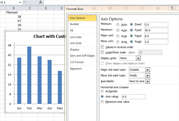
Format axis for Excel chart in C#
By default, Excel sets the axis properties automatically for charts. These properties include axis options like maximum & minimum value, major & minor unit, major & minor tick mark type, axis labels position, axis across value and whether values in reverse order. Sometimes we need to set those properties manually to beautify and perfect the charts. This article is going to introduce the method to customize axis setting for Excel chart in C# using Spire.XLS.
Note: before start, please download the latest version of Spire.XLS and add the .dll in the bin folder as the reference of Visual Studio.
Step 1: Create a workbook and add a sheet filled with some sample data.
            Workbook workbook = new Workbook();
            workbook.CreateEmptySheets(1);
            Worksheet sheet = workbook.Worksheets[0];
            sheet.Name = "Demo";
            sheet.Range["A1"].Value = "Month";
            sheet.Range["A2"].Value = "Jan";
            sheet.Range["A3"].Value = "Feb";
            sheet.Range["A4"].Value = "Mar";
            sheet.Range["A5"].Value = "Apr";
            sheet.Range["A6"].Value = "May";
            sheet.Range["A7"].Value = "Jun";
            sheet.Range["A8"].Value = "Jul";
            sheet.Range["A9"].Value = "Aug";
            sheet.Range["B1"].Value = "Planned";
            sheet.Range["B2"].NumberValue = 38;
            sheet.Range["B3"].NumberValue = 47;
            sheet.Range["B4"].NumberValue = 39;
            sheet.Range["B5"].NumberValue = 36;
            sheet.Range["B6"].NumberValue = 27;
            sheet.Range["B7"].NumberValue = 25;
            sheet.Range["B8"].NumberValue = 36;
            sheet.Range["B9"].NumberValue = 48;
Step 2: Create a column clustered chart based on the sample data.
            Chart chart = sheet.Charts.Add(ExcelChartType.ColumnClustered);
            chart.DataRange = sheet.Range["B1:B9"];
            chart.SeriesDataFromRange = false;
            chart.PlotArea.Visible = false;
            chart.TopRow = 6;
            chart.BottomRow = 25;
            chart.LeftColumn = 2;
            chart.RightColumn = 9;
            chart.ChartTitle = "Chart with Customized Axis";
            chart.ChartTitleArea.IsBold = true;
            chart.ChartTitleArea.Size = 12;
            Spire.Xls.Charts.ChartSerie cs1 = chart.Series[0];
            cs1.CategoryLabels = sheet.Range["A2:A9"];
Step 3: Set the customized axis properties for the chart.
            chart.PrimaryValueAxis.MajorUnit = 8;
            chart.PrimaryValueAxis.MinorUnit = 2;
            chart.PrimaryValueAxis.MaxValue = 50;
            chart.PrimaryValueAxis.MinValue = 0;
            chart.PrimaryValueAxis.IsReverseOrder = false;
            chart.PrimaryValueAxis.MajorTickMark = TickMarkType.TickMarkOutside;
            chart.PrimaryValueAxis.MinorTickMark = TickMarkType.TickMarkInside;
            chart.PrimaryValueAxis.TickLabelPosition = TickLabelPositionType.TickLabelPositionNextToAxis;
            chart.PrimaryValueAxis.CrossesAt = 0;
Step 4: Save the document and launch to see effects.
            workbook.SaveToFile("Result.xlsx", ExcelVersion.Version2010);
            System.Diagnostics.Process.Start("Result.xlsx");
Effects:
Full codes:
using System;
using System.Collections.Generic;
using System.Linq;
using System.Text;
using Spire.Xls;
using System.Drawing;

namespace ConsoleApplication2
{
    class Program
    {
        static void Main(string[] args)
        {
            Workbook workbook = new Workbook();
            workbook.CreateEmptySheets(1);
            Worksheet sheet = workbook.Worksheets[0];
            sheet.Name = "Demo";
            sheet.Range["A1"].Value = "Month";
            sheet.Range["A2"].Value = "Jan";
            sheet.Range["A3"].Value = "Feb";
            sheet.Range["A4"].Value = "Mar";
            sheet.Range["A5"].Value = "Apr";
            sheet.Range["A6"].Value = "May";
            sheet.Range["A7"].Value = "Jun";
            sheet.Range["A8"].Value = "Jul";
            sheet.Range["A9"].Value = "Aug";
            sheet.Range["B1"].Value = "Planned";
            sheet.Range["B2"].NumberValue = 38;
            sheet.Range["B3"].NumberValue = 47;
            sheet.Range["B4"].NumberValue = 39;
            sheet.Range["B5"].NumberValue = 36;
            sheet.Range["B6"].NumberValue = 27;
            sheet.Range["B7"].NumberValue = 25;
            sheet.Range["B8"].NumberValue = 36;
            sheet.Range["B9"].NumberValue = 48;

            Chart chart = sheet.Charts.Add(ExcelChartType.ColumnClustered);
            chart.DataRange = sheet.Range["B1:B9"];
            chart.SeriesDataFromRange = false;
            chart.PlotArea.Visible = false;
            chart.TopRow = 6;
            chart.BottomRow = 25;
            chart.LeftColumn = 2;
            chart.RightColumn = 9;
            chart.ChartTitle = "Chart with Customized Axis";
            chart.ChartTitleArea.IsBold = true;
            chart.ChartTitleArea.Size = 12;
            Spire.Xls.Charts.ChartSerie cs1 = chart.Series[0];
            cs1.CategoryLabels = sheet.Range["A2:A9"];

            chart.PrimaryValueAxis.MajorUnit = 8;
            chart.PrimaryValueAxis.MinorUnit = 2;
            chart.PrimaryValueAxis.MaxValue = 50;
            chart.PrimaryValueAxis.MinValue = 0;
            chart.PrimaryValueAxis.IsReverseOrder = false;
            chart.PrimaryValueAxis.MajorTickMark = TickMarkType.TickMarkOutside;
            chart.PrimaryValueAxis.MinorTickMark = TickMarkType.TickMarkInside;
            chart.PrimaryValueAxis.TickLabelPosition = TickLabelPositionType.TickLabelPositionNextToAxis;
            chart.PrimaryValueAxis.CrossesAt = 0;

            workbook.SaveToFile("Result.xlsx", ExcelVersion.Version2010);
            System.Diagnostics.Process.Start("Result.xlsx");
        }
    }
}
How to set and format data labels for Excel charts in C#
There are articles in our tutorials that introduce how to add trendline, error bars and data tables to Excel charts in C# using Spire.XLS. It's worthy of mention that Spire.XLS also supports data labels which are widely used to quickly identify a data series in a chart. In label options, we could set whether label contains series name, category name, value, percentages (pie chart) and legend key. This article is going to introduce the method to set and format data labels for Excel charts in C# using Spire.XLS.
Note: before start, please download the latest version of Spire.XLS and add the .dll in the bin folder as the reference of Visual Studio.
Step 1: Create an Excel document and add sample data.
            Workbook workbook = new Workbook();
            workbook.CreateEmptySheets(1);
            Worksheet sheet = workbook.Worksheets[0];
            sheet.Name = "Demo";
            sheet.Range["A1"].Value = "Month";
            sheet.Range["A2"].Value = "Jan";
            sheet.Range["A3"].Value = "Feb";
            sheet.Range["A4"].Value = "Mar";
            sheet.Range["A5"].Value = "Apr";
            sheet.Range["A6"].Value = "May";
            sheet.Range["A7"].Value = "Jun";
            sheet.Range["B1"].Value = "Peter";
            sheet.Range["B2"].NumberValue = 25;
            sheet.Range["B3"].NumberValue = 18;
            sheet.Range["B4"].NumberValue = 8;
            sheet.Range["B5"].NumberValue = 13;
            sheet.Range["B6"].NumberValue = 22;
            sheet.Range["B7"].NumberValue = 28;
Step 2: Create a line markers chart based on the sample data.
            Chart chart = sheet.Charts.Add(ExcelChartType.LineMarkers);
            chart.DataRange = sheet.Range["B1:B7"];
            chart.PlotArea.Visible = false;
            chart.SeriesDataFromRange = false;
            chart.TopRow = 5;
            chart.BottomRow = 26;
            chart.LeftColumn = 2;
            chart.RightColumn =11;
            chart.ChartTitle = "Data Labels Demo";
            chart.ChartTitleArea.IsBold = true;
            chart.ChartTitleArea.Size = 12;
            Spire.Xls.Charts.ChartSerie cs1 = chart.Series[0];
            cs1.CategoryLabels = sheet.Range["A2:A7"];
Step 3: Set which parts are displayed in the data labels and the delimiter to separate them.
            cs1.DataPoints.DefaultDataPoint.DataLabels.HasValue = true;
            cs1.DataPoints.DefaultDataPoint.DataLabels.HasLegendKey = false;
            cs1.DataPoints.DefaultDataPoint.DataLabels.HasPercentage = false;
            cs1.DataPoints.DefaultDataPoint.DataLabels.HasSeriesName = true;
            cs1.DataPoints.DefaultDataPoint.DataLabels.HasCategoryName = true;
            cs1.DataPoints.DefaultDataPoint.DataLabels.Delimiter = ". ";
Step 4: Set the font, position and fill effects for data labels in the chart.
            cs1.DataPoints.DefaultDataPoint.DataLabels.Size = 9;
            cs1.DataPoints.DefaultDataPoint.DataLabels.Color = Color.Red;
            cs1.DataPoints.DefaultDataPoint.DataLabels.FontName = "Calibri";
            cs1.DataPoints.DefaultDataPoint.DataLabels.Position = DataLabelPositionType.Center;
            cs1.DataPoints.DefaultDataPoint.DataLabels.FrameFormat.Fill.Texture = GradientTextureType.Papyrus;
Step 5: Save the document as Excel 2010.
            workbook.SaveToFile("S3.xlsx", ExcelVersion.Version2010);
            System.Diagnostics.Process.Start("S3.xlsx");
Effects:

Full Codes:
using System;
using System.Collections.Generic;
using System.Linq;
using System.Text;
using Spire.Xls;
using System.Drawing;

namespace ConsoleApplication2
{
    class Program
    {
        static void Main(string[] args)
        {

            Workbook workbook = new Workbook();
            workbook.CreateEmptySheets(1);
            Worksheet sheet = workbook.Worksheets[0];

            sheet.Name = "Demo";
            sheet.Range["A1"].Value = "Month";
            sheet.Range["A2"].Value = "Jan";
            sheet.Range["A3"].Value = "Feb";
            sheet.Range["A4"].Value = "Mar";
            sheet.Range["A5"].Value = "Apr";
            sheet.Range["A6"].Value = "May";
            sheet.Range["A7"].Value = "Jun";
            sheet.Range["B1"].Value = "Peter";
            sheet.Range["B2"].NumberValue = 25;
            sheet.Range["B3"].NumberValue = 18;
            sheet.Range["B4"].NumberValue = 8;
            sheet.Range["B5"].NumberValue = 13;
            sheet.Range["B6"].NumberValue = 22;
            sheet.Range["B7"].NumberValue = 28;

            Chart chart = sheet.Charts.Add(ExcelChartType.LineMarkers);
            chart.DataRange = sheet.Range["B1:B7"];
            chart.PlotArea.Visible = false;
            chart.SeriesDataFromRange = false;
            chart.TopRow = 5;
            chart.BottomRow = 26;
            chart.LeftColumn = 2;
            chart.RightColumn =11;
            chart.ChartTitle = "Data Labels Demo";
            chart.ChartTitleArea.IsBold = true;
            chart.ChartTitleArea.Size = 12;
            Spire.Xls.Charts.ChartSerie cs1 = chart.Series[0];
            cs1.CategoryLabels = sheet.Range["A2:A7"];

            cs1.DataPoints.DefaultDataPoint.DataLabels.HasValue = true;
            cs1.DataPoints.DefaultDataPoint.DataLabels.HasLegendKey = false;
            cs1.DataPoints.DefaultDataPoint.DataLabels.HasPercentage = false;
            cs1.DataPoints.DefaultDataPoint.DataLabels.HasSeriesName = true;
            cs1.DataPoints.DefaultDataPoint.DataLabels.HasCategoryName = true;
            cs1.DataPoints.DefaultDataPoint.DataLabels.Delimiter = ". ";

            cs1.DataPoints.DefaultDataPoint.DataLabels.Size = 9;
            cs1.DataPoints.DefaultDataPoint.DataLabels.Color = Color.Red;
            cs1.DataPoints.DefaultDataPoint.DataLabels.FontName = "Calibri";
            cs1.DataPoints.DefaultDataPoint.DataLabels.Position = DataLabelPositionType.Center;
            cs1.DataPoints.DefaultDataPoint.DataLabels.FrameFormat.Fill.Texture = GradientTextureType.Papyrus;

            workbook.SaveToFile("S3.xlsx", ExcelVersion.Version2010);
            System.Diagnostics.Process.Start("S3.xlsx");
        }
    }
}
How to set the background color for Excel Chart in C#
As a powerful Excel library, Spire.XLS supports to work with many kinds of charts and it also supports to set the performance for the chart. We have already shown you how to fill the excel chart with background image to make the chart more attractive. This article will show you how to fill the excel chart with background color in C#.
Please check the original Excel chart without any background color:
Code Snippet for Inserting Background color:
Step 1: Create a new workbook and load from file.
Workbook workbook = new Workbook();
workbook.LoadFromFile("sample.xlsx");
Step 2: Get the first worksheet from workbook and then get the first chart from the worksheet.
Worksheet ws = workbook.Worksheets[0];
Chart chart = ws.Charts[0];
Step 3: Set the property to ForeGroundColor for PlotArea to fill the background color for the chart.
chart.PlotArea.ForeGroundColor = System.Drawing.Color.LightYellow;
Step 4: Save the document to file.
workbook.SaveToFile("result.xlsx",ExcelVersion.Version2010);
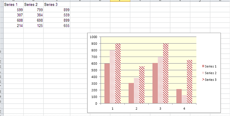
Effective screenshot after fill the background color for Excel chart:
Full codes:
using Spire.Xls;
namespace SetBackgroundColor
{
    class Program
    {

        static void Main(string[] args)
        {
            Workbook workbook = new Workbook();
            workbook.LoadFromFile("sample.xlsx");

            Worksheet ws = workbook.Worksheets[0];
            Chart chart = ws.Charts[0];

            chart.PlotArea.ForeGroundColor = System.Drawing.Color.LightYellow;

            workbook.SaveToFile("result.xlsx", ExcelVersion.Version2010);
        }

    }
}