
Making your data easy to understand can be tricky, especially if you’re not sure how to turn numbers into visuals. If you’ve ever opened PowerPoint and wondered how to make a chart quickly, you’re in the right place. In this guide, you’ll learn how to create a pie chart in PowerPoint, step by step. We’ll cover everything from adding a chart to customizing colors and labels, so your slides look clear and professional. By the end, you’ll be able to show your data in a way that’s simple, attractive, and easy for anyone to understand.
How to Create a Pie Chart in PowerPoint Manually
Making a pie chart in PowerPoint is easier than you might think. In this chapter, we’ll guide you step by step through the process. First, make sure you have your data ready along with a PowerPoint presentation. Most importantly, you’ll need Microsoft PowerPoint or another presentation editing app installed on your device. In this tutorial, we’ll use Microsoft PowerPoint as our example. Once you’re ready, let’s dive into today’s guide.
Step 1: Open Your Presentation
Start by locating and opening the PowerPoint file where you want to add your chart.
Step 2: Choose the Slide
Select the slide where the pie chart should appear. Make sure it’s ready for the data you want to show.
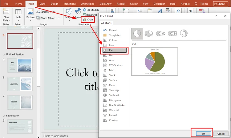
Step 3: Insert the Chart
Go to the Insert tab on the Ribbon at the top and click Chart.
Step 4: Pick Your Pie Chart
In the Insert Chart dialog box, select Pie from the left panel. You’ll see several types of pie charts—if you want to create a 3D Pie chart on the slide, choose the second option. Click OK to insert the chart.
Step 5: Enter Your Data
PowerPoint will show default data in an Excel-like sheet. Replace it with your own numbers to match your presentation needs.

Step 6: Customize the Chart
Click the chart and go to the Chart Design tab on the Ribbon. Here, you can change the style, colors, labels, or even switch to another chart type. Play around until it looks just right for your slide.
Here is the final look of the pie chart: 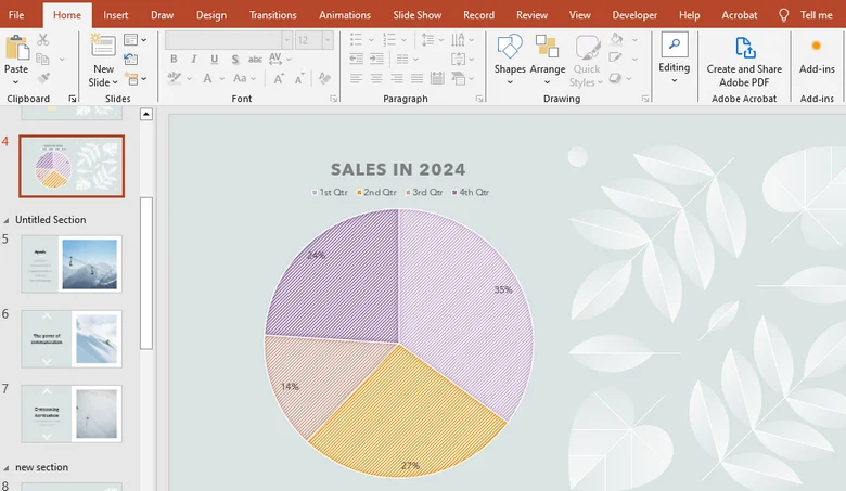
How to Create a Pie Chart in PowerPoint Presentation Automatically
After learning how to add a pie chart manually in PowerPoint, you’ve probably noticed that the steps can be a bit tedious, especially when updating data or customizing the chart. So, is there a faster way?
Using code to generate charts is a great solution. With Spire.Presentation, a professional PowerPoint library, you can easily create charts automatically, handling everything from file setup to data input and chart customization in one go.
Here’s a detailed guide on how to create a chart in PowerPoint using Spire.Presentation:
Step 1: Install Spire.Presentation
In this tutorial, we’ll use Spire.Presentation for Python. You can install it via pip by opening your Python environment (for example, the VSCode terminal) and running:
pip install spire.presentation
Press Enter, and the library will be installed.
Step 2: Write the Code
Here’s the overall logic for creating a pie chart with Spire.Presentation:
- Import the file – Load the PowerPoint presentation you want to work with or create a new presentation.
- Access the target slide – Select the slide where the pie chart will be inserted.
- Insert the pie chart – Add a pie chart object to the slide.
- Set the chart title – Give your pie chart a title.
- Add data to the chart – Fill the pie chart with your dataset.
- Customize chart colors – Adjust colors to make the chart visually appealing.
Below is the complete Python code showing how to create a pie chart while making a new PowerPoint presentation:
from spire.presentation.common import *
from spire.presentation import *

# Create a Presentation instance
presentation = Presentation()

# Add a pie chart at a specified location on the first slide
rect = RectangleF.FromLTRB (40, 100, 590, 420)
chart = presentation.Slides[0].Shapes.AppendChartInit (ChartType.Pie, rect, False)

# Set and format chart title
chart.ChartTitle.TextProperties.Text = "Sales by Quarter (2024)"
chart.ChartTitle.TextProperties.IsCentered = True
chart.ChartTitle.Height = 30
chart.HasTitle = True

# Define some data
quarters = ["1st Qtr", "2nd Qtr", "3rd Qtr", "4th Qtr"]
sales = [210, 320, 180, 460]

# Append data to ChartData, which represents a data table where the chart data is stored
chart.ChartData[0,0].Text = "Quarters"
chart.ChartData[0,1].Text = "Sales"
i = 0
while i < len(quarters):
    chart.ChartData[i + 1,0].Text = quarters[i]
    chart.ChartData[i + 1,1].NumberValue = sales[i]
    i += 1

# Set series labels and category labels
chart.Series.SeriesLabel = chart.ChartData["B1","B1"]
chart.Categories.CategoryLabels = chart.ChartData["A2","A5"]

# Set values for series
chart.Series[0].Values = chart.ChartData["B2","B5"]

# Add data points to series
for i, unusedItem in enumerate(chart.Series[0].Values):
    cdp = ChartDataPoint(chart.Series[0])
    cdp.Index = i
    chart.Series[0].DataPoints.Add(cdp)

# Fill each data point with a different color
chart.Series[0].DataPoints[0].Fill.FillType = FillFormatType.Solid
chart.Series[0].DataPoints[0].Fill.SolidColor.Color = Color.get_Honeydew()
chart.Series[0].DataPoints[1].Fill.FillType = FillFormatType.Solid
chart.Series[0].DataPoints[1].Fill.SolidColor.Color = Color.get_LightBlue()
chart.Series[0].DataPoints[2].Fill.FillType = FillFormatType.Solid
chart.Series[0].DataPoints[2].Fill.SolidColor.Color = Color.get_LightPink()
chart.Series[0].DataPoints[3].Fill.FillType = FillFormatType.Solid
chart.Series[0].DataPoints[3].Fill.SolidColor.Color = Color.get_AliceBlue()

# Set the data labels to display label value and percentage value
chart.Series[0].DataLabels.LabelValueVisible = True
chart.Series[0].DataLabels.PercentValueVisible = True

# Save the result file
presentation.SaveToFile("E:/Administrator/Python1/output/CreatePieChart.pptx", FileFormat.Pptx2016)
presentation.Dispose()
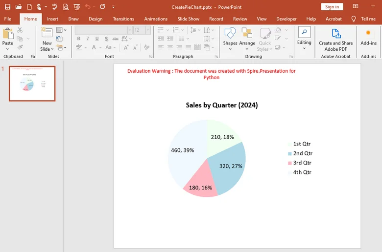
Here's the pie chart made by Spire.Presentation:
With Spire.Presentation, you can do much more than just create pie charts. It also lets you generate column charts, line charts, bar charts, and many other types of visuals directly in your slides. Plus, the library supports multiple programming languages — whether you prefer C#, Java, Python or JavaScript, you can easily create and customize charts with just a few lines of code.
The Conclusion
In this guide, we’ve walked through how to create a pie chart in PowerPoint step by step, from inserting the chart manually to customizing its style and colors. While the manual method works well for simple tasks, Spire.Presentation works better under complecated situations. With this professional library, you can automate the entire process—from adding charts and inputting data to customizing their appearance. Try it out immediately by obtaining a temporary license for 30 days , making chart creation faster and more efficient than ever.
FAQs about Creating a Pie Chart in PowerPoint
1. How do I create a pie chart step by step in PowerPoint?
Go to Insert → Chart → Pie, then replace the sample data with your own and adjust the chart style under Chart Design.
2. How can I show percentages in a pie chart?
Click the chart, select Data Labels → More Options, and check Percentage to display values as percentages.
3. How do I make a progress pie chart in PowerPoint?
Use a Pie or Doughnut chart with two values—progress and remaining—and format the slices with different colors.
4. Can I automate pie chart creation?
Yes. You can use Spire.Presentation to generate and edit charts automatically after obtaining a temporary license.
ALSO READ