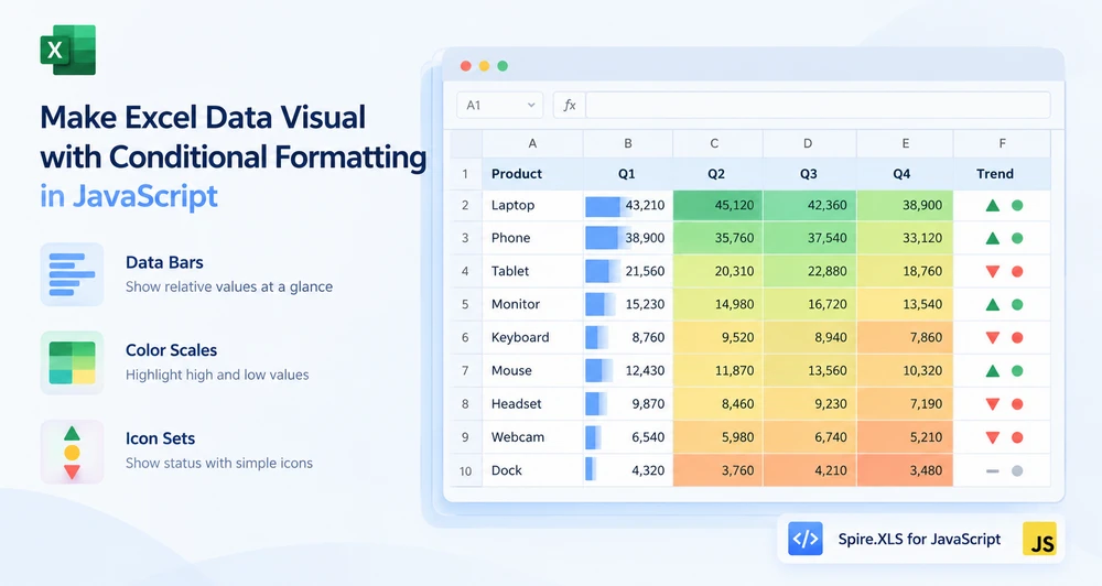
A sales table with twenty columns of numbers is accurate and unreadable. The eye cannot compare 43,210 against 38,900 across a row fast enough to find the weak quarter, and the person reading the report knows this — which is why they ask for a chart. But a chart per column means twenty charts, and now the worksheet is a gallery instead of a table.
Data bars, color scales, and icon sets solve this inside the cells themselves. A bar grows in proportion to the value. A color shifts from pale to saturated as the number rises. An icon changes shape when the value crosses a threshold. None of them add rows, columns, or floating objects — the visualization sits in the cell that already holds the number. All three are forms of Excel conditional formatting, and Spire.XLS for JavaScript applies them through a single API in the browser on WebAssembly, with files moving through a virtual file system (VFS) and no backend required.
For project setup, see Integrating Spire.XLS for JavaScript in a React Project. The examples below assume the package is installed and the WebAssembly module has been initialized.
Why not just add a chart
Charts and in-cell visualization answer the same question — "how do these values compare?" — but they fit different moments:
| Charts | In-cell visualization | |
|---|---|---|
| Space | Floats over the worksheet, occupies a rectangular area | Lives inside the cells that already hold the data |
| Density | One chart per data set; multiple charts crowd the sheet | One format per range; dozens of columns can carry cues simultaneously |
| Detail | Shows axes, gridlines, labels — a full rendering | Shows only the cue: a bar, a color, an icon |
| Best for | Presentations, reports, standalone displays | Scanning a table, spotting outliers, comparing across many columns |
When the goal is to make a table of numbers scannable without rebuilding the layout, in-cell visualization is the lighter tool. The three sections below cover each type, and they share more API than they differ on — which is the first thing worth knowing.
Prerequisites
You need a React project with Spire.XLS for JavaScript installed and the WebAssembly module initialized, reachable at window.wasmModule.spirexls. The sample loads a font and a sales data file into the VFS, and saves with the Excel 2010 version flag, which is the earliest version that supports these conditional format types.
One API, three visualizations
All three types follow the same chain of calls. The only line that changes is the FormatType assignment:
sheet.ConditionalFormats.Add() → xcfs.AddRange(range) → format = xcfs.AddCondition() → format.FormatType = ???
| Visualization |
FormatType value |
Extra setup |
|---|---|---|
| Data bars | ConditionalFormatType.DataBar |
DataBar.BarColor for the fill color |
| Color scales | ConditionalFormatType.ColorScale |
None — defaults to a two-color gradient |
| Icon sets | ConditionalFormatType.IconSet |
IconSet.IconSetType for the icon style |
The shared chain is why the three code examples below look similar — they are the same operation with a different format type. The differences are in what each type produces and when you would reach for it, which is what the comparison table later in this article addresses.
Data bars: magnitude at a glance
A data bar draws a horizontal colored band inside each cell, and the band's length is proportional to the cell's value relative to the rest of the selected range. The largest value fills the cell; the smallest fills a sliver. Scanning a row of data bars is the same mental operation as scanning a bar chart, except the numbers stay visible underneath.
The steps are:
- Load the font and the test data file into the VFS.
- Load the workbook and get the worksheet.
- Call
ConditionalFormats.Addto create a conditional format, and bind the data range withAddRange. - Call
AddConditionto add a condition, setFormatTypetoDataBar, and set the bar color. - Save the workbook.
function App() {
  const applyDataBars = async () => {
    // Get the Spire.XLS WASM module
    const xlsModule = window.wasmModule?.spirexls;

    // Check whether the module is ready
    if (!xlsModule) {
      alert('Spire.Xls is not ready yet');
      return;
    }

    // Load the font and the test data file into the VFS
    await window.spire.FetchFileToVFS('ARIAL.TTF', '/Library/Fonts/', `${process.env.PUBLIC_URL}/font/`);
    const inputFileName = 'SalesData.xlsx';
    await window.spire.FetchFileToVFS(inputFileName, '', `${process.env.PUBLIC_URL}data/`);

    // Load the workbook and get the first worksheet
    const workbook = new xlsModule.Workbook();
    workbook.LoadFromFile({ fileName: inputFileName });
    const sheet = workbook.Worksheets.get(0);

    // Select the data range that receives the data bars
    const dataRange = sheet.Range.get("B2:E9");

    // Create a conditional format and bind it to that range
    const xcfs = sheet.ConditionalFormats.Add();
    xcfs.AddRange(dataRange);

    // Add a data bar condition and set the bar color
    const format = xcfs.AddCondition();
    format.FormatType = xlsModule.ConditionalFormatType.DataBar;
    format.DataBar.BarColor = xlsModule.Color.get_CadetBlue();

    // Save the workbook
    const outputFileName = "ApplyDataBars.xlsx";
    workbook.SaveToFile({ fileName: outputFileName, version: xlsModule.ExcelVersion.Version2010 });

    // Dispose of the workbook object to free resources
    workbook.Dispose();

    // Read the result file from the VFS and trigger the download
    const fileArray = window.dotnetRuntime.Module.FS.readFile(outputFileName);
    const blob = new Blob([fileArray], { type: 'application/vnd.openxmlformats-officedocument.spreadsheetml.sheet' });
    const url = URL.createObjectURL(blob);
    const a = document.createElement('a');
    a.href = url;
    a.download = outputFileName;
    a.click();
    URL.revokeObjectURL(url);
  };

  return (
    <div style={{ textAlign: 'center', height: '300px' }}>
      <h1>Apply Data Bars</h1>
      <button onClick={applyDataBars}>Start</button>
    </div>
  );
}

export default App;
Data bars applied to a sales figures table, bar length proportional to cell value
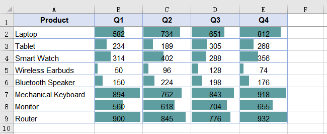
Only numeric cells receive bars — text cells inside the range are skipped. This is expected: a data bar expresses relative magnitude, and text has no magnitude to express. Keep the range bounded by the numeric area; including a product-name column or a header row does not cause an error, but those cells will show nothing.
Color scales: heat-mapping without a chart
A color scale shades each cell based on where its value falls between the range minimum and maximum. No color arguments are required — when none are specified, the result is a two-color scale that takes orange at the minimum and pale yellow at the maximum, with intermediate values shaded proportionally. The effect is a heat map embedded in the data table: hot spots and cold spots are visible without sorting or charting.
The steps are the same as for data bars, with FormatType set to ColorScale and no additional properties:
- Load the font and the test data file into the VFS.
- Load the workbook and get the worksheet.
- Call
ConditionalFormats.Addto create a conditional format, and bind the data range withAddRange. - Call
AddConditionto add a condition, and setFormatTypetoColorScale. - Save the workbook.
function App() {
  const applyColorScales = async () => {
    // Get the Spire.XLS WASM module
    const xlsModule = window.wasmModule?.spirexls;

    // Check whether the module is ready
    if (!xlsModule) {
      alert('Spire.Xls is not ready yet');
      return;
    }

    // Load the font and the test data file into the VFS
    await window.spire.FetchFileToVFS('ARIAL.TTF', '/Library/Fonts/', `${process.env.PUBLIC_URL}/font/`);
    const inputFileName = 'SalesData.xlsx';
    await window.spire.FetchFileToVFS(inputFileName, '', `${process.env.PUBLIC_URL}data/`);

    // Load the workbook and get the first worksheet
    const workbook = new xlsModule.Workbook();
    workbook.LoadFromFile({ fileName: inputFileName });
    const sheet = workbook.Worksheets.get(0);

    // Select the data range that receives the color scales
    const dataRange = sheet.Range.get("B2:E9");

    // Create a conditional format and bind it to that range
    const xcfs = sheet.ConditionalFormats.Add();
    xcfs.AddRange(dataRange);

    // Add a color scale condition; colors transition with the values
    const format = xcfs.AddCondition();
    format.FormatType = xlsModule.ConditionalFormatType.ColorScale;

    // Save the workbook
    const outputFileName = "ApplyColorScales.xlsx";
    workbook.SaveToFile({ fileName: outputFileName, version: xlsModule.ExcelVersion.Version2010 });

    // Dispose of the workbook object to free resources
    workbook.Dispose();

    // Read the result file from the VFS and trigger the download
    const fileArray = window.dotnetRuntime.Module.FS.readFile(outputFileName);
    const blob = new Blob([fileArray], { type: 'application/vnd.openxmlformats-officedocument.spreadsheetml.sheet' });
    const url = URL.createObjectURL(blob);
    const a = document.createElement('a');
    a.href = url;
    a.download = outputFileName;
    a.click();
    URL.revokeObjectURL(url);
  };

  return (
    <div style={{ textAlign: 'center', height: '300px' }}>
      <h1>Apply Color Scales</h1>
      <button onClick={applyColorScales}>Start</button>
    </div>
  );
}

export default App;
Color scales applied to a sales figures table, shading from orange to pale yellow
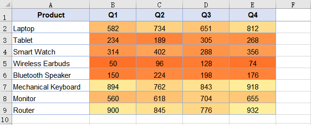
Where data bars show absolute magnitude through bar length, color scales show relative position through hue. A value in the middle of the range gets a mid-tone regardless of whether the range spans 1 to 100 or 10,000 to 50,000 — the shading is positional, not absolute.
Icon sets: status bands
An icon set places a different icon in each cell based on which band the value falls into. The example uses three-traffic-lights: red for the lowest third, yellow for the middle, green for the highest. Unlike data bars and color scales, which communicate a continuous gradient, icon sets communicate a discrete category — "this is low", "this is medium", "this is high" — which is closer to a status indicator than a measurement.
The steps differ only in the FormatType and the icon style selection:
- Load the font and the test data file into the VFS.
- Load the workbook and get the worksheet.
- Call
ConditionalFormats.Addto create a conditional format, and bind the data range withAddRange. - Call
AddConditionto add a condition, setFormatTypetoIconSet, and specify the icon set type. - Save the workbook.
function App() {
  const applyIconSets = async () => {
    // Get the Spire.XLS WASM module
    const xlsModule = window.wasmModule?.spirexls;

    // Check whether the module is ready
    if (!xlsModule) {
      alert('Spire.Xls is not ready yet');
      return;
    }

    // Load the font and the test data file into the VFS
    await window.spire.FetchFileToVFS('ARIAL.TTF', '/Library/Fonts/', `${process.env.PUBLIC_URL}/font/`);
    const inputFileName = 'SalesData.xlsx';
    await window.spire.FetchFileToVFS(inputFileName, '', `${process.env.PUBLIC_URL}data/`);

    // Load the workbook and get the first worksheet
    const workbook = new xlsModule.Workbook();
    workbook.LoadFromFile({ fileName: inputFileName });
    const sheet = workbook.Worksheets.get(0);

    // Select the data range that receives the icon sets
    const dataRange = sheet.Range.get("B2:E9");

    // Create a conditional format and bind it to that range
    const xcfs = sheet.ConditionalFormats.Add();
    xcfs.AddRange(dataRange);

    // Add an icon set condition and set the icon style to three traffic lights
    const format = xcfs.AddCondition();
    format.FormatType = xlsModule.ConditionalFormatType.IconSet;
    format.IconSet.IconSetType = xlsModule.IconSetType.ThreeTrafficLights1;

    // Save the workbook
    const outputFileName = "ApplyIconSets.xlsx";
    workbook.SaveToFile({ fileName: outputFileName, version: xlsModule.ExcelVersion.Version2010 });

    // Dispose of the workbook object to free resources
    workbook.Dispose();

    // Read the result file from the VFS and trigger the download
    const fileArray = window.dotnetRuntime.Module.FS.readFile(outputFileName);
    const blob = new Blob([fileArray], { type: 'application/vnd.openxmlformats-officedocument.spreadsheetml.sheet' });
    const url = URL.createObjectURL(blob);
    const a = document.createElement('a');
    a.href = url;
    a.download = outputFileName;
    a.click();
    URL.revokeObjectURL(url);
  };

  return (
    <div style={{ textAlign: 'center', height: '300px' }}>
      <h1>Apply Icon Sets</h1>
      <button onClick={applyIconSets}>Start</button>
    </div>
  );
}

export default App;
Icon sets applied to a sales figures table, traffic-light icons based on value bands
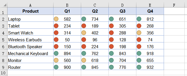
An icon set divides the range into bands, so the same icon covers a different span of values in different ranges. In a range of 10 to 90, the green icon covers roughly 60 to 90; in a range of 10 to 900, it covers roughly 600 to 900. The bands are relative, not absolute — which is the right default for a table where each column has its own scale, but worth knowing if you expect a fixed threshold.
Choosing between the three
All three are applied to a range, all three live inside the cells, and all three are conditional formatting. The choice is about what the reader needs to do with the numbers:
| The reader needs to | Use | Because |
|---|---|---|
| Compare magnitudes across a row or column | Data bars | Bar length is the most precise visual cue for "how much" |
| Spot hot and cold spots in a large table | Color scales | Color intensity registers peripherally even when the eye is not focused on a specific cell |
| Classify values into a few status categories | Icon sets | Discrete icons map to discrete decisions — "this needs attention", "this is fine" |
| See all of the above at once | Combine on different ranges | Each conditional format is independent; apply data bars to one range and icon sets to another |
The three are not mutually exclusive. A worksheet can carry data bars on the revenue columns and icon sets on the growth-rate column in the same save, because each call to ConditionalFormats.Add creates an independent format bound to its own range.
Customizing data bar appearance
The fill color of a data bar comes from DataBar.BarColor. Setting only FormatType without BarColor yields the default blue. A border is also available, but it has a dependency: the border type must be set before the border color takes effect.
// Set the border type first so that the border color takes effect
format.DataBar.BarBorder.Type = xlsModule.DataBarBorderType.DataBarBorderSolid;
format.DataBar.BarBorder.Color = xlsModule.Color.get_Red();

// Fill color of the bar
format.DataBar.BarColor = xlsModule.Color.get_GreenYellow();
Setting BarBorder.Color on its own, without first setting BarBorder.Type, has no effect — the border is not drawn because no border type has been declared. Color scales and icon sets do not have equivalent appearance properties; their styling is determined by the format type and, for icon sets, the IconSetType enum.
Common issues
Text cells in the target range show no data bars. This is expected. A data bar expresses relative magnitude, and only numeric cells have magnitude. Text cells are skipped silently — no error, no bar. Keep the range limited to the numeric area.
Data bars are all the default blue.
DataBar.BarColor was not set after FormatType was assigned. Set it to any xlsModule.Color value to change the fill.
The data bar border color is not showing.
The border type was not set first. Assign DataBar.BarBorder.Type before DataBar.BarBorder.Color — the color only takes effect once a solid border type is declared.
No visible change after applying a conditional format.
Check that the range passed to AddRange matches where the data actually is. A range pointing at empty cells produces no error and no visible result.
FAQ
Can I apply more than one conditional format to the same range?
Yes. Each call to ConditionalFormats.Add creates an independent format. Two formats can target the same range, though the visual result of stacking a data bar and a color scale on the same cells may be confusing — it is usually clearer to apply different types to different ranges.
Which Excel versions support these conditional format types?
Data bars, color scales, and icon sets were introduced in Excel 2007. The sample saves with ExcelVersion.Version2010 to ensure compatibility with both Excel 2010 and later versions.
Do I need Excel installed to apply conditional formatting?
No. The spreadsheet engine is bundled with the package and runs as WebAssembly in the browser. The conditional formatting is written as standard XML inside the .xlsx file, and Excel renders it when the file is opened.
Can I set custom thresholds for icon sets?
The IconSetType enum selects a predefined icon style with predefined band boundaries. The example uses ThreeTrafficLights1, which divides the range into three equal bands.
Does the conditional formatting survive if the file is opened and re-saved in Excel?
Yes. Conditional formatting is part of the worksheet's stored format rules, not a rendering artifact. Excel reads, preserves, and re-applies the same rules on recalculation.