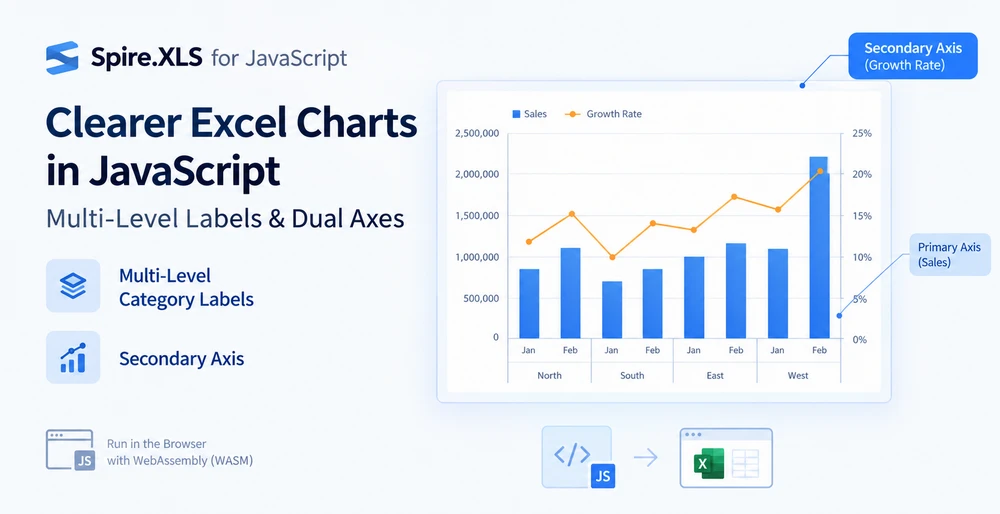
A column chart with regions and months on the same axis has two problems, and they are not the same problem. The first is that the category labels collapse into a single row — "North", "Jan", "North", "Feb" — and the reader has to mentally re-group which month belongs to which region. The second is that when a growth-rate series is added alongside a sales series that runs into the millions, the growth rate becomes a flat line hugging the baseline, because one value axis cannot serve two magnitudes at once.
Multi-level category labels fix the first. A secondary axis fixes the second. They are independent features that happen to be useful on the same chart, and Spire.XLS for JavaScript handles both through the chart axis API — directly in the browser on WebAssembly, with files moving through a virtual file system (VFS) and no backend involved.
For project setup, see Integrating Spire.XLS for JavaScript in a React Project. The examples below assume the package is installed and the WebAssembly module has been initialized.
When one axis is not enough
The two problems show up on the same kind of worksheet — one where the categories have a hierarchy and the values have a spread — but they come from different places:
| Problem | Where it comes from | What the chart looks like | What fixes it |
|---|---|---|---|
| Labels pile into one row | Categories are hierarchical (region → month, year → quarter) but the axis treats them as flat | A single row of labels where outer and inner categories alternate without visual grouping | Multi-level category labels |
| One series flattens to a line | Two series differ by orders of magnitude (sales in millions, growth in percent) but share one value axis | The smaller series compresses to near-zero and its variation is invisible | Secondary axis |
Neither is a styling issue. Both are about the axis not knowing something it needs to know — that the categories have layers, or that the values have incompatible scales. The two sections below address them in turn, and the second builds on the first so the final chart carries both fixes.
Prerequisites
You need a React project with Spire.XLS for JavaScript installed and the WebAssembly module initialized, reachable at window.wasmModule.spirexls. The sample loads a font and a pre-built data file into the VFS before creating the chart, and both are fetched from the project's public folder.
The data behind multi-level labels
Multi-level labels are not created by a property alone — they are read from the data. The category axis draws as many label levels as there are columns in the range that CategoryLabels points at. So the worksheet needs to be laid out with the hierarchy across columns:
| Column A (outer) | Column B (inner) | Column C (values) |
|---|---|---|
| North | Jan | 120,000 |
| North | Feb | 135,000 |
| South | Jan | 98,000 |
| South | Feb | 110,000 |
The outer labels in column A are merged across the rows they cover — "North" spans the two rows for Jan and Feb. That merging is what makes the level visually collapse into a single label per group when the chart renders. Without it, the axis still shows two levels, but the outer level repeats the label on every row instead of grouping.
This is a data-layout concern, not a chart-API concern. The chart code only has to point CategoryLabels at both columns; whether the outer cells are merged is decided in the workbook, not in the chart object.
Create a chart with multi-level category labels
Once the data is laid out, the chart code does two things: it points CategoryLabels at a range spanning both the outer and the inner column, and it turns on MultiLevelLable so the axis expands those columns into stacked rows. The steps are:
- Load the font and the test data file into the VFS.
- Load the workbook and get the worksheet.
- Add a column chart and add a named sales series.
- Point the category labels at both the region and the month column.
- Turn on multi-level labels for the category axis and save the workbook.
function App() {
  const createMultiLevelChart = async () => {
    // Get the Spire.XLS WASM module
    const xlsModule = window.wasmModule?.spirexls;

    // Check if the module is ready
    if (!xlsModule) {
      alert('Spire.Xls is not ready yet');
      return;
    }

    // Load the font and the test data file into the VFS
    await window.spire.FetchFileToVFS('ARIAL.TTF', '/Library/Fonts/', `${process.env.PUBLIC_URL}/font/`);
    const inputFileName = 'MultiLevelChartData.xlsx';
    await window.spire.FetchFileToVFS(inputFileName, '', `${process.env.PUBLIC_URL}data/`);

    // Load the workbook and get the first worksheet
    const workbook = new xlsModule.Workbook();
    workbook.LoadFromFile({ fileName: inputFileName });
    const sheet = workbook.Worksheets.get(0);

    // Add a column chart
    const chart = sheet.Charts.Add({ chartType: xlsModule.ExcelChartType.ColumnClustered });
    chart.ChartTitle = "Sales";
    chart.Legend.Delete();

    // Add the sales series and give it a name
    const serie = chart.Series.Add({ name: "Sales", serieType: xlsModule.ExcelChartType.ColumnClustered });
    serie.Values = sheet.Range.get("C2:C7");

    // Point the category labels at both the region and the month column
    serie.CategoryLabels = sheet.Range.get("A2:B7");

    // Turn on multi-level category labels so each level gets its own row
    chart.PrimaryCategoryAxis.MultiLevelLable = true;

    // Place the chart on the worksheet
    chart.LeftColumn = 5;
    chart.TopRow = 1;
    chart.RightColumn = 14;

    // Save the workbook
    const outputFileName = "MultiLevelLabels.xlsx";
    workbook.SaveToFile({ fileName: outputFileName });

    // Dispose of the workbook object to free resources
    workbook.Dispose();

    // Read the result file from the VFS and trigger the download
    const fileArray = window.dotnetRuntime.Module.FS.readFile(outputFileName);
    const blob = new Blob([fileArray], { type: 'application/vnd.openxmlformats-officedocument.spreadsheetml.sheet' });
    const url = URL.createObjectURL(blob);
    const a = document.createElement('a');
    a.href = url;
    a.download = outputFileName;
    a.click();
    URL.revokeObjectURL(url);
  };

  return (
    <div style={{ textAlign: 'center', height: '300px' }}>
      <h1>Multi-Level Labels</h1>
      <button onClick={createMultiLevelChart}>Start</button>
    </div>
  );
}

export default App;
A chart with multi-level category labels, each level on its own row
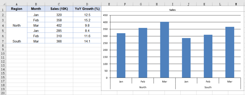
The range A2:B7 is what makes the axis show two levels. Binding a single-column range such as B2:B7 would still produce one level even with MultiLevelLable set to true — the property controls whether multiple levels are expanded into rows, not whether a level of data exists to expand.
Why the growth series disappears
Add a second series for year-over-year growth — values in the low teens, percentages — and plot it on the same value axis as sales. The sales columns reach 120,000; the growth rate reaches 12. On an axis that scales from 0 to 140,000, the number 12 is indistinguishable from zero. The series is there, the data is correct, and the chart shows a line flat against the baseline.
This is not a bug in the data or the chart. It is the value axis doing its job — mapping a range that covers the largest series — at the cost of the smallest. The only way to see both series clearly is to give each its own scale, and that is what the secondary axis does.
Move a series to the secondary axis
The growth series is added as a line rather than a column. A line takes up no bar width, so it reads clearly against the column series sharing the same categories. Moving it off the primary axis is a single property: UsePrimaryAxis = false. The steps are:
- Load the font and the test data file into the VFS.
- Load the workbook and get the worksheet.
- Add a column chart and add a named sales series.
- Add the growth series as a line.
- Move the growth series to the secondary axis and save the workbook.
function App() {
  const addSecondaryAxis = async () => {
    // Get the Spire.XLS WASM module
    const xlsModule = window.wasmModule?.spirexls;

    // Check if the module is ready
    if (!xlsModule) {
      alert('Spire.Xls is not ready yet');
      return;
    }

    // Load the font and the test data file into the VFS
    await window.spire.FetchFileToVFS('ARIAL.TTF', '/Library/Fonts/', `${process.env.PUBLIC_URL}/font/`);
    const inputFileName = 'MultiLevelChartData.xlsx';
    await window.spire.FetchFileToVFS(inputFileName, '', `${process.env.PUBLIC_URL}data/`);

    // Load the workbook and get the first worksheet
    const workbook = new xlsModule.Workbook();
    workbook.LoadFromFile({ fileName: inputFileName });
    const sheet = workbook.Worksheets.get(0);

    // Add a column chart
    const chart = sheet.Charts.Add({ chartType: xlsModule.ExcelChartType.ColumnClustered });
    chart.ChartTitle = "Sales and YoY Growth";

    // Add the sales series, which stays on the primary axis
    const salesSerie = chart.Series.Add({ name: "Sales", serieType: xlsModule.ExcelChartType.ColumnClustered });
    salesSerie.Values = sheet.Range.get("C2:C7");

    // Point the category labels at both the region and the month column
    salesSerie.CategoryLabels = sheet.Range.get("A2:B7");

    // Add the growth series as a line
    const growthSerie = chart.Series.Add({ name: "YoY Growth", serieType: xlsModule.ExcelChartType.Line });
    growthSerie.Values = sheet.Range.get("D2:D7");

    // Move the growth series to the secondary axis so it plots on its own percentage scale
    growthSerie.UsePrimaryAxis = false;

    // Turn on multi-level category labels
    chart.PrimaryCategoryAxis.MultiLevelLable = true;

    // Place the chart on the worksheet
    chart.LeftColumn = 5;
    chart.TopRow = 1;
    chart.RightColumn = 14;

    // Save the workbook
    const outputFileName = "SecondaryAxis.xlsx";
    workbook.SaveToFile({ fileName: outputFileName });

    // Dispose of the workbook object to free resources
    workbook.Dispose();

    // Read the result file from the VFS and trigger the download
    const fileArray = window.dotnetRuntime.Module.FS.readFile(outputFileName);
    const blob = new Blob([fileArray], { type: 'application/vnd.openxmlformats-officedocument.spreadsheetml.sheet' });
    const url = URL.createObjectURL(blob);
    const a = document.createElement('a');
    a.href = url;
    a.download = outputFileName;
    a.click();
    URL.revokeObjectURL(url);
  };

  return (
    <div style={{ textAlign: 'center', height: '300px' }}>
      <h1>Secondary Axis</h1>
      <button onClick={addSecondaryAxis}>Start</button>
    </div>
  );
}

export default App;
A column chart with a secondary axis for the growth rate line series
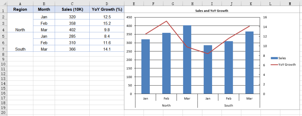
UsePrimaryAxis = false affects only the series it is set on; every other series stays on the primary axis. The chart gains a second pair of value and category axes, giving it two separate scale ranges. Series.Add takes the series name at the same time, so the legend shows the name passed in rather than an auto-generated "Series 1".
Setting the secondary axis scale
Once a series moves to the secondary axis, that axis works out its own scale — and it does so independently of the primary. The two ranges have no knowledge of each other, which means the secondary axis may pick bounds that do not line up well with the data.
PrimaryValueAxis.MinValue, MaxValue, and MajorUnit control the primary axis only. To set the secondary axis scale, use SecondaryValueAxis:
// Give the secondary axis a 0-20 scale with a major unit of 5
chart.SecondaryValueAxis.MinValue = 0;
chart.SecondaryValueAxis.MaxValue = 20;
chart.SecondaryValueAxis.MajorUnit = 5;
Set the scale after the series has been moved to the secondary axis. While no series uses the secondary axis, the assignment is accepted but never written to the file — the axis does not exist in the output until a series is plotted on it.
Common issues
The category axis shows only one level of labels.
CategoryLabels is pointing at a single-column range. The number of levels is decided by how many columns the range spans, not by the MultiLevelLable property. Point at a multi-column range such as A2:B7, and make sure the outer label cells are merged in the data.
The secondary axis scale looks wrong.
The primary and secondary value axes compute their scales independently. Setting MinValue or MaxValue on PrimaryValueAxis does not affect the secondary axis. Use chart.SecondaryValueAxis to set its scale directly, and do so after moving a series onto it.
The growth series still appears flat after adding a secondary axis.
Check that UsePrimaryAxis = false is set on the growth series, not on the sales series. The property is per-series — setting it on the wrong series moves the wrong one to the secondary axis.
The legend shows "Series 1" instead of the series name.
The name was not passed to Series.Add. Use chart.Series.Add({ name: "Sales", ... }) so the legend picks up the name you intended rather than an auto-generated label.
FAQ
Can I have more than two levels of category labels?
Yes. The number of levels is determined by the number of columns the CategoryLabels range spans. A three-column range produces three levels — for example, year, quarter, and month. The outer label cells need to be merged in the data for each level to group correctly.
Does the secondary axis work with chart types other than column and line?
Yes. The secondary axis is not tied to a specific chart type. The common pattern is column plus line — the line takes no bar width and reads clearly against the columns — but any series can be moved to the secondary axis by setting UsePrimaryAxis = false.
Do I need Excel installed to create these charts?
No. The spreadsheet engine ships with the package and runs as WebAssembly in the browser. The workbook is built, charted, and saved entirely client-side.
Can I control the secondary category axis separately?
When a series moves to the secondary axis, the chart gains a secondary category axis in addition to the secondary value axis. The two category axes share the same category labels by default, so multi-level labels apply to both.
Is the output file compatible with Excel?
Yes. The workbook is saved as .xlsx, and the chart — including multi-level labels and the secondary axis — is written as standard chart XML that Excel reads natively.