
.NET (1327)
Children categories
Developers can use PDF layer to set some content to be visible and others to be invisible in the same PDF file. It makes the PDF Layer widely be used to deal with related contents within the same PDF. Now developers can easily add page layers by using class PdfPageLayer offered by Spire.PDF. This article will focus on showing how to add layers to a PDF file in C# with the help of Spire.PDF.
Note: Before Start, please download the latest version of Spire.PDF and add Spire.PDF.dll in the bin folder as the reference of Visual Studio.
Here comes to the details:
Step 1: Create a new PDF document
PdfDocument pdfdoc = new PdfDocument();
Step 2: Add a new page to the PDF document.
PdfPageBase page = pdfdoc.Pages.Add();
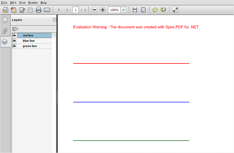
Step 3: Add a layer named "red line" to the PDF page.
PdfLayer layer = doc.Layers.AddLayer("red line", PdfVisibility.On);
Step 4: Draw a red line to the added layer.
// Create a graphics context for drawing on the specified page's canvas using the created layer
 PdfCanvas pcA = layer.CreateGraphics(page.Canvas);

 // Draw a red line on the graphics context using a pen with thickness 2, starting from (100, 350) to (300, 350)
 pcA.DrawLine(new PdfPen(PdfBrushes.Red, 2), new PointF(100, 350), new PointF(300, 350));
Step 5: Use the same method above to add the other two layers to the PDF page.
layer = doc.Layers.AddLayer("blue line");
PdfCanvas pcB = layer.CreateGraphics(doc.Pages[0].Canvas);
pcB.DrawLine(new PdfPen(PdfBrushes.Blue, 2), new PointF(100, 400), new PointF(300, 400));
layer = doc.Layers.AddLayer("green line");
PdfCanvas pcC = layer.CreateGraphics(doc.Pages[0].Canvas);
pcC.DrawLine(new PdfPen(PdfBrushes.Green, 2), new PointF(100, 450), new PointF(300, 450));
Step 6: Save the document to file.
pdfdoc.SaveToFile("AddLayers.pdf", FileFormat.PDF);
Effective screenshot:
Full codes:
using Spire.Pdf;
using Spire.Pdf.Graphics;
using System.Drawing;

namespace AddLayer
{
    class Program
    {
        static void Main(string[] args)
        {
  // Create a new PdfDocument object
  PdfDocument doc = new PdfDocument();

  // Load an existing PDF document from the specified file path
  doc.LoadFromFile(@"..\..\..\..\..\..\Data\AddLayers.pdf");

  // Get the first page of the loaded document
  PdfPageBase page = doc.Pages[0];

  // Create a new layer named "red line" with visibility set to "On"
  PdfLayer layer = doc.Layers.AddLayer("red line", PdfVisibility.On);

  // Create a graphics context for drawing on the specified page's canvas using the created layer
  PdfCanvas pcA = layer.CreateGraphics(page.Canvas);

  // Draw a red line on the graphics context using a pen with thickness 2, starting from (100, 350) to (300, 350)
  pcA.DrawLine(new PdfPen(PdfBrushes.Red, 2), new PointF(100, 350), new PointF(300, 350));

  // Create a new layer named "blue line" without specifying visibility (default is "Off")
  layer = doc.Layers.AddLayer("blue line");

  // Create a graphics context for drawing on the first page's canvas using the newly created layer
  PdfCanvas pcB = layer.CreateGraphics(doc.Pages[0].Canvas);

  // Draw a blue line on the graphics context using a pen with thickness 2, starting from (100, 400) to (300, 400)
  pcB.DrawLine(new PdfPen(PdfBrushes.Blue, 2), new PointF(100, 400), new PointF(300, 400));

  // Create a new layer named "green line" without specifying visibility (default is "Off")
  layer = doc.Layers.AddLayer("green line");

  // Create a graphics context for drawing on the first page's canvas using the newly created layer
  PdfCanvas pcC = layer.CreateGraphics(doc.Pages[0].Canvas);

  // Draw a green line on the graphics context using a pen with thickness 2, starting from (100, 450) to (300, 450)
  pcC.DrawLine(new PdfPen(PdfBrushes.Green, 2), new PointF(100, 450), new PointF(300, 450));

  // Specify the output file name for the modified PDF
  string output = "AddLayers.pdf";

  // Save the modified PDF document to the specified output file
  doc.SaveToFile(output);
        }
    }
}
Spire.PDFViewer is a powerful and independent ASP.NET library, by which users can easily achieve functions such as load and view pdf files on website, switch to target page, fit page, page down/up, zoom in/out pdf files etc.
Then how to use Spire.PDFViewer for ASP.NET? This article will introduce the usage of Spire.PDFViewer for ASP.NET to you.
Before start, please download Spire.PDFViewer for ASP.NET and install it on your system.
Detail steps overview:
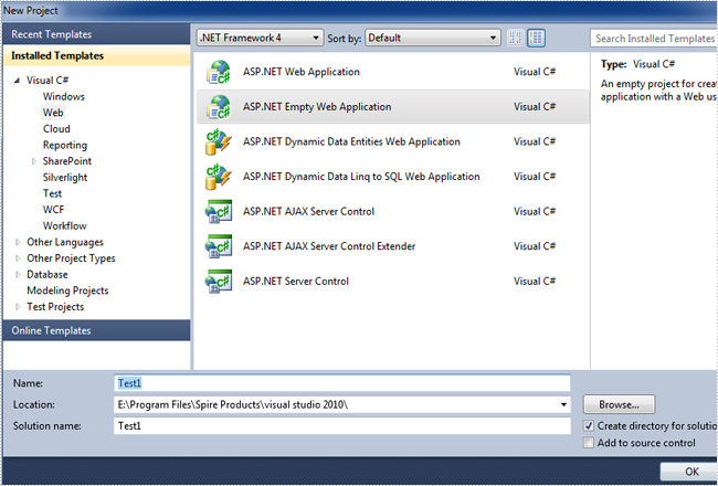
Step 1: Create a new ASP.NET Empty Web Application in Visual Studio.
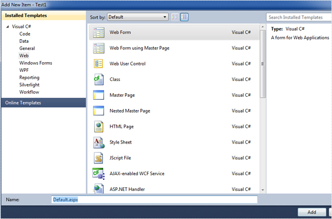
Add a new web Form to Test1.
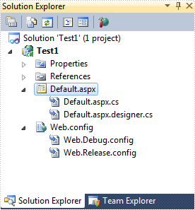
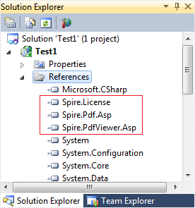
Then add the .dll files from the bin folder as the references of Test1.
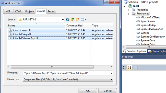
Now the three .dll files have been added into the References.
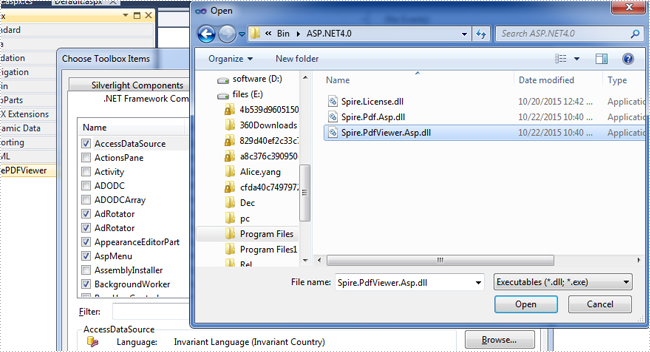
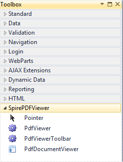
Step 2: Add the PDFViewer control and the PDFDocumentViewer control into toolbox.
First, right-click toolbox, select add tab to add a new tab named SpirePDFViewer.
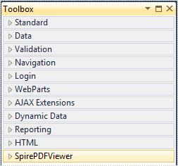
Second, add the PDFViewer control and the PDFDocumentViewer control into SpirePDFViewer.
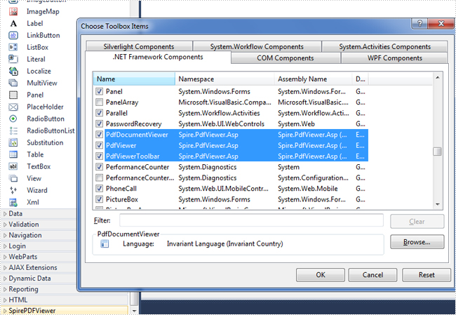
Now all of the controls have been added into SpirePDFViewer.
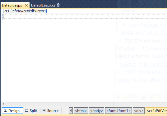
Step 3: Right-click Default.aspx, select view designer, and then drag the PDFViewer control from toolbox into Deafault.aspx.
Step 4: Double-click Default.aspx.cs, add the code below to load a PDF file, Note that you have to add the following if statement and !IsPostBack property before loading the pdf file.
protected void Page_Load(object sender, EventArgs e)
        {
            if (!IsPostBack)
            {
                //load the sample PDF file
                this.pdfViewer1.CacheInterval = 1000;
                this.pdfViewer1.CacheTime = 1200;
                this.pdfViewer1.CacheNumberImage = 1000;
                this.pdfViewer1.ScrollInterval = 300;
                this.pdfViewer1.ZoomFactor = 1f;
                this.pdfViewer1.CustomErrorMessages = "";
                this.pdfViewer1.LoadFromFile("PDF file/Test.pdf");
            }
        }
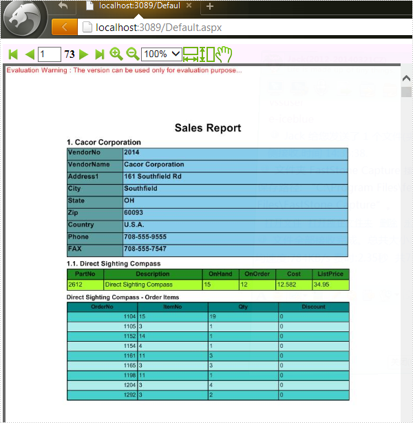
Effect screenshot:
Footnotes are notes placed at the bottom of a page. In MS Word, you can use footnotes to cite references, give explanations, or make comments without affecting the main text. In this article, you will learn how to insert or delete footnotes in a Word document using Spire.Doc for .NET.
- Insert a Footnote after a Specific Paragraph in Word in C# and VB.NET
- Insert a Footnote after a Specific Text in Word in C# and VB.NET
- Remove Footnotes in a Word Document in C# and VB.NET
Install Spire.Doc for .NET
To begin with, you need to add the DLL files included in the Spire.Doc for.NET package as references in your .NET project. The DLL files can be either downloaded from this link or installed via NuGet.
PM> Install-Package Spire.Doc
Insert a Footnote after a Specific Paragraph in Word in C# and VB.NET
The Paragraph.AppendFootnote(FootnoteType.Footnote) method provided by Spire.Doc for .NET allows you to insert a footnote after a specified paragraph. The following are the detailed steps.
- Create a Document instance
- Load a sample Word document using Document.LoadFromFile() method.
- Get the first section and then get a specified paragraph in the section.
- Add a footnote at the end of the paragraph using Paragraph.AppendFootnote(FootnoteType.Footnote) method.
- Set the text content, font and color of the footnote, and then set the format of the footnote superscript number.
- Save the result document using Document.SaveToFile() method.
- C#
- VB.NET
using Spire.Doc;
using Spire.Doc.Documents;
using Spire.Doc.Fields;
using System.Drawing;
namespace AddFootnote
{
class Program
{
static void Main(string[] args)
{
//Create a Document instance
Document document = new Document();
//Load a sample Word document
document.LoadFromFile("Sample.docx");
//Get the first section
Section section = document.Sections[0];
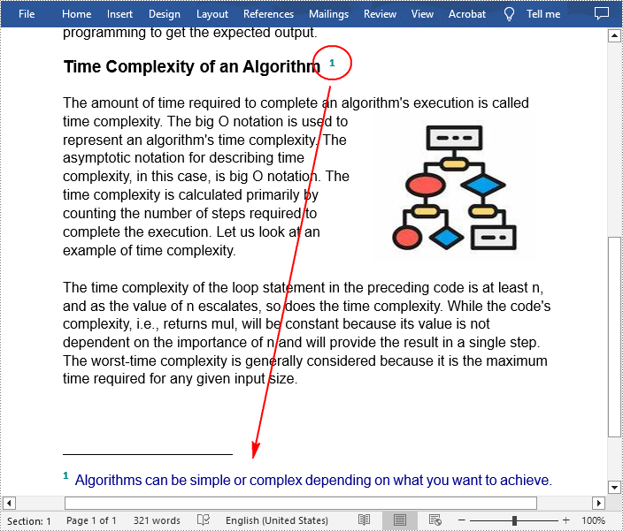
//Get a specified paragraph in the section
Paragraph paragraph = section.Paragraphs[3];
//Add a footnote at the end of the paragraph
Footnote footnote = paragraph.AppendFootnote(FootnoteType.Footnote);
//Set the text content of the footnote
TextRange text = footnote.TextBody.AddParagraph().AppendText("Algorithms can be simple or complex depending on what you want to achieve.");
//Set the text font and color
text.CharacterFormat.FontName = "Arial";
text.CharacterFormat.FontSize = 12;
text.CharacterFormat.TextColor = Color.DarkBlue;
//Set the format of the footnote superscript number
footnote.MarkerCharacterFormat.FontName = "Calibri";
footnote.MarkerCharacterFormat.FontSize = 15;
footnote.MarkerCharacterFormat.Bold = true;
footnote.MarkerCharacterFormat.TextColor = Color.DarkCyan;
//Save the result document
document.SaveToFile("AddFootnote.docx", FileFormat.Docx);
}
}
}
Insert a Footnote after a Specific Text in Word in C# and VB.NET
With Spire.Doc for .NET, a footnote can also be inserted after a specified text located anywhere in the document. The following are the detailed steps.
- Create a Document instance.
- Load a Word document using Document.LoadFromFile() method.
- Find a specified text using Document.FindString() method.
- Get the text range of the specified text using TextSelection.GetAsOneRange() method.
- Get the paragraph where the text range is located using TextRange.OwnerParagraph property.
- Get the position index of the text range in the paragraph using Paragraph.ChildObjects.IndexOf() method.
- Add a footnote using Paragraph.AppendFootnote(FootnoteType.Footnote) method, and then insert the footnote after the specified text using Paragraph.ChildObjects.Insert() method
- Set the text content, font and color of the footnote, and then set the format of the footnote superscript number.
- Save the result document using Document.SaveToFile() method.
- C#
- VB.NET
using Spire.Doc;
using Spire.Doc.Documents;
using Spire.Doc.Fields;
using System.Drawing;
namespace InsertFootnote
{
class Program
{
static void Main(string[] args)
{
//Create a Document instance
Document document = new Document();
//Load a sample Word document
document.LoadFromFile("Sample.docx");
//Find a specified text string
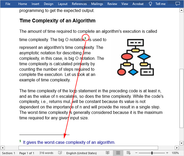
TextSelection selection = document.FindString("big O notation", false, true);
//Get the text range of the specified text
TextRange textRange = selection.GetAsOneRange();
//Get the paragraph where the text range is located
Paragraph paragraph = textRange.OwnerParagraph;
//Get the position index of the text range in the paragraph
int index = paragraph.ChildObjects.IndexOf(textRange);
//Add a footnote
Footnote footnote = paragraph.AppendFootnote(FootnoteType.Footnote);
//Insert the footnote after the specified paragraph
paragraph.ChildObjects.Insert(index + 1, footnote);
//Set the text content of the footnote
TextRange text = footnote.TextBody.AddParagraph().AppendText("It gives the worst-case complexity of an algorithm.");
//Set the text font and color
text.CharacterFormat.FontName = "Arial";
text.CharacterFormat.FontSize = 12;
text.CharacterFormat.TextColor = Color.DarkBlue;
//Set the format of the footnote superscript number
footnote.MarkerCharacterFormat.FontName = "Calibri";
footnote.MarkerCharacterFormat.FontSize = 15;
footnote.MarkerCharacterFormat.Bold = true;
footnote.MarkerCharacterFormat.TextColor = Color.DarkGreen;
//Save the result document
document.SaveToFile("InsertFootnote.docx", FileFormat.Docx);
}
}
}
Remove Footnotes in a Word Document in C# and VB.NET
It takes time and effort to search and delete the existing footnotes in your document manually. The following are the steps to remove all footnotes at once programmatically.
- Create a Document instance.
- Load a Word document using Document.LoadFromFile() method.
- Get a specified section using Document.Sections property.
- Traverse through each paragraph in the section to find the footnote.
- Remove the footnote using Paragraph.ChildObjects.RemoveAt() method.
- Save the result document using Document.SaveToFile() method.
- C#
- VB.NET
using Spire.Doc;
using Spire.Doc.Documents;
using Spire.Doc.Fields;

namespace RemoveFootnote
{
    class Program
    {
        static void Main(string[] args)
        {
            //Create a Document instance
            Document document = new Document();

            //Load a sample Word document
            document.LoadFromFile("AddFootnote.docx");

            //Get the first section
            Section section = document.Sections[0];

            //Traverse through each paragraph in the section to find the footnote
            foreach (Paragraph para in section.Paragraphs)
            {
                int index = -1;
                for (int i = 0, cnt = para.ChildObjects.Count; i < cnt; i++)
                {
                    ParagraphBase pBase = para.ChildObjects[i] as ParagraphBase;
                    if (pBase is Footnote)
                    {
                        index = i;
                        break;
                    }
                }

                if (index > -1)

                    //Remove the footnote
                    para.ChildObjects.RemoveAt(index);
            }

            //Save the result document
            document.SaveToFile("RemoveFootnote.docx", FileFormat.Docx);
        }
    }
}
Apply for a Temporary License
If you'd like to remove the evaluation message from the generated documents, or to get rid of the function limitations, please request a 30-day trial license for yourself.
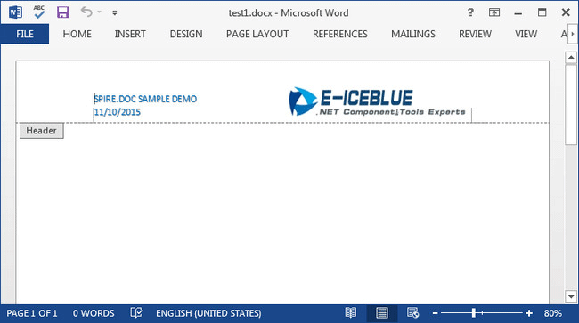
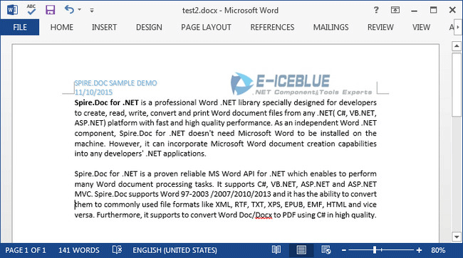
When you create several Word documents that are closely related, you may want the header or footer of one document to be used as the header or footer of other documents. For example, you're creating internal documents with your company logo or name or other material been placed in header, you only have to create the header once and copy the header to other places.
In this article, I'll introduce you a simple and efficient solution to copy the entire header (including text and graphic) from one Word document and insert it to another.
Source Document:
Detail Steps:
Step 1: Create a new instance of Document class and load the source file.
Document doc1 = new Document();
doc1.LoadFromFile("test1.docx");
Step 2: Get the header section from the source document.
HeaderFooter header = doc1.Sections[0].HeadersFooters.Header;
Step 3: Initialize a new instance of Document and load another file that you want to insert header.
Document doc2 = new Document("test2.docx");
Step 4: Call DocuentObject.Clone() method to copy each object in the header of source file, then call DocumentObjectCollection.Add() method to insert copied object into the header of destination file.
foreach (Section section in doc2.Sections)
{
    foreach (DocumentObject obj in header.ChildObjects)
    {
        section.HeadersFooters.Header.ChildObjects.Add(obj.Clone());
    }
}
Step 5: Save the changes and launch the file.
doc2.SaveToFile("test2.docx", FileFormat.Docx2013);
System.Diagnostics.Process.Start("test2.docx");
Destination Document:
Full Code:
Document doc1 = new Document();
doc1.LoadFromFile("test1.docx");
HeaderFooter header = doc1.Sections[0].HeadersFooters.Header;
Document doc2 = new Document("test2.docx");
foreach (Section section in doc2.Sections)
{
    foreach (DocumentObject obj in header.ChildObjects)
    {
        section.HeadersFooters.Header.ChildObjects.Add(obj.Clone());
    }
}
doc2.SaveToFile("test2.docx", FileFormat.Docx2013);
System.Diagnostics.Process.Start("test2.docx");
Dim doc1 As New Document()
doc1.LoadFromFile("test1.docx")
Dim header As HeaderFooter = doc1.Sections(0).HeadersFooters.Header
Dim doc2 As New Document("test2.docx")
For Each section As Section In doc2.Sections
	For Each obj As DocumentObject In header.ChildObjects
		section.HeadersFooters.Header.ChildObjects.Add(obj.Clone())
	Next
Next
doc2.SaveToFile("test2.docx", FileFormat.Docx2013)
System.Diagnostics.Process.Start("test2.docx")
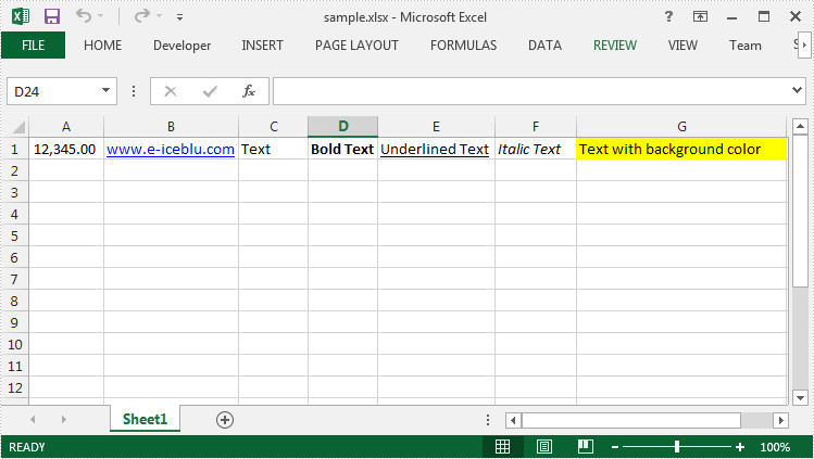
Sometimes, we need to copy the data with formatting from one cell range (a row or a column) to another. It is an extremely easy work in MS Excel, because we can select the source range and then use Copy and Paste function to insert the same data in destination cells.
In fact, Spire.XLS has provided two methods Worksheet.Copy(CellRange sourceRange, CellRange destRange, bool copyStyle) and Worksheet.Copy(CellRange sourceRange, Worksheet worksheet, int destRow, int destColumn, bool copyStyle) that allow programmers to copy rows and columns within or between workbooks. This article will present how to duplicate a row within a workbook using Spire.XLS.
Test File:
Code Snippet:
Step 1: Create a new instance of Workbook class and load the sample file.
Workbook book = new Workbook();
book.LoadFromFile("sample.xlsx", ExcelVersion.Version2010);
Step 2: Get the first worksheet.
Worksheet sheet = book.Worksheets[0];
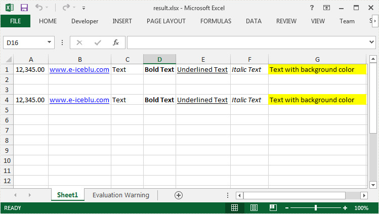
Step 3: Call Worksheet.Copy(CellRange sourceRange, CellRange destRange, bool copyStyle) method to copy data from source range (A1:G1) to destination range (A4:G4) and maintain the formatting.
sheet.Copy(sheet.Range["A1:G1"], sheet.Range["A4:G4"],true);
Step 4: Save and launch the file.
book.SaveToFile("result.xlsx", ExcelVersion.Version2010);
System.Diagnostics.Process.Start("result.xlsx");
Output:
Full Code:
using Spire.Xls;
namespace DuplicateRowExcel
{
    class Program
    {

        static void Main(string[] args)
        {
            Workbook book = new Workbook();
            book.LoadFromFile("sample.xlsx", ExcelVersion.Version2010);
            Worksheet sheet = book.Worksheets[0];

            sheet.Copy(sheet.Range["A1:G1"], sheet.Range["A4:G4"], true);

            book.SaveToFile("result.xlsx", ExcelVersion.Version2010);
            System.Diagnostics.Process.Start("result.xlsx");
        }
    }
}
Imports Spire.Xls
Namespace DuplicateRowExcel
	Class Program

		Private Shared Sub Main(args As String())
			Dim book As New Workbook()
			book.LoadFromFile("sample.xlsx", ExcelVersion.Version2010)
			Dim sheet As Worksheet = book.Worksheets(0)

			sheet.Copy(sheet.Range("A1:G1"), sheet.Range("A4:G4"), True)

			book.SaveToFile("result.xlsx", ExcelVersion.Version2010)
			System.Diagnostics.Process.Start("result.xlsx")
		End Sub
	End Class
End Namespace
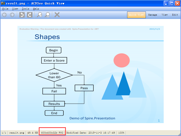
With the help of Spire.Presentation for .NET, we can easily save PowerPoint slides as image in C# and VB.NET. Sometimes, we need to use the resulted images for other purpose and the image size becomes very important. To ensure the image is easy and beautiful to use, we need to set the image with specified size beforehand. This example will demonstrate how to save a particular presentation slide as image with specified size by using Spire.Presentation for your .NET applications.
Note: Before Start, please download the latest version of Spire.Presentation and add Spire.Presentation.dll in the bin folder as the reference of Visual Studio.
Step 1: Create a presentation document and load the document from file.
Presentation presentation = new Presentation();
presentation.LoadFromFile("sample.pptx");
Step 2: Save the first slide to Image and set the image size to 600*400.
Image img = presentation.Slides[0].SaveAsImage(600, 400);
Step 3: Save image to file.
img.Save("result.png",System.Drawing.Imaging.ImageFormat.Png);
Effective screenshot of the resulted image with specified size:
Full codes:
using Spire.Presentation;
using System.Drawing;
namespace SavePowerPointSlideasImage
{
    class Program
    {
        static void Main(string[] args)
        {
            Presentation presentation = new Presentation();
            presentation.LoadFromFile("sample.pptx");

            Image img = presentation.Slides[0].SaveAsImage(600, 400);
            img.Save("result.png", System.Drawing.Imaging.ImageFormat.Png);
        }
    }
There are many kinds of areas in a chart, such as chart area, plot area, legend area. Spire.XLS offers properties to set the performance of each area easily in C# and VB.NET. We have already shown you how to set the background color and image for chart area and plot area in C#. This article will show you how to set the background color for chart legend in C# with the help of Spire.XLS 7.8.43 or above.
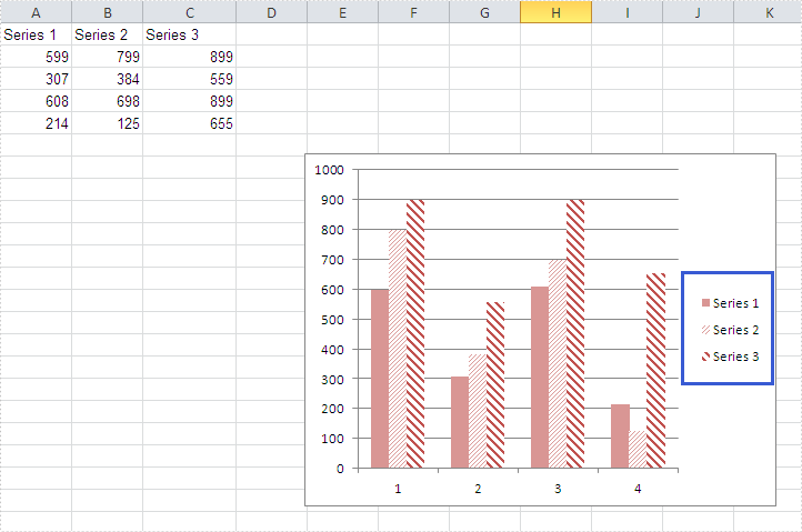
Firstly, please check the original screenshot of excel chart with the automatic setting for chart legend.
Code Snippet of how to set the background color of legend in a Chart:
Step 1: Create a new workbook and load from file.
Workbook workbook = new Workbook();
workbook.LoadFromFile("sample.xlsx");
Step 2: Get the first worksheet from workbook and then get the first chart from the worksheet.
Worksheet ws = workbook.Worksheets[0];
Chart chart = ws.Charts[0];
Step 3: Change the background color of the legend in a chart and specify a Solid Fill of SkyBlue.
XlsChartFrameFormat x = chart.Legend.FrameFormat as XlsChartFrameFormat;
x.Fill.FillType = ShapeFillType.SolidColor;
x.ForeGroundColor = Color.SkyBlue;
Step 4: Save the document to file.
workbook.SaveToFile("result.xlsx",ExcelVersion.Version2010);
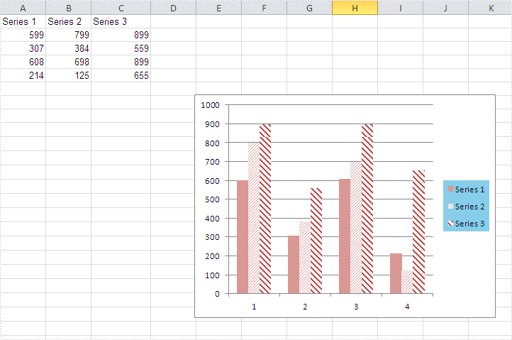
Effective screenshot after fill the background color for Excel chart legend:
Full codes:
using Spire.Xls;
using Spire.Xls.Core.Spreadsheet.Charts;
using System.Drawing;
namespace SetBackgroundColor
{
    class Program
    {

        static void Main(string[] args)
        {

            Workbook workbook = new Workbook();
            workbook.LoadFromFile("sample.xlsx");

            Worksheet ws = workbook.Worksheets[0];
            Chart chart = ws.Charts[0];

            XlsChartFrameFormat x = chart.Legend.FrameFormat as XlsChartFrameFormat;
            x.Fill.FillType = ShapeFillType.SolidColor;
            x.ForeGroundColor = Color.SkyBlue;

            workbook.SaveToFile("result.xlsx", ExcelVersion.Version2010);
        }
    }
}
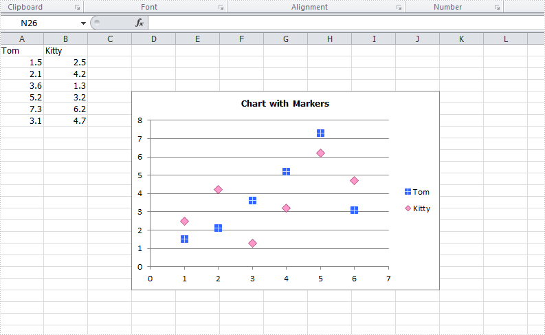
The format of data marker in a line, scatter and radar chart can be changed and customized, which makes it more attractive and distinguishable. We could set markers' built-in type, size, background color, foreground color and transparency in Excel. This article is going to introduce how to achieve those features in C# using Spire.XLS.
Note: before start, please download the latest version of Spire.XLS and add the .dll in the bin folder as the reference of Visual Studio.
Step 1: Create a workbook with sheet and add some sample data.
            Workbook workbook = new Workbook();
            workbook.CreateEmptySheets(1);
            Worksheet sheet = workbook.Worksheets[0];
            sheet.Name = "Demo";
            sheet.Range["A1"].Value = "Tom";
            sheet.Range["A2"].NumberValue = 1.5;
            sheet.Range["A3"].NumberValue = 2.1;
            sheet.Range["A4"].NumberValue = 3.6;
            sheet.Range["A5"].NumberValue = 5.2;
            sheet.Range["A6"].NumberValue = 7.3;
            sheet.Range["A7"].NumberValue = 3.1;
            sheet.Range["B1"].Value = "Kitty";
            sheet.Range["B2"].NumberValue = 2.5;
            sheet.Range["B3"].NumberValue = 4.2;
            sheet.Range["B4"].NumberValue = 1.3;
            sheet.Range["B5"].NumberValue = 3.2;
            sheet.Range["B6"].NumberValue = 6.2;
            sheet.Range["B7"].NumberValue = 4.7;
Step 2: Create a Scatter-Markers chart based on the sample data.
            Chart chart = sheet.Charts.Add(ExcelChartType.ScatterMarkers);
            chart.DataRange = sheet.Range["A1:B7"];
            chart.PlotArea.Visible=false;
            chart.SeriesDataFromRange = false;
            chart.TopRow = 5;
            chart.BottomRow = 22;
            chart.LeftColumn = 4;
            chart.RightColumn = 11;
            chart.ChartTitle = "Chart with Markers";
            chart.ChartTitleArea.IsBold = true;
            chart.ChartTitleArea.Size = 10;
Step 3: Format the markers in the chart by setting the background color, foreground color, type, size and transparency.
            Spire.Xls.Charts.ChartSerie cs1 = chart.Series[0];
            cs1.DataFormat.MarkerBackgroundColor = Color.RoyalBlue;
            cs1.DataFormat.MarkerForegroundColor = Color.WhiteSmoke;
            cs1.DataFormat.MarkerSize = 7;
            cs1.DataFormat.MarkerStyle = ChartMarkerType.PlusSign;
            cs1.DataFormat.MarkerTransparencyValue = 0.8;

            Spire.Xls.Charts.ChartSerie cs2 = chart.Series[1];
            cs2.DataFormat.MarkerBackgroundColor = Color.Pink;
            cs2.DataFormat.MarkerSize = 9;
            cs2.DataFormat.MarkerStyle = ChartMarkerType.Diamond;
            cs2.DataFormat.MarkerTransparencyValue = 0.9;
Step 4: Save the document and launch to see effects.
            workbook.SaveToFile("S3.xlsx", ExcelVersion.Version2010);
            System.Diagnostics.Process.Start("S3.xlsx");
Effects:
Full Codes:
using System;
using System.Collections.Generic;
using System.Linq;
using System.Text;
using Spire.Xls;
using System.Drawing;

namespace ConsoleApplication2
{
    class Program
    {
        static void Main(string[] args)
        {

            Workbook workbook = new Workbook();
            workbook.CreateEmptySheets(1);
            Worksheet sheet = workbook.Worksheets[0];

            sheet.Name = "Demo";
            sheet.Range["A1"].Value = "Tom";
            sheet.Range["A2"].NumberValue = 1.5;
            sheet.Range["A3"].NumberValue = 2.1;
            sheet.Range["A4"].NumberValue = 3.6;
            sheet.Range["A5"].NumberValue = 5.2;
            sheet.Range["A6"].NumberValue = 7.3;
            sheet.Range["A7"].NumberValue = 3.1;
            sheet.Range["B1"].Value = "Kitty";
            sheet.Range["B2"].NumberValue = 2.5;
            sheet.Range["B3"].NumberValue = 4.2;
            sheet.Range["B4"].NumberValue = 1.3;
            sheet.Range["B5"].NumberValue = 3.2;
            sheet.Range["B6"].NumberValue = 6.2;
            sheet.Range["B7"].NumberValue = 4.7;

            Chart chart = sheet.Charts.Add(ExcelChartType.ScatterMarkers);
            chart.DataRange = sheet.Range["A1:B7"];
            chart.PlotArea.Visible=false;
            chart.SeriesDataFromRange = false;
            chart.TopRow = 5;
            chart.BottomRow = 22;
            chart.LeftColumn = 4;
            chart.RightColumn = 11;
            chart.ChartTitle = "Chart with Markers";
            chart.ChartTitleArea.IsBold = true;
            chart.ChartTitleArea.Size = 10;

            Spire.Xls.Charts.ChartSerie cs1 = chart.Series[0];
            cs1.DataFormat.MarkerBackgroundColor = Color.RoyalBlue;
            cs1.DataFormat.MarkerForegroundColor = Color.WhiteSmoke;
            cs1.DataFormat.MarkerSize = 7;
            cs1.DataFormat.MarkerStyle = ChartMarkerType.PlusSign;
            cs1.DataFormat.MarkerTransparencyValue = 0.8;

            Spire.Xls.Charts.ChartSerie cs2 = chart.Series[1];
            cs2.DataFormat.MarkerBackgroundColor = Color.Pink;
            cs2.DataFormat.MarkerSize = 9;
            cs2.DataFormat.MarkerStyle = ChartMarkerType.Diamond;
            cs2.DataFormat.MarkerTransparencyValue = 0.9;

            workbook.SaveToFile("S3.xlsx", ExcelVersion.Version2010);
            System.Diagnostics.Process.Start("S3.xlsx");
        }
    }
}
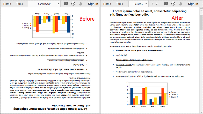
In some cases, you might need to rotate PDF pages. For example, when you receive a PDF document that contains disoriented pages, you may wish to rotate the pages so you can read the document easier. In this article, you will learn how to rotate pages in PDF in C# and VB.NET using Spire.PDF for .NET.
Install Spire.PDF for .NET
To begin with, you need to add the DLL files included in the Spire.PDF for.NET package as references in your .NET project. The DLL files can be either downloaded from this link or installed via NuGet.
PM> Install-Package Spire.PDF
Rotate a Specific Page in PDF using C# and VB.NET
Rotation is based on 90-degree increments. You can rotate a PDF page by 0/90/180/270 degrees. The following are the steps to rotate a PDF page:
- Create an instance of PdfDocument class.
- Load a PDF document using PdfDocument.LoadFromFile() method.
- Get the desired page by its index (zero-based) through PdfDocument.Pages[pageIndex] property.
- Get the original rotation angle of the page through PdfPageBase.Rotation property.
- Increase the original rotation angle by desired degrees.
- Apply the new rotation angle to the page through PdfPageBase.Rotation property.
- Save the result document using PdfDocument.SaveToFile() method.
- C#
- VB.NET
using Spire.Pdf;

namespace RotatePdfPage
{
    class Program
    {
        static void Main(string[] args)
        {
            //Create a PdfDocument instance
            PdfDocument pdf = new PdfDocument();
            //Load a PDF document
            pdf.LoadFromFile("Sample.pdf");

            //Get the first page
            PdfPageBase page = pdf.Pages[0];

            //Get the original rotation angle of the page
            int rotation = (int)page.Rotation;

            //Rotate the page 180 degrees clockwise based on the original rotation angle
            rotation += (int)PdfPageRotateAngle.RotateAngle180;
            page.Rotation = (PdfPageRotateAngle)rotation;

            //Save the result document
            pdf.SaveToFile("Rotate.pdf");
        }
    }
}
Rotate All Pages in PDF using C# and VB.NET
The following are the steps to rotate all pages in a PDF document:
- Create an instance of PdfDocument class.
- Load a PDF document using PdfDocument.LoadFromFile() method.
- Loop through each page in the document.
- Get the original rotation angle of the page through PdfPageBase.Rotation property.
- Increase the original rotation angle by desired degrees.
- Apply the new rotation angle to the page through PdfPageBase.Rotation property.
- Save the result document using PdfDocument.SaveToFile() method.
- C#
- VB.NET
using Spire.Pdf;

namespace RotateAllPdfPages
{
    class Program
    {
        static void Main(string[] args)
        {
            //Create a PdfDocument instance
            PdfDocument pdf = new PdfDocument();
            //Load a PDF document
            pdf.LoadFromFile("Sample.pdf");

            foreach (PdfPageBase page in pdf.Pages)
            {
                //Get the original rotation angle of the page
                int rotation = (int)page.Rotation;
                //Rotate the page 180 degrees clockwise based on the original rotation angle
                rotation += (int)PdfPageRotateAngle.RotateAngle180;
                page.Rotation = (PdfPageRotateAngle)rotation;
            }

            //Save the result document
            pdf.SaveToFile("RotateAll.pdf");
        }
    }
}
Apply for a Temporary License
If you'd like to remove the evaluation message from the generated documents, or to get rid of the function limitations, please request a 30-day trial license for yourself.
In certain cases, you may need to adjust the page size of a Word document to ensure that it fits your specific needs or preferences. For instance, if you are creating a document that will be printed on a small paper size, such as a brochure or flyer, you may want to decrease the page size of the document to avoid any cropping or scaling issues during printing. In this article, we will explain how to adjust the page size of a Word document in C# and VB.NET using Spire.Doc for .NET.
- Adjust the Page Size of a Word Document to a Standard Page Size in C# and VB.NET
- Adjust the Page Size of a Word Document to a Custom Page Size in C# and VB.NET
Install Spire.Doc for .NET
To begin with, you need to add the DLL files included in the Spire.Doc for.NET package as references in your .NET project. The DLL files can be either downloaded from this link or installed via NuGet.
PM> Install-Package Spire.Doc
Adjust the Page Size of a Word Document to a Standard Page Size in C# and VB.NET
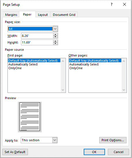
With Spire.Doc for .NET, you can easily adjust the page sizes of Word documents to a variety of standard page sizes, such as A3, A4, A5, A6, B4, B5, B6, letter, legal, and tabloid. The following steps explain how to change the page size of a Word document to a standard page size using Spire.Doc for .NET:
- Initialize an instance of the Document class.
- Load a Word document using the Document.LoadFromFile() method.
- Iterate through the sections in the document.
- Adjust the page size of each section to a standard page size by setting the value of the Section.PageSetup.PageSize property to a constant value of the PageSize enum.
- Save the result document using the Document.SaveToFile() method.
- C#
- VB.NET
using Spire.Doc;
using Spire.Doc.Documents;

namespace ChangePageSizeToStandardSize
{
    internal class Program
    {
        static void Main(string[] args)
        {
            //Initialize an instance of the Document class
            Document doc = new Document();
            //Load a Word document
            doc.LoadFromFile("Input.docx");

            //Iterate through the sections in the document
            foreach (Section section in doc.Sections)
            {
                //Change the page size of each section to A4
                section.PageSetup.PageSize = PageSize.A4;
            }

            //Save the result document
            doc.SaveToFile("StandardSize.docx", FileFormat.Docx2016);
        }
    }
}
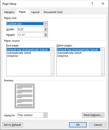
Adjust the Page Size of a Word Document to a Custom Page Size in C# and VB.NET
If you plan to print your document on paper with dimensions that don't match any standard paper size, you can change the page size of your document to a custom page size that matches the exact dimensions of the paper. The following steps explain how to change the page size of a Word document to a custom page size using Spire.Doc for .NET:
- Initialize an instance of the Document class.
- Load a Word document using the Document.LoadFromFile() method.
- Initialize an instance of the SizeF structure from specified dimensions.
- Iterate through the sections in the document.
- Adjust the page size of each section to the specified dimensions by assigning the SizeF instance to the Section.PageSetup.PageSize property.
- Save the result document using the Document.SaveToFile() method.
- C#
- VB.NET
using Spire.Doc;
using System.Drawing;

namespace ChangePageSizeToCustomSize
{
    internal class Program
    {
        static void Main(string[] args)
        {
            //Initialize an instance of the Document class
            Document doc = new Document();
            //Load a Word document
            doc.LoadFromFile("Input.docx");

            //Initialize an instance of the SizeF structure from specified dimensions
            SizeF customSize = new SizeF(600, 800);

            //Iterate through the sections in the document
            foreach (Section section in doc.Sections)
            {
                //Change the page size of each section to the specified dimensions
                section.PageSetup.PageSize = customSize;
            }

            //Save the result document
            doc.SaveToFile("CustomSize.docx", FileFormat.Docx2016);
        }
    }
}
Apply for a Temporary License
If you'd like to remove the evaluation message from the generated documents, or to get rid of the function limitations, please request a 30-day trial license for yourself.