Raw business data like sales logs, inventory records and survey responses often exists in long, unstructured lists. Manually sifting through these rows to spot patterns, compare metrics or build summaries eats into productive work time and invites human calculation errors.
Excel pivot tables resolve this exact challenge. As one of Excel’s most powerful native tools, pivot tables allow users to reorganize, aggregate, filter, and explore datasets dynamically, all without writing complex formulas. You can switch your analytical perspective on data in just a few clicks.
This guide explains how to add pivot table in Excel, covering both manual setup and automation approaches. Whether you are a complete beginner learning spreadsheet analytics, an office analyst streamlining recurring reports, or a developer building automated data pipelines, you will find actionable steps to make pivot tables work for your projects.
- What Is a Pivot Table?
- Pre Work: Prepare Your Source Data
- How to Create a Pivot Table in Excel (Manual)
- How to Insert Pivot Table in Excel with Python (Automation)
- Expert Tips & Advanced Customization
- Frequently Asked Questions (FAQs)
What Is a Pivot Table?
A pivot table is a data summarization tool built into Excel. It takes a flat dataset and lets you reorganize it dynamically by dragging and dropping fields into different areas, allowing you to view your data from multiple perspectives without modifying the source.
Pivot tables excel for these use cases:
- Compare sales totals across different products, regions or business segments
- Calculate product sales as percentage contributions against total revenue
- Identify trends over time by grouping dates into months or quarters
- Build interactive reports and dashboards with slicers and calculated fields
Pre‑Work: Prepare Your Source Data
Before you add a pivot table in Excel, your source data must be structured correctly. Poorly organized data is the top cause of unexpected pivot‑table behavior.
Follow these rules to ensure your data is pivot-ready:
- Use a single header row: Each column should have one unique, descriptive name. Avoid merged cells in the header.
- Remove blank rows or columns: Every row should represent a single record, and there should be no empty rows or columns within your dataset.
- Consistent data types: Keep one data type per column (for example, only dates in your date column; only numeric values in your sales column).
- No subtotal or grand total rows: Pre‑existing summary rows can confuse Excel's data detection.
Pro tip: Convert your dataset to an Excel Table first (Insert > Table). When your source data grows, the pivot table can refresh to include new rows automatically.
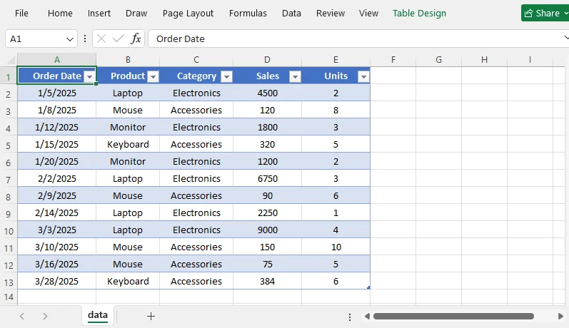
A well-structured dataset looks like this:
How to Create a Pivot Table in Excel (Manual Method)
Step 1: Select Your Data Range
Click any cell inside your target dataset. Excel will automatically detect the full contiguous data range. If your data is non-contiguous, click and drag to manually select your full range including column headers.
Step 2: Insert a Pivot Table
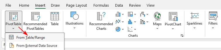
- Go to the Insert tab on the Excel ribbon.
- Click PivotTable. In the dropdown, select From Table/Range.
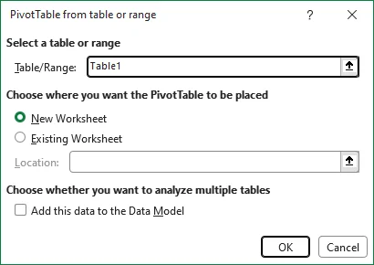
- The Create PivotTable dialog box opens. Confirm the Table/Range is correct.
- Choose where to place your pivot table:
- New Worksheet: Places pivot report on a new blank sheet (recommended for most users)
- Existing Worksheet: Select a cell location on your current sheet to place the report.
- Click OK. A blank pivot table canvas and the PivotTable Fields panel will appear on the right side of your screen.
Keyboard shortcut: To add a pivot table instantly, click inside your data and press Alt + N + V + T.
Step 3: Build Your Pivot Table Using the Fields Pane
The PivotTable Fields panel lists all your column headers. Drag fields into the four areas below to build your report:
| Area | Function | Typical Examples |
|---|---|---|
| Rows | Displays categories vertically as row labels | Product, Region, Employee |
| Columns | Arranges categories horizontally for side‑by‑side comparison | Month, Quarter |
| Values | Runs calculations on numeric fields; defaults to Sum. You may switch to Count, Average, Max or Min | Sales, Revenue, Unit quantity |
| Filters | Applies high‑level global filters for the whole report | Year, Product Category |
Practical Pivot Table Example:
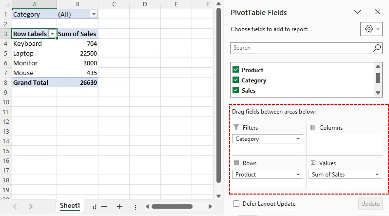
- Drag “Product” to Rows
- Drag “Sales” to Values
- Drag “Category” to Filters
You now have a summary showing total sales per product, with a filter to view one category at a time.
How to Insert Pivot Table in Excel with Python (Automation)
For recurring reporting workflows, manual Excel operations become inefficient. You can programmatically generate pivot tables using the Free Spire.XLS for Python library. This solution runs without a local Microsoft Office installation, making it ideal for scheduled automation and server‑side data pipelines.
Prerequisite
First install the package via pip:
pip install Spire.XLS.Free
Python Code Example: Add a Pivot Table
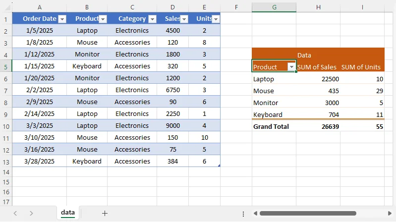
The following example loads an existing Excel file, adds a pivot table based on a data range, configures the row and value fields, applies a built-in style, and saves the result.
from spire.xls import *
from spire.xls.common import *

# Create a Workbook object
workbook = Workbook()

# Load a sample Excel document
workbook.LoadFromFile("Source.xlsx")

# Get the first worksheet
sheet = workbook.Worksheets[0]

# Select the data source range
cellRange = sheet.Range["A1:E13"]
piVotCache = workbook.PivotCaches.Add(cellRange)

# Add a PivotTable to the worksheet and set the location and cache of it
pivotTable = sheet.PivotTables.Add("Pivot Table", sheet.Range["G4"], piVotCache)

# Add "Product" fields to rows area
productField = pivotTable.PivotFields["Product"]
productField.Axis = AxisTypes.Row
pivotTable.Options.RowHeaderCaption = "Product"

# Add "Sales" and "Units" fields to values area
pivotTable.DataFields.Add(pivotTable.PivotFields["Sales"], "SUM of Sales", SubtotalTypes.Sum)
pivotTable.DataFields.Add(pivotTable.PivotFields["Units"], "SUM of Units", SubtotalTypes.Sum)

# Apply a built-in style to the pivot table
pivotTable.BuiltInStyle = PivotBuiltInStyles.PivotStyleMedium3

# Set column width
sheet.SetColumnWidth(7, 12)
sheet.SetColumnWidth(8, 12)
sheet.SetColumnWidth(9, 12)

# Save the document
workbook.SaveToFile("PivotTable.xlsx", ExcelVersion.Version2016)
workbook.Dispose()
Code Breakdown
-
Workbook.LoadFromFile()opens your input Excel file with raw source data -
PivotCaches.Add()builds the pivot cache that references your source‑data cell range -
PivotTables.Add()renders the pivot table at your specified worksheet cell -
Axis = AxisTypes.Rowassigns the Product field to the row grouping area -
DataFields.Add()adds numeric metrics and sets aggregation logic (Sum in this example) -
BuiltInStyleapplies pre‑formatted visual styling -
SaveToFile()exports your completed workbook as .xlsx
The output result:
Pro Tip: Free Spire.XLS also allows you to create a pivot chart in Excel to visualize pivot‑table outputs programmatically.
Expert Tips & Advanced Customization
To enhance interactivity and visuals
- Add Slicers: Enable one‑click, visual filtering for your pivot‑table dataset
- Pivot Charts: Pair your pivot table with a pivot chart to visualize aggregated results graphically
- Rename default field labels: Replace auto‑generated labels such as “Sum of Sales” with cleaner custom names for readability
To format and refresh pivot‑table outputs
- Number formatting: Right-click any number in the pivot table, select Format Cells to apply currency, percentage or custom decimal formatting.
-
Layout: Go to the Design tab (under PivotTable Tools) to adjust the layout. For better readability:
- Set Report Layout to Tabular Form
- Enable Banded Rows
- Turn off Subtotals if you don't need them
- Refresh: Pivot tables do not update automatically when your source data changes. After adding or editing rows, refresh the pivot table by:
- Right-clicking anywhere inside it and selecting Refresh
- Or go to PivotTable Analyze > Refresh
Final Thoughts
Excel pivot tables turn messy raw data into actionable summaries, eliminating tedious manual calculations. For quick, ad hoc analysis, use Excel’s manual point‑and‑click workflow. For recurring, large-scale reporting, automate pivot table creation with Python to reduce manual effort and human error.
Reliable pivot table outputs depend on well-prepared source data. Begin with basic field configuration, then add slicers, charts, and custom formatting to build powerful, interactive business reports.
Frequently Asked Questions (FAQs)
Q: What is the fastest way to add a pivot table?
A: Use the keyboard shortcut Alt + N + V + T after clicking inside your data range. Excel will auto-detect the range and open the Create PivotTable dialog.
Q: What is the difference between a pivot table and a pivot chart?
A: A pivot table summarizes data in a grid. A pivot chart is a visual graph based on that summary. You can create a pivot chart directly from a pivot table, and it stays linked to the table’s filters and fields.
Q: Can I create a pivot table in Excel without opening Excel?
A: Yes. Using a Python library like Free Spire.XLS, you can generate pivot tables programmatically from source data files — ideal for automated reporting workflows and server-side processing.
Q: Can I use multiple sheets as the source for one pivot table?
A: Not directly. You need to combine the data first using Power Query or add the tables to the Data Model. Then you can create a pivot table from the combined data.
Q: How do I add more than one field to the Rows area?
A: Drag multiple fields into the Rows area. The order in which you drag them determines the grouping hierarchy. You can rearrange them by dragging up or down.