
Pie charts are a simple but effective way to visualize how different categories contribute to a whole. In Microsoft Excel, creating a pie chart only takes a few clicks, making it a popular choice for reports, presentations, and data analysis.
However, creating a chart manually is not always the best option. When working with complex data or repeated reporting tasks, AI tools and programming methods can provide a more efficient workflow.
In this article, we will explore three ways to create a pie chart in Excel:
- Creating a pie chart directly using Microsoft Excel
- Using an AI Agent to generate and refine charts through conversation
- Creating pie charts programmatically with Python
Each method has its own advantages depending on your workflow, technical skills, and automation needs.
Part 1. Create a Pie Chart Using Microsoft Excel
Microsoft Excel provides a built-in chart feature that allows you to create a pie chart in just a few clicks. This method is suitable when you need to quickly visualize a small dataset, such as sales distribution, budget allocation, or market share.
In this section, we will use a simple sales dataset to demonstrate how to create and customize a pie chart in Excel.
Step 1: Prepare Your Data
Before creating a pie chart, organize your data into two columns: one for categories and another for values.
For example:
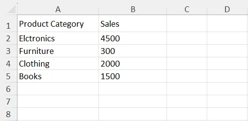
Excel uses the category column as the labels for each slice and the value column to calculate the size of each slice.
For better results, make sure your dataset contains clear category names and numeric values. Avoid leaving empty rows inside the selected range, as they may affect how Excel interprets the chart data.
Step 2: Select Your Data
Select the complete dataset, including the column headers.
In this example, select the range A1:B5. Including headers helps Excel automatically recognize the data structure and use the first row as chart labels.
Step 3: Insert a Pie Chart
After selecting the data, go to the Insert tab on the Excel ribbon.
Then:
- Click Insert Pie or Doughnut Chart in the Charts section.
- Choose your preferred pie chart style.
- Excel will automatically generate the chart based on your selected data.
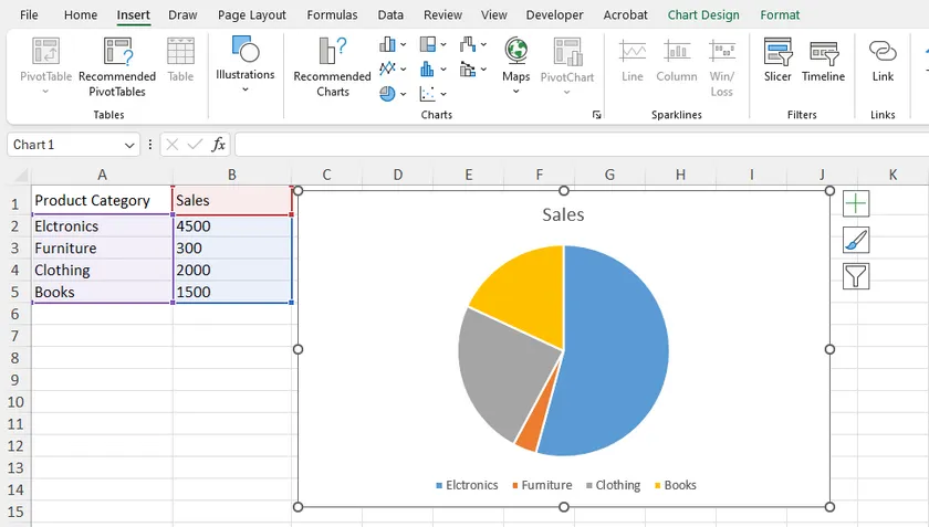
Excel provides several pie chart variations, including standard 2-D Pie, 3-D Pie, Doughnut Chart, and Pie of Pie Chart.
For most situations, the standard 2-D Pie Chart is recommended because it provides a clear comparison without unnecessary visual effects.
Step 4: Customize the Pie Chart
After inserting the chart, you can adjust its appearance and displayed information.
Click the chart, and Excel will show the Chart Design and Format tabs. From here, you can change the chart style, colors, title, and layout.
For example, you can add data labels to display percentages directly on each slice. This is especially useful for pie charts because the main purpose of this chart type is to show how each category contributes to the whole.
To add data labels:
- Select the chart.
- Click the Chart Elements (+) button.
- Enable Data Labels .
Step 5: Highlight Important Data (Optional)
Sometimes, you may want to emphasize a specific category in your pie chart.
For example, if Electronics represents the largest sales segment, you can separate this slice from the rest of the chart.
To highlight a slice, click the slice twice and drag it slightly away from the center. You can also adjust the separation distance through the Format Data Point panel.
This feature is useful when presenting key information in reports or presentations.
Step 6: Save or Export the Chart
Once your pie chart is complete, you can reuse it in other applications.
Excel allows you to copy the chart directly into PowerPoint or Word, save the worksheet as PDF, or export the chart as an image.
This makes Excel pie charts a practical choice for business reports, presentations, and data analysis.
Why Use Excel to Create Pie Charts?
Creating a pie chart directly in Excel is usually the fastest approach because all chart tools are already integrated into the application.
It is especially useful when:
- You are working with Excel data already.
- You need to quickly adjust the chart manually.
- You want full control over the chart appearance.
However, if you need to analyze large datasets or generate charts repeatedly, AI tools and programming methods can provide a more efficient workflow. We will cover these approaches in the following sections.
Part 2. Create a Pie Chart with an AI Agent
Creating a pie chart directly in Excel is straightforward, but it still requires users to manually select data, choose a chart type, and adjust the appearance.
An AI Agent provides a different approach. Instead of working through multiple Excel menus, you can describe what you want to create in natural language. The AI can analyze your spreadsheet, recommend a suitable chart, generate the result, and help you refine it through follow-up conversations.
For this method, we will use CloudXDocs AI Agent, which supports working with Office documents, including Excel files, through conversational interaction.
Step 1: Upload Your Excel File
Start by uploading the Excel workbook that contains your data.

After uploading the file, the AI Agent can understand the structure of your spreadsheet and use the existing data to create a chart.
Step 2: Describe Your Chart Requirements
Instead of manually selecting ranges and chart options, you can explain your goal using a simple prompt.
For example:
Create a pie chart showing sales distribution by product category.
Display percentages on each slice and use a clear title.

The AI Agent can interpret your request, identify the relevant data, and generate a pie chart based on your instructions.
This approach is especially useful when you know what information you want to present but are unsure which Excel settings or chart options to use.
Step 3: Review and Refine the Chart Through Conversation
One advantage of using an AI Agent is that chart creation does not have to be a one-time action.
After reviewing the generated result, you can continue the conversation and request changes.
For example, you can ask:
Change the chart style to make it suitable for a business presentation.
or:
Highlight the Electronics category and move it away from the center.
The AI can adjust the output based on your feedback, allowing you to refine the chart through multiple rounds of interaction.
Step 4: Export and Continue Working with the Result
Once the pie chart meets your requirements, you can continue editing the generated Excel file or use it in other documents.
Compared with creating a pie chart manually in Excel, an AI Agent can save time when you need additional analysis, formatting suggestions, or repeated adjustments.
Why Use an AI Agent to Create Pie Charts?
An AI Agent is not necessarily faster for every simple chart. If you only need a basic pie chart from a small table, Excel's built-in chart tools are usually enough.
However, an AI Agent becomes more useful when your workflow involves understanding data, choosing the right visualization, or making multiple changes through conversation.
It is especially helpful when:
- You need assistance analyzing spreadsheet data before creating a chart.
- You want to generate charts through natural language instructions.
- You need to refine the result through multiple iterations.
Part 3. Create a Pie Chart Programmatically with Python
When working with a small dataset, creating a pie chart directly in Excel is usually the simplest option. However, manual creation becomes inefficient when you need to generate charts repeatedly, process multiple Excel files, or build automated reporting workflows.
In these scenarios, creating pie charts programmatically with Python provides more flexibility. Developers can generate charts, control their appearance, and save the results automatically without manually opening Excel.
In this example, we will use Spire.XLS for Python to create a pie chart in an Excel workbook.
Step 1: Install Spire.XLS for Python
Before creating a pie chart, install the required library:
pip install spire.xls
Spire.XLS for Python provides APIs for creating and manipulating Excel workbooks, including worksheets, charts, formatting, and other spreadsheet elements.
Step 2: Create an Excel Workbook and Add Data
First, create a workbook and add the source data that will be displayed in the pie chart.
from spire.xls import *
from spire.xls.common import *

# Create a workbook
workbook = Workbook()

# Get the first worksheet
sheet = workbook.Worksheets[0]

# Add data
sheet.Range["A1"].Value = "Year"
sheet.Range["A2"].Value = "2002"
sheet.Range["A3"].Value = "2003"
sheet.Range["A4"].Value = "2004"
sheet.Range["A5"].Value = "2005"

sheet.Range["B1"].Value = "Sales"
sheet.Range["B2"].NumberValue = 4000
sheet.Range["B3"].NumberValue = 6000
sheet.Range["B4"].NumberValue = 7000
sheet.Range["B5"].NumberValue = 8500
The first column contains category labels, while the second column provides the numerical values used to calculate the pie slices.
Step 3: Add a Pie Chart
After preparing the data, create a pie chart and specify the data range.
# Add a pie chart
chart = sheet.Charts.Add(ExcelChartType.Pie)

# Set chart data
chart.DataRange = sheet.Range["B2:B5"]
chart.SeriesDataFromRange = False

# Set category labels and values
cs = chart.Series[0]

cs.CategoryLabels = sheet.Range["A2:A5"]
cs.Values = sheet.Range["B2:B5"]
The ExcelChartType.Pie option creates a standard pie chart. You can also use other chart types provided by Spire.XLS, such as ExcelChartType.PieExploded for an exploded pie chart, or ExcelChartType.PieOfPie for a pie-of-pie chart.
The chart creation workflow remains the same; only the chart type and specific formatting options need to be changed.
Step 4: Customize the Chart Appearance
After creating the chart, you can customize its position, title, and data labels.
# Set chart position
chart.LeftColumn = 4
chart.TopRow = 2
chart.RightColumn = 12
chart.BottomRow = 20

# Set chart title
chart.ChartTitle = "Sales by Year"

# Display data labels
cs.DataPoints.DefaultDataPoint.DataLabels.HasValue = True
These settings allow you to create charts that match the style requirements of automated reports.
Step 5: Save the Excel File
Finally, save the workbook containing the generated pie chart.
workbook.SaveToFile("output/PieChart.xlsx", ExcelVersion.Version2016)
workbook.Dispose()
The generated Excel file can be opened directly in Microsoft Excel, where users can continue editing the chart if needed.
Why Create Pie Charts with Python?
Compared with manually creating charts in Excel, a programming approach provides better automation capabilities.
It is useful when you need to:
- Generate charts from large amounts of data automatically.
- Create consistent reports with predefined formatting.
- Integrate Excel chart generation into applications or data processing workflows.
For occasional chart creation, Excel's built-in tools are usually enough. However, Python automation is a better choice when chart generation becomes part of a repeated workflow.
Tips for Creating Better Pie Charts
Creating a pie chart in Excel is easy, but choosing the right design can make the chart much clearer and more effective.
Keep the Number of Categories Limited
Pie charts work best when showing a small number of categories. When too many slices are displayed, the differences between categories become difficult to identify.
If your dataset contains many categories, consider combining smaller categories into an "Others" group or using a bar chart instead.
Use Percentages to Highlight Proportions
The main purpose of a pie chart is to show how each category contributes to the total.
Displaying percentages can often make the chart easier to understand than showing only raw values. For example, showing that a product category represents 35% of total sales provides more context than displaying only the sales amount.
Avoid Unnecessary 3D Effects
Excel provides several visual styles, including 3D pie charts. While these effects may look attractive, they can make it harder to compare slice sizes accurately.
For professional reports and presentations, a simple 2-D pie chart is usually the better choice.
Choose the Right Situation for a Pie Chart
Pie charts are most useful when you want to show a part-to-whole relationship.
For example, they work well for:
- Sales distribution by category.
- Budget allocation.
- Market share comparison.
However, pie charts are not ideal for showing changes over time or comparing many similar values. In those cases, line charts or bar charts may provide a clearer view.
Comparison Table: Which Method Should You Choose?
The best way to create a pie chart depends on your specific requirements.
| Method | Difficulty | Best For | Main Advantage |
|---|---|---|---|
| Microsoft Excel | Easy | Occasional chart creation | Quick and full manual control |
| AI Agent | Easy | Users who want assistance and flexible editing | Create and refine charts through conversation |
| Python Programming | Advanced | Automated reporting and large-scale workflows | Generate charts programmatically |
For most everyday Excel users, the built-in chart feature is the fastest solution. If you need help understanding data or adjusting charts through natural language, an AI Agent can simplify the process. For developers who need repeatable chart generation, programming provides the greatest flexibility.
Final Thoughts
Creating a pie chart in Excel can be done in several ways depending on your workflow.
For simple tasks, Microsoft Excel remains the most convenient option because it provides all the necessary chart tools without additional setup. Users can quickly create, customize, and export charts directly from their spreadsheets.
If you want a more interactive approach, an AI Agent can help analyze your data, create charts based on your instructions, and refine the results through multiple conversations.
For automated workflows, Python provides a powerful solution for generating Excel charts at scale. It allows developers to create consistent reports and integrate chart generation into applications or data processing systems.
Choosing the right method depends on whether you prioritize simplicity, assistance, or automation.
FAQs
How do I create a pie chart in Excel?
To create a pie chart in Excel, select your data range, go to the Insert tab, choose Pie Chart , and select the desired chart style. You can then customize the title, colors, and data labels.
What type of data is suitable for a pie chart?
Pie charts are best suited for showing how individual categories contribute to a total. Common examples include sales distribution, budget allocation, and market share.
Can AI create a pie chart from an Excel file?
Yes. AI Agents can analyze uploaded Excel files, understand your requirements, and create charts based on natural language instructions. Users can also continue the conversation to request changes and refine the result.
Can I create a pie chart in Excel using Python?
Yes. Python libraries such as Spire.XLS for Python allow developers to create Excel files, add pie charts, customize chart properties, and save the results programmatically.
Should I use a pie chart or a bar chart?
Pie charts are better for showing proportions of a whole, especially when there are only a few categories. Bar charts are usually better when comparing many categories or values with small differences.