Drawing a single chart type per figure is Excel's default behaviour, not a rule anyone has to keep. A report usually has more than one thing to say, and each reading has a shape that suits it: height suits columns, movement suits a line, a running total suits an area. A custom (combination) chart exists for exactly this: within one chart, each series can be given a chart type of its own, and which types are put together is decided by the questions the figure has to answer side by side -- there is no fixed pairing. Columns with a line is the pairing most widely used in practice, because it accommodates both readings at once. The example below takes that pair, drawing sales as columns and the target as a line, so that what the reader compares is the line's position against the column tops. Two separate charts would need their category axes aligned first, before any comparison could be made; one chart, with a category axis the series share, keeps the months strictly aligned. A report also often holds a series that cannot be brought into the main data range, and such a series has to be added by hand. Spire.XLS for JavaScript performs all of this in the browser on top of WebAssembly, managing input and output files through a virtual file system (VFS), with no backend service required.
This article covers two key features:
For installation and project setup, see Integrating Spire.XLS for JavaScript in a React Project. The examples below assume Spire.XLS is installed and the WebAssembly module has been initialised.
Combine a column chart with a line chart
A pairing is not fixed: which types share one figure depends on which questions have to be answered side by side, and columns with a line is only the most widely used of them. In this example sales are best expressed as columns, where heights are compared at a glance, and the target is best expressed as a line, where what the reader compares is its position against the column tops. Once the two series have a type each, one figure carries both readings, and the category axis they share keeps the months strictly aligned, so no comparison across two figures is needed. Substituting clustered bars with a line, or columns with an area, works the same way. The steps are:
- Load the font and the test data file into the VFS.
- Load the workbook with
workbook.LoadFromFileand take the first worksheet. - Add a chart with
sheet.Charts.Add()and pointchart.DataRangeatA1:C7: the first row supplies the series names, the first column the category labels, and the next two columns become one series each. - Set
chart.SeriesDataFromRangetofalseso that each series keeps the values bound to it. - Place the chart on the sheet with
chart.LeftColumn,chart.TopRow,chart.RightColumnandchart.BottomRow. - Give
chart.Series.get(0).SerieTypeandchart.Series.get(1).SerieTypethe valuesExcelChartType.ColumnClusteredandExcelChartType.Line. Every series names its own type this way, so which types go together is yours to choose. - Set the title with
chart.ChartTitle, then save the workbook withworkbook.SaveToFile.
The complete code example below shows how to combine a column chart with a line chart in React:
function App() {
  const combineColumnAndLine = async () => {
    // get the Spire.XLS WASM module
    const xlsModule = window.wasmModule?.spirexls;

    // check that the module is ready
    if (!xlsModule) {
      alert('Spire.Xls is not ready yet');
      return;
    }

    // load the font and the test data file into the VFS
    await window.spire.FetchFileToVFS('ARIAL.TTF', '/Library/Fonts/', `${process.env.PUBLIC_URL}/font/`);
    const inputFileName = 'SalesReport.xlsx';
    await window.spire.FetchFileToVFS(inputFileName, '', `${process.env.PUBLIC_URL}data/`);

    // load the workbook
    const workbook = new xlsModule.Workbook();
    workbook.LoadFromFile({ fileName: inputFileName });

    // take the first worksheet
    const sheet = workbook.Worksheets.get(0);

    // add a chart and bind its data range to A1:C7: the first column becomes the category labels, the next two become one series each
    const chart = sheet.Charts.Add();
    chart.DataRange = sheet.Range.get('A1:C7');
    chart.SeriesDataFromRange = false;

    // place the chart
    chart.LeftColumn = 1;
    chart.TopRow = 10;
    chart.RightColumn = 9;
    chart.BottomRow = 26;

    // give the two series a chart type each: sales drawn as columns, target sales drawn as a line
    chart.Series.get(0).SerieType = xlsModule.ExcelChartType.ColumnClustered;
    chart.Series.get(1).SerieType = xlsModule.ExcelChartType.Line;

    chart.ChartTitle = 'Sales and Target Sales';

    // save the workbook
    const outputFileName = 'CombineColumnAndLine.xlsx';
    workbook.SaveToFile({ fileName: outputFileName });

    // dispose of the workbook to free resources
    workbook.Dispose();

    // read the result file from the VFS and start the download
    const fileArray = window.dotnetRuntime.Module.FS.readFile(outputFileName);
    const blob = new Blob([fileArray], { type: 'application/vnd.openxmlformats-officedocument.spreadsheetml.sheet' });
    const url = URL.createObjectURL(blob);
    const a = document.createElement('a');
    a.href = url;
    a.download = outputFileName;
    a.click();
    URL.revokeObjectURL(url);
  };

  return (
    <div style={{ textAlign: 'center', height: '300px' }}>
      <h1>Create a Custom (Combination) Chart</h1>
      <button id="combine-column-and-line" onClick={combineColumnAndLine}>Combine a column chart with a line chart</button>
    </div>
  );
}

export default App;
After running, the effect of combining a column chart with a line chart: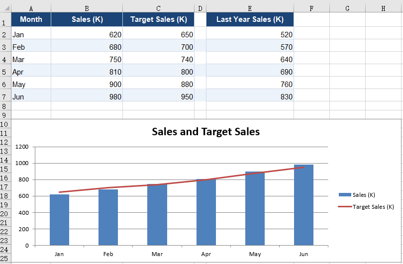
Add a series by hand
DataRange can only ever be one continuous rectangle, and that is a hard limit on how data gets bound. Reports commonly present two such cases: the main data occupies columns A to C while the reference values start a column further along, with an empty column in between; or the values to be plotted are derived by calculation and occupy no cell at all. Neither case can be bound in a single call, so the chart has to be built series by series instead. A hand-added series does not depend on DataRange: its range can point anywhere, and it still takes a chart type of its own, so the rules of a combination chart apply to it in full. Here last year's sales are added as a second column series, paired alongside the current year, with the target line running across both. The steps are:
- Load the font and the test data file into the VFS, load the workbook and take the first worksheet.
- Add a chart with
sheet.Charts.Add()and pointchart.DataRangeat the main block alone,A1:C7. - Give the two series of that block
ExcelChartType.ColumnClusteredandExcelChartType.Line. - Add a series with
chart.Series.Add({ name, serieType }), which takes the series name and its chart type in one call. - Bind the category labels and the values with
series.CategoryLabelsandseries.Values, each pointing at the range the data actually occupies. - Set the title with
chart.ChartTitle, then save the workbook withworkbook.SaveToFile.
The complete code example below shows how to add a series by hand in React:
function App() {
  const addSeriesManually = async () => {
    // get the Spire.XLS WASM module
    const xlsModule = window.wasmModule?.spirexls;

    // check that the module is ready
    if (!xlsModule) {
      alert('Spire.Xls is not ready yet');
      return;
    }

    // load the font and the test data file into the VFS
    await window.spire.FetchFileToVFS('ARIAL.TTF', '/Library/Fonts/', `${process.env.PUBLIC_URL}/font/`);
    const inputFileName = 'SalesReport.xlsx';
    await window.spire.FetchFileToVFS(inputFileName, '', `${process.env.PUBLIC_URL}data/`);

    // load the workbook
    const workbook = new xlsModule.Workbook();
    workbook.LoadFromFile({ fileName: inputFileName });

    // take the first worksheet
    const sheet = workbook.Worksheets.get(0);

    // add a chart and bind its data range to the main block, A1:C7
    const chart = sheet.Charts.Add();
    chart.DataRange = sheet.Range.get('A1:C7');
    chart.SeriesDataFromRange = false;

    // place the chart
    chart.LeftColumn = 1;
    chart.TopRow = 10;
    chart.RightColumn = 9;
    chart.BottomRow = 26;

    // the two series of the main block: sales as columns, target sales as a line
    chart.Series.get(0).SerieType = xlsModule.ExcelChartType.ColumnClustered;
    chart.Series.get(1).SerieType = xlsModule.ExcelChartType.Line;

    // last year's figures sit in column E, one empty column away from the main block, so they cannot come along with the data range; add a series by hand instead.
    // a hand-added series takes a chart type of its own too; here it is drawn as columns alongside sales
    const lastYear = chart.Series.Add({ name: 'Last Year Sales (K)', serieType: xlsModule.ExcelChartType.ColumnClustered });
    lastYear.CategoryLabels = sheet.Range.get('A2:A7');
    lastYear.Values = sheet.Range.get('E2:E7');

    chart.ChartTitle = 'Sales, Target Sales and Last Year Sales';

    // save the workbook
    const outputFileName = 'AddSeriesManually.xlsx';
    workbook.SaveToFile({ fileName: outputFileName });

    // dispose of the workbook to free resources
    workbook.Dispose();

    // read the result file from the VFS and start the download
    const fileArray = window.dotnetRuntime.Module.FS.readFile(outputFileName);
    const blob = new Blob([fileArray], { type: 'application/vnd.openxmlformats-officedocument.spreadsheetml.sheet' });
    const url = URL.createObjectURL(blob);
    const a = document.createElement('a');
    a.href = url;
    a.download = outputFileName;
    a.click();
    URL.revokeObjectURL(url);
  };

  return (
    <div style={{ textAlign: 'center', height: '300px' }}>
      <h1>Create a Custom (Combination) Chart</h1>
      <button id="add-series-manually" onClick={addSeriesManually}>Add a series by hand</button>
    </div>
  );
}

export default App;
After running, the effect of adding a series by hand: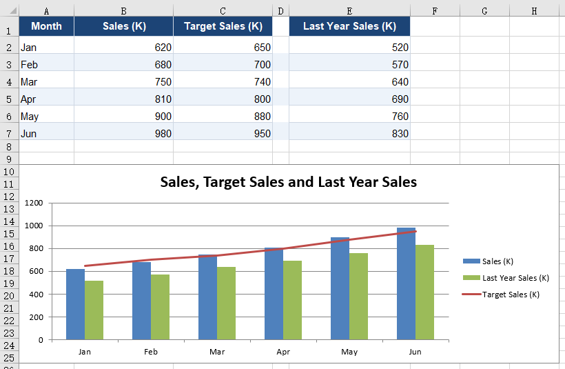
FAQ
Can a hand-added series be used alongside DataRange?
Cause: Yes, and the two do not interfere. DataRange produces only the series that correspond to the columns of the main block; a hand-added series carries its own Values and CategoryLabels, which are unrelated to the range DataRange covers and need not lie within the same rectangle. In the second example above the chart holds both series of the main block and the hand-added last-year series at once.
Solution: Point DataRange at the main block, then add each extra series with chart.Series.Add({ name, serieType }). Note that a hand-added series does not inherit the category labels of the main block: CategoryLabels has to be assigned explicitly, and if it is pointed at the same column the series share one category axis.
// the two series of the main block come from DataRange; the hand-added one is bound separately
chart.DataRange = sheet.Range.get('A1:C7');

const lastYear = chart.Series.Add({ name: 'Last Year Sales (K)', serieType: xlsModule.ExcelChartType.ColumnClustered });
lastYear.CategoryLabels = sheet.Range.get('A2:A7');
lastYear.Values = sheet.Range.get('E2:E7');
What type does a series added without serieType get?
Cause: It takes the chart's own type. sheet.Charts.Add() is called with no arguments in the example, and the chart it builds defaults to ExcelChartType.ColumnClustered, which is the type a new series keeps as well.
Solution: For a new series to join a combination chart, name its type at the call, or change SerieType after adding it:
// named at the call
const serie = chart.Series.Add({ name: 'Last Year Sales (K)', serieType: xlsModule.ExcelChartType.ColumnClustered });

// or changed after adding
serie.SerieType = xlsModule.ExcelChartType.Line;
Get a Free License
Spire.XLS for JavaScript offers a 30-day full-featured free trial license with no functional limitations. Apply here to evaluate before purchasing.
