A chart plots averages, and an average says nothing about how steady the underlying readings were. The same rising line can sit on top of six near-identical measurements or six wildly scattered ones -- the curve alone will not tell you which. Error bars supply that missing layer: a short segment drawn at each data point marks the spread or uncertainty around it, so the reader can see how much confidence each turn of the line deserves. Percentage error bars derive their range from a fixed proportion of the value, while standard error bars derive theirs from the data itself, and the two suit different situations. Spire.XLS for JavaScript performs both directly in the browser through WebAssembly, managing input and output files with a virtual file system (VFS) and requiring no backend service.
This article covers two key features:
For installation and project setup, see Integrating Spire.XLS for JavaScript in a React Project. The examples below assume Spire.XLS is installed and the WebAssembly module has been initialised.
Add percentage error bars to a line chart
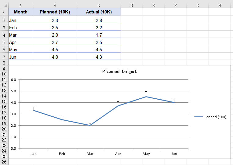
A percentage error bar takes the value of each data point as its base and works out the range from the given percentage. Set it to 10, and a point valued at 4.0 gets an error amount of 0.4; which side of the data point that length is drawn on is decided by a separate parameter. This kind of error bar expresses a tolerance -- a production target allowed to drift by a tenth, or an instrument reading with a fixed relative precision. Error bars belong to a series, so the series object has to be fetched first and its ErrorBar method called on it. The steps are:
- Load the font and the test data file into the VFS.
- Load the workbook and get the first worksheet.
- Add a line chart whose data range is the planned output column.
- Use the month column as the category labels.
- Add a percentage error bar to the series, setting its direction and amount, then save the workbook.
The complete code example below shows how to add percentage error bars to a line chart in React:
function App() {
  const addPercentageErrorBar = async () => {
    // Get the Spire.XLS WASM module
    const xlsModule = window.wasmModule?.spirexls;

    // Check if the module is ready
    if (!xlsModule) {
      alert('Spire.Xls is not ready yet');
      return;
    }

    // Load the font and the test data file into the VFS
    await window.spire.FetchFileToVFS('ARIAL.TTF', '/Library/Fonts/', `${process.env.PUBLIC_URL}/font/`);
    const inputFileName = 'ErrorBarChartData.xlsx';
    await window.spire.FetchFileToVFS(inputFileName, '', `${process.env.PUBLIC_URL}data/`);

    // Load the workbook and get the first worksheet
    const workbook = new xlsModule.Workbook();
    workbook.LoadFromFile({ fileName: inputFileName });
    const sheet = workbook.Worksheets.get(0);

    // Add a line chart whose data range is the planned output column
    const chart = sheet.Charts.Add({ chartType: xlsModule.ExcelChartType.Line });
    chart.ChartTitle = "Planned Output";
    chart.ChartTitleArea.IsBold = true;
    chart.ChartTitleArea.Size = 12;
    chart.DataRange = sheet.Range.get("B1:B7");
    chart.SeriesDataFromRange = false;

    // Set the chart position on the worksheet
    chart.TopRow = 9;
    chart.BottomRow = 26;
    chart.LeftColumn = 1;
    chart.RightColumn = 9;

    // Get the series and use the month column as its category labels
    const serie = chart.Series.get(0);
    serie.CategoryLabels = sheet.Range.get("A2:A7");

    // Add a percentage error bar to the series: plus direction, 10% of the value
    serie.ErrorBar({
      bIsY: true,
      include: xlsModule.ErrorBarIncludeType.Plus,
      type: xlsModule.ErrorBarType.Percentage,
      numberValue: 10.0,
    });

    // Save the workbook
    const outputFileName = "PercentageErrorBar.xlsx";
    workbook.SaveToFile({ fileName: outputFileName });

    // Dispose of the workbook object to free resources
    workbook.Dispose();

    // Read the result file from the VFS and trigger the download
    const fileArray = window.dotnetRuntime.Module.FS.readFile(outputFileName);
    const blob = new Blob([fileArray], { type: 'application/vnd.openxmlformats-officedocument.spreadsheetml.sheet' });
    const url = URL.createObjectURL(blob);
    const a = document.createElement('a');
    a.href = url;
    a.download = outputFileName;
    a.click();
    URL.revokeObjectURL(url);
  };

  return (
    <div style={{ textAlign: 'center', height: '300px' }}>
      <h1>Percentage Error Bars</h1>
      <button onClick={addPercentageErrorBar}>Start</button>
    </div>
  );
}

export default App;
After running, the effect of adding percentage error bars to a line chart:
Add standard error bars to a column chart
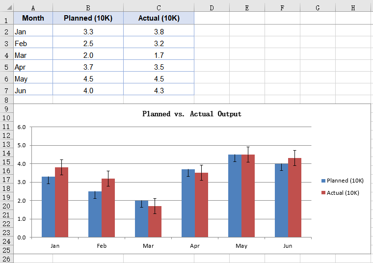
A standard error bar takes no percentage from you; it computes the standard error of the series itself, so a series with scattered values automatically gets longer error bars. That is the division of labour between the two kinds: the standard error bar describes how steady the data is, the percentage one describes how far you are willing to let it drift. Column charts are usually there to compare several groups side by side, and hanging a standard error bar on each group shows at a glance which one's readings cluster more tightly. The steps are:
- Load the font and the test data file into the VFS.
- Load the workbook and get the first worksheet.
- Add a column chart covering both the planned and the actual output columns.
- Add a standard error bar to each of the two series.
- Save the workbook.
The complete code example below shows how to add standard error bars to a column chart in React:
function App() {
  const addStandardErrorBar = async () => {
    // Get the Spire.XLS WASM module
    const xlsModule = window.wasmModule?.spirexls;

    // Check if the module is ready
    if (!xlsModule) {
      alert('Spire.Xls is not ready yet');
      return;
    }

    // Load the font and the test data file into the VFS
    await window.spire.FetchFileToVFS('ARIAL.TTF', '/Library/Fonts/', `${process.env.PUBLIC_URL}/font/`);
    const inputFileName = 'ErrorBarChartData.xlsx';
    await window.spire.FetchFileToVFS(inputFileName, '', `${process.env.PUBLIC_URL}data/`);

    // Load the workbook and get the first worksheet
    const workbook = new xlsModule.Workbook();
    workbook.LoadFromFile({ fileName: inputFileName });
    const sheet = workbook.Worksheets.get(0);

    // Add a column chart covering both the planned and the actual output columns
    const chart = sheet.Charts.Add({ chartType: xlsModule.ExcelChartType.ColumnClustered });
    chart.ChartTitle = "Planned vs. Actual Output";
    chart.ChartTitleArea.IsBold = true;
    chart.ChartTitleArea.Size = 12;
    chart.DataRange = sheet.Range.get("B1:C7");
    chart.SeriesDataFromRange = false;

    // Set the chart position on the worksheet
    chart.TopRow = 9;
    chart.BottomRow = 26;
    chart.LeftColumn = 1;
    chart.RightColumn = 9;

    // Get the first series and use the month column as its category labels
    const serie = chart.Series.get(0);
    serie.CategoryLabels = sheet.Range.get("A2:A7");

    // Draw a standard error bar on the first series, minus direction
    serie.ErrorBar({
      bIsY: true,
      include: xlsModule.ErrorBarIncludeType.Minus,
      type: xlsModule.ErrorBarType.StandardError,
      numberValue: 0.3,
    });

    // Draw a standard error bar on the second series as well, both directions
    const serie2 = chart.Series.get(1);
    serie2.ErrorBar({
      bIsY: true,
      include: xlsModule.ErrorBarIncludeType.Both,
      type: xlsModule.ErrorBarType.StandardError,
      numberValue: 0.5,
    });

    // Save the workbook
    const outputFileName = "StandardErrorBar.xlsx";
    workbook.SaveToFile({ fileName: outputFileName });

    // Dispose of the workbook object to free resources
    workbook.Dispose();

    // Read the result file from the VFS and trigger the download
    const fileArray = window.dotnetRuntime.Module.FS.readFile(outputFileName);
    const blob = new Blob([fileArray], { type: 'application/vnd.openxmlformats-officedocument.spreadsheetml.sheet' });
    const url = URL.createObjectURL(blob);
    const a = document.createElement('a');
    a.href = url;
    a.download = outputFileName;
    a.click();
    URL.revokeObjectURL(url);
  };

  return (
    <div style={{ textAlign: 'center', height: '300px' }}>
      <h1>Standard Error Bars</h1>
      <button onClick={addStandardErrorBar}>Start</button>
    </div>
  );
}

export default App;
After running, the effect of adding standard error bars to a column chart:
FAQ
Which directions do error bars support?
The direction comes from the include parameter of ErrorBar, which takes three values from ErrorBarIncludeType:
| Value | Effect |
|---|---|
Both |
Both directions, a segment drawn above and below the data point |
Minus |
Negative only, drawn below the data point |
Plus |
Positive only, drawn above the data point |
// Draw it in both directions
serie.ErrorBar({
  bIsY: true,
  include: xlsModule.ErrorBarIncludeType.Both,
  type: xlsModule.ErrorBarType.Percentage,
  numberValue: 10.0,
});
Direction only decides which side of the data point the error bar is drawn on, and does not change its length. The same parameters give the same error amount in all three directions.
Which error amount types are supported?
The error amount type comes from the type parameter of ErrorBar, which takes five values from ErrorBarType:
| Type | Description |
|---|---|
Fixed |
A fixed value, given by numberValue |
Percentage |
A percentage of each data point's value |
StandardDeviation |
A standard deviation, given by numberValue |
StandardError |
A standard error, computed from the series data; numberValue plays no part |
Custom |
Custom ranges,needs a different overload |
The first four take their amount in numberValue:
serie.ErrorBar({
  bIsY: true,
  include: xlsModule.ErrorBarIncludeType.Both,
  type: xlsModule.ErrorBarType.StandardDeviation,
  numberValue: 2,
});
Get a Free License
Spire.XLS for JavaScript offers a 30-day full-featured free trial license with no functional limitations. Apply here to evaluate before purchasing.
