Pie charts and doughnut charts are the most intuitive chart types for showing the proportion of each data item. An exploded pie chart or exploded doughnut chart pulls all the slices apart, which makes every part stand out more clearly. Spire.XLS for JavaScript completes this directly in the browser based on WebAssembly, managing input/output files through a virtual file system (VFS), with no backend service required.
This article introduces two core features:
For installation and project configuration, refer to Integrating Spire.XLS for JavaScript in a React Project. The examples below assume Spire.XLS is installed and the WebAssembly module is initialized.
Create an Exploded Pie Chart
The slices of an exploded pie chart are separated from each other, which is suitable for highlighting the proportion of each data item. To create an exploded pie chart, follow these steps:
- Create a
Workbookobject and use theLoadFromFile()method to load the Excel file that contains the data. - Use the
Workbook.Worksheets.get()method to get the worksheet that contains the data. - Call the
Charts.Add()method to add a chart and set theChartTypetoExcelChartType.PieExploded. - Use the
Series.CategoryLabelsandSeries.Valuesproperties to specify the categories and values of the chart. - Set properties such as the chart title, position and data labels.
- Use the
Workbook.SaveToFile()method to save the workbook.
Here is a complete code example showing how to create an exploded pie chart from the product sales data in a worksheet in React:
function App() {
  const createExplodedPieChart = async () => {
    // Get the Spire.XLS WASM module
    const xlsModule = window.wasmModule?.spirexls;

    // Check whether the module is ready
    if (!xlsModule) {
      alert('Spire.Xls is not ready yet');
      return;
    }

    // Load the font and Excel file into the VFS
    await window.spire.FetchFileToVFS('ARIAL.TTF', '/Library/Fonts/', `${process.env.PUBLIC_URL}/font/`);
    const inputFileName = 'SalesData.xlsx';
    await window.spire.FetchFileToVFS(inputFileName, '', `${process.env.PUBLIC_URL}data/`);

    // Load the workbook and get the worksheet that contains the data
    const workbook = new xlsModule.Workbook();
    workbook.LoadFromFile({ fileName: inputFileName });
    const sheet = workbook.Worksheets.get(0);

    // Add a chart and set its chart type to an exploded pie chart
    const chart = sheet.Charts.Add();
    chart.ChartType = xlsModule.ExcelChartType.PieExploded;

    // Set the data range and the title of the chart
    chart.DataRange = sheet.Range.get("B2:B7");
    chart.SeriesDataFromRange = false;
    chart.ChartTitle = "Product Sales Share";
    chart.ChartTitleArea.IsBold = true;
    chart.ChartTitleArea.Size = 12;

    // Set the category labels and the values of the chart, and show the value labels
    const cs = chart.Series.get(0);
    cs.CategoryLabels = sheet.Range.get("A2:A7");
    cs.Values = sheet.Range.get("B2:B7");
    cs.DataPoints.DefaultDataPoint.DataLabels.HasValue = true;

    // Set the position of the chart
    chart.LeftColumn = 4;
    chart.TopRow = 1;
    chart.RightColumn = 15;
    chart.BottomRow = 25;

    // Hide the background of the plot area and set the position of the legend
    chart.PlotArea.Fill.Visible = false;
    chart.Legend.Position = xlsModule.LegendPositionType.Right;

    // Save the document
    const outputFileName = 'ExplodedPieChart_output.xlsx';
    workbook.SaveToFile({ fileName: outputFileName });

    // Release resources
    workbook.Dispose();

    // Read the converted file from the VFS and trigger a download
    const fileArray = window.dotnetRuntime.Module.FS.readFile(outputFileName);
    const blob = new Blob([fileArray], { type: 'application/vnd.openxmlformats-officedocument.spreadsheetml.sheet' });
    const url = URL.createObjectURL(blob);
    const a = document.createElement('a');
    a.href = url;
    a.download = outputFileName;
    a.click();
    URL.revokeObjectURL(url);
  };

  return (
    <div style={{ textAlign: 'center', height: '300px' }}>
      <h1>Create Exploded Pie Chart</h1>
      <button onClick={createExplodedPieChart}>
        Start
      </button>
    </div>
  );
}

export default App;
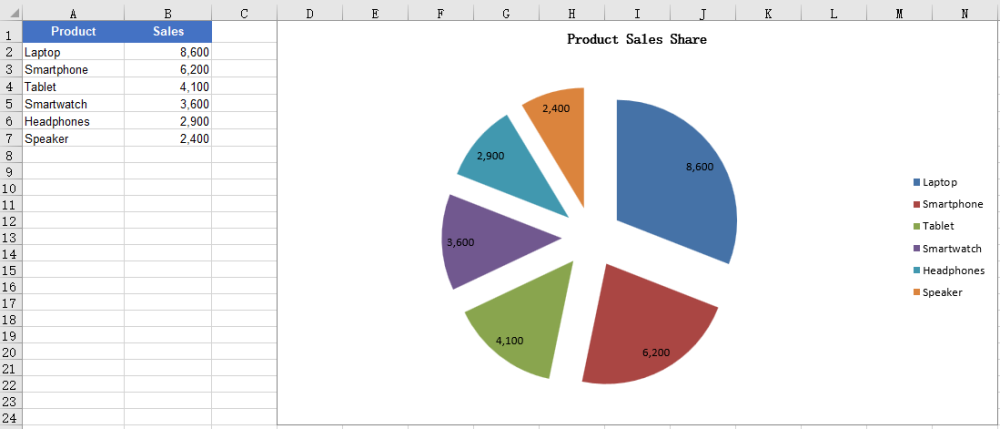
After running the code, you can see the effect of the exploded pie chart:
Create an Exploded Doughnut Chart
A doughnut chart is similar to a pie chart, but it has a hole in the center and can also show the proportion of each part in the whole. An exploded doughnut chart further pulls the slices apart. To create an exploded doughnut chart, follow these steps:
- Create a
Workbookobject and use theLoadFromFile()method to load the Excel file that contains the data. - Use the
Workbook.Worksheets.get()method to get the worksheet that contains the data. - Call the
Charts.Add()method to add a chart and set theChartTypetoExcelChartType.DoughnutExploded. - Use the
Series.CategoryLabelsandSeries.Valuesproperties to specify the categories and values of the chart. - Set properties such as the chart title, position and data labels.
- Use the
Workbook.SaveToFile()method to save the workbook.
Here is a complete code example showing how to create an exploded doughnut chart from the product sales data in a worksheet in React:
function App() {
  const createExplodedDoughnutChart = async () => {
    // Get the Spire.XLS WASM module
    const xlsModule = window.wasmModule?.spirexls;

    // Check whether the module is ready
    if (!xlsModule) {
      alert('Spire.Xls is not ready yet');
      return;
    }

    // Load the font and Excel file into the VFS
    await window.spire.FetchFileToVFS('ARIAL.TTF', '/Library/Fonts/', `${process.env.PUBLIC_URL}/font/`);
    const inputFileName = 'SalesData.xlsx';
    await window.spire.FetchFileToVFS(inputFileName, '', `${process.env.PUBLIC_URL}data/`);

    // Load the workbook and get the worksheet that contains the data
    const workbook = new xlsModule.Workbook();
    workbook.LoadFromFile({ fileName: inputFileName });
    const sheet = workbook.Worksheets.get(0);

    // Add a chart and set its chart type to an exploded doughnut chart
    const chart = sheet.Charts.Add();
    chart.ChartType = xlsModule.ExcelChartType.DoughnutExploded;

    // Set the data range and the title of the chart
    chart.DataRange = sheet.Range.get("B2:B7");
    chart.SeriesDataFromRange = false;
    chart.ChartTitle = "Sales Share by Product";
    chart.ChartTitleArea.IsBold = true;
    chart.ChartTitleArea.Size = 12;

    // Set the category labels and the values of the chart, and show the value labels
    const cs = chart.Series.get(0);
    cs.CategoryLabels = sheet.Range.get("A2:A7");
    cs.Values = sheet.Range.get("B2:B7");
    cs.DataPoints.DefaultDataPoint.DataLabels.HasValue = true;

    // Set the position of the chart
    chart.LeftColumn = 4;
    chart.TopRow = 1;
    chart.RightColumn = 15;
    chart.BottomRow = 25;

    // Hide the background of the plot area and set the position of the legend
    chart.PlotArea.Fill.Visible = false;
    chart.Legend.Position = xlsModule.LegendPositionType.Right;

    // Save the document
    const outputFileName = 'ExplodedDoughnutChart_output.xlsx';
    workbook.SaveToFile({ fileName: outputFileName });

    // Release resources
    workbook.Dispose();

    // Read the converted file from the VFS and trigger a download
    const fileArray = window.dotnetRuntime.Module.FS.readFile(outputFileName);
    const blob = new Blob([fileArray], { type: 'application/vnd.openxmlformats-officedocument.spreadsheetml.sheet' });
    const url = URL.createObjectURL(blob);
    const a = document.createElement('a');
    a.href = url;
    a.download = outputFileName;
    a.click();
    URL.revokeObjectURL(url);
  };

  return (
    <div style={{ textAlign: 'center', height: '300px' }}>
      <h1>Create Exploded Doughnut Chart</h1>
      <button onClick={createExplodedDoughnutChart}>
        Start
      </button>
    </div>
  );
}

export default App;
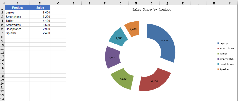
After running the code, you can see the effect of the exploded doughnut chart:
FAQ
The created chart is blank with no slices
Cause: The chart has no valid data series. For example, the DataRange or Values points to an empty range or a range without numbers, so the chart has no data to draw.
Solution: Assign a data range that contains the data to the chart, for example:
chart.DataRange = sheet.Range.get("A1:B7");

const cs = chart.Series.get(0);
cs.CategoryLabels = sheet.Range.get("A2:A7");
cs.Values = sheet.Range.get("B2:B7");
Want to show percentages instead of values in the data labels
Cause: Pie and doughnut charts are usually used to show proportions, but the data labels show values by default, or the percentage labels are not enabled.
Solution: Disable the value labels and enable the percentage labels, for example:
const cs = chart.Series.get(0);
cs.DataPoints.DefaultDataPoint.DataLabels.HasValue = false;
cs.DataPoints.DefaultDataPoint.DataLabels.HasPercentage = true;
Obtain a Free License
Spire.XLS for JavaScript offers a 30-day full-featured free trial license with no functional limitations. Apply here to evaluate before purchasing.
