Adding charts to Excel files is one of the most common data visualization requirements in web applications. Spire.XLS for JavaScript runs entirely in the browser via WebAssembly, using a virtual file system (VFS) to manage input and output files — no backend server required. It supports creating a wide variety of chart types, including column charts, pie charts, doughnut charts, line charts, scatter charts, and more.
This article covers three core features:
For installation and project setup, refer to Integrating Spire.XLS for JavaScript in a React Project. The examples below assume Spire.XLS is installed and the WebAssembly module is initialized.
Create a Column Chart
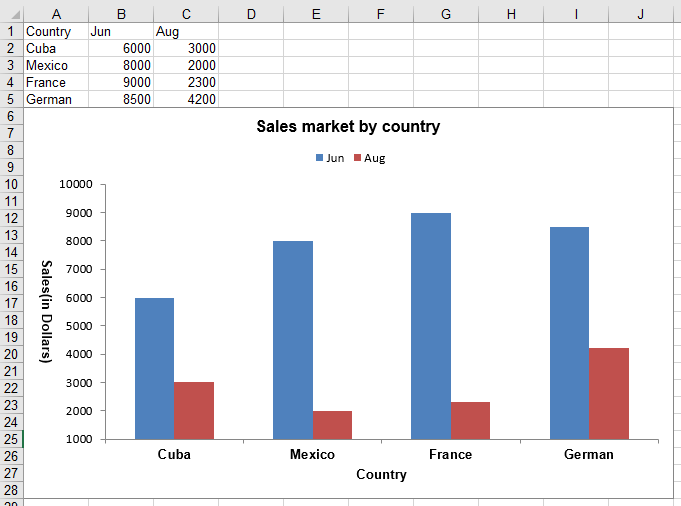
Column charts are one of the most commonly used chart types for comparing values across categories. With Spire.XLS for JavaScript, you can create a clustered column chart by first populating a worksheet with data, then adding a chart object, setting the chart type to ColumnClustered, and configuring the chart title, axes, and data labels. The steps are as follows:
- Create a
Workbookobject and get the default worksheet. - Populate the worksheet with category labels and numeric data.
- Add a chart to the worksheet using
sheet.Charts.Add(). - Set the chart's
DataRangeto the data range and specify the chart type asExcelChartType.ColumnClustered. - Configure the chart position, title, axis titles, and legend.
- Save the workbook to an Excel file using
SaveToFile().
Below is a complete code example demonstrating how to create a clustered column chart in React:
function App() {
  const createColumnChart = async () => {
    // Get the Spire.XLS WASM module
    const xlsModule = window.wasmModule?.spirexls;

    // Check if the module is ready
    if (!xlsModule) {
      alert('Spire.Xls is not ready yet');
      return;
    }

    // Create a new workbook and get the default worksheet
    const workbook = new xlsModule.Workbook();
    const sheet = workbook.Worksheets.get(0);
    sheet.Name = "ClusteredColumn";

    // Populate chart data
    sheet.Range.get("A1").Value = "Country";
    sheet.Range.get("A2").Value = "Cuba";
    sheet.Range.get("A3").Value = "Mexico";
    sheet.Range.get("A4").Value = "France";
    sheet.Range.get("A5").Value = "German";

    sheet.Range.get("B1").Value = "Jun";
    sheet.Range.get("B2").NumberValue = 6000;
    sheet.Range.get("B3").NumberValue = 8000;
    sheet.Range.get("B4").NumberValue = 9000;
    sheet.Range.get("B5").NumberValue = 8500;

    sheet.Range.get("C1").Value = "Aug";
    sheet.Range.get("C2").NumberValue = 3000;
    sheet.Range.get("C3").NumberValue = 2000;
    sheet.Range.get("C4").NumberValue = 2300;
    sheet.Range.get("C5").NumberValue = 4200;

    // Add a chart and set its data range
    const chart = sheet.Charts.Add();
    chart.DataRange = sheet.Range.get("A1:C5");
    chart.SeriesDataFromRange = false;

    // Set the chart position
    chart.LeftColumn = 1;
    chart.TopRow = 6;
    chart.RightColumn = 11;
    chart.BottomRow = 29;

    // Set the chart type to clustered column
    chart.ChartType = xlsModule.ExcelChartType.ColumnClustered;

    // Configure chart title
    chart.ChartTitle = "Sales market by country";
    chart.ChartTitleArea.IsBold = true;
    chart.ChartTitleArea.Size = 12;

    // Configure axis titles
    chart.PrimaryCategoryAxis.Title = "Country";
    chart.PrimaryCategoryAxis.Font.IsBold = true;
    chart.PrimaryCategoryAxis.TitleArea.IsBold = true;

    chart.PrimaryValueAxis.Title = "Sales(in Dollars)";
    chart.PrimaryValueAxis.HasMajorGridLines = false;
    chart.PrimaryValueAxis.MinValue = 1000;
    chart.PrimaryValueAxis.TitleArea.IsBold = true;
    chart.PrimaryValueAxis.TitleArea.TextRotationAngle = 90;

    // Configure data labels: show numeric value on each data point
    for (let i = 0; i < chart.Series.Length; i++) {
      let cs = chart.Series.get(i);
      cs.Format.Options.IsVaryColor = true;
      cs.DataPoints.DefaultDataPoint.DataLabels.HasValue = true; // Show value labels
    }

    // Set legend position
    chart.Legend.Position = xlsModule.LegendPositionType.Top;

    // Save the workbook
    const outputFileName = 'ClusteredColumn.xlsx';
    workbook.SaveToFile(outputFileName);
    workbook.Dispose();

    // Read the file from VFS and trigger download
    const fileArray = window.dotnetRuntime.Module.FS.readFile(outputFileName);
    const blob = new Blob([fileArray], { type: 'application/vnd.openxmlformats-officedocument.spreadsheetml.sheet' });
    const url = URL.createObjectURL(blob);
    const a = document.createElement('a');
    a.href = url;
    a.download = outputFileName;
    a.click();
    URL.revokeObjectURL(url);
  };

  return (
    <div style={{ textAlign: 'center', height: '300px' }}>
      <h1>Create Clustered Column Chart</h1>
      <button onClick={createColumnChart}>
        Generate
      </button>
    </div>
  );
}

export default App;
Clustered column chart created with Spire.XLS for JavaScript
Create a Pie Chart
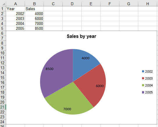
Pie charts are ideal for displaying the proportional distribution of data across categories. With Spire.XLS for JavaScript, you can create a pie chart by specifying the chart type as Pie when adding the chart, then binding category labels and data values. The steps are as follows:
- Create a
Workbookobject and get the default worksheet. - Populate the worksheet with category labels and numeric values.
- Add a chart with
ExcelChartType.Pieusingsheet.Charts.Add(). - Set the chart data range and bind category labels and values.
- Configure the chart position, title, and data labels.
- Save the workbook to an Excel file using
SaveToFile().
Below is a complete code example demonstrating how to create a pie chart in React:
function App() {
  const createPieChart = async () => {
    // Get the Spire.XLS WASM module
    const xlsModule = window.wasmModule?.spirexls;

    // Check if the module is ready
    if (!xlsModule) {
      alert('Spire.Xls is not ready yet');
      return;
    }

    // Create a new workbook and get the default worksheet
    const workbook = new xlsModule.Workbook();
    let sheet = workbook.Worksheets.get(0);
    sheet.Name = "Pie Chart";

    // Populate chart data
    sheet.Range.get("A1").Value = "Year";
    sheet.Range.get("A2").Value = "2002";
    sheet.Range.get("A3").Value = "2003";
    sheet.Range.get("A4").Value = "2004";
    sheet.Range.get("A5").Value = "2005";

    sheet.Range.get("B1").Value = "Sales";
    sheet.Range.get("B2").NumberValue = 4000;
    sheet.Range.get("B3").NumberValue = 6000;
    sheet.Range.get("B4").NumberValue = 7000;
    sheet.Range.get("B5").NumberValue = 8500;

    // Add a pie chart
    let chart = sheet.Charts.Add({ chartType: xlsModule.ExcelChartType.Pie });
    chart.DataRange = sheet.Range.get("B2:B5");
    chart.SeriesDataFromRange = false;

    // Set the chart position
    chart.LeftColumn = 1;
    chart.TopRow = 6;
    chart.RightColumn = 9;
    chart.BottomRow = 25;

    // Configure chart title
    chart.ChartTitle = "Sales by year";
    chart.ChartTitleArea.IsBold = true;
    chart.ChartTitleArea.Size = 12;

    // Bind category labels and values
    let cs = chart.Series.get(0);
    cs.CategoryLabels = sheet.Range.get("A2:A5");
    cs.Values = sheet.Range.get("B2:B5");
    cs.DataPoints.DefaultDataPoint.DataLabels.HasValue = true; // Show value labels

    chart.PlotArea.Fill.Visible = false;

    // Save the workbook
    const outputFileName = 'Pie.xlsx';
    workbook.SaveToFile(outputFileName);
    workbook.Dispose();

    // Read the file from VFS and trigger download
    const fileArray = window.dotnetRuntime.Module.FS.readFile(outputFileName);
    const blob = new Blob([fileArray], { type: 'application/vnd.openxmlformats-officedocument.spreadsheetml.sheet' });
    const url = URL.createObjectURL(blob);
    const a = document.createElement('a');
    a.href = url;
    a.download = outputFileName;
    a.click();
    URL.revokeObjectURL(url);
  };

  return (
    <div style={{ textAlign: 'center', height: '300px' }}>
      <h1>Create Pie Chart</h1>
      <button onClick={createPieChart}>
        Generate
      </button>
    </div>
  );
}

export default App;
Pie chart created with Spire.XLS for JavaScript
Create a Doughnut Chart
A doughnut chart is similar to a pie chart but with a hollow center, which can display multiple data series. With Spire.XLS for JavaScript, you can create a doughnut chart by setting the chart type to Doughnut and configuring percentage data labels. The steps are as follows:
- Create a
Workbookobject and get the default worksheet. - Populate the worksheet with category labels and numeric values.
- Add a chart and set its
ChartTypetoExcelChartType.Doughnut. - Configure the chart position, title, and percentage data labels.
- Save the workbook to an Excel file using
SaveToFile().
Below is a complete code example demonstrating how to create a doughnut chart in React:
function App() {
  const createDoughnutChart = async () => {
    // Get the Spire.XLS WASM module
    const xlsModule = window.wasmModule?.spirexls;

    // Check if the module is ready
    if (!xlsModule) {
      alert('Spire.Xls is not ready yet');
      return;
    }

    // Create a new workbook and get the default worksheet
    const workbook = new xlsModule.Workbook();
    let sheet = workbook.Worksheets.get(0);

    // Populate chart data
    sheet.Range.get("A1").Value = "Country";
    sheet.Range.get("A1").Style.Font.IsBold = true;
    sheet.Range.get("A2").Value = "Cuba";
    sheet.Range.get("A3").Value = "Mexico";
    sheet.Range.get("A4").Value = "France";
    sheet.Range.get("A5").Value = "German";
    sheet.Range.get("B1").Value = "Sales";
    sheet.Range.get("B1").Style.Font.IsBold = true;
    sheet.Range.get("B2").NumberValue = 6000;
    sheet.Range.get("B3").NumberValue = 8000;
    sheet.Range.get("B4").NumberValue = 9000;
    sheet.Range.get("B5").NumberValue = 8500;

    // Add a doughnut chart
    let chart = sheet.Charts.Add();
    chart.ChartType = xlsModule.ExcelChartType.Doughnut;
    chart.DataRange = sheet.Range.get("A1:B5");
    chart.SeriesDataFromRange = false;

    // Set the chart position
    chart.LeftColumn = 4;
    chart.TopRow = 2;
    chart.RightColumn = 12;
    chart.BottomRow = 22;

    // Configure chart title
    chart.ChartTitle = "Market share by country";
    chart.ChartTitleArea.IsBold = true;
    chart.ChartTitleArea.Size = 12;

    // Show percentage data labels
    for (let i = 0; i < chart.Series.Count; i++) {
      chart.Series.get(i).DataPoints.DefaultDataPoint.DataLabels.HasPercentage = true;
    }

    // Set legend position
    chart.Legend.Position = xlsModule.LegendPositionType.Top;

    // Save the workbook
    const outputFileName = 'CreateDoughnutChart.xlsx';
    workbook.SaveToFile(outputFileName);
    workbook.Dispose();

    // Read the file from VFS and trigger download
    const fileArray = window.dotnetRuntime.Module.FS.readFile(outputFileName);
    const blob = new Blob([fileArray], { type: 'application/vnd.openxmlformats-officedocument.spreadsheetml.sheet' });
    const url = URL.createObjectURL(blob);
    const a = document.createElement('a');
    a.href = url;
    a.download = outputFileName;
    a.click();
    URL.revokeObjectURL(url);
  };

  return (
    <div style={{ textAlign: 'center', height: '300px' }}>
      <h1>Create Doughnut Chart</h1>
      <button onClick={createDoughnutChart}>
        Generate
      </button>
    </div>
  );
}

export default App;
Doughnut chart created with Spire.XLS for JavaScript
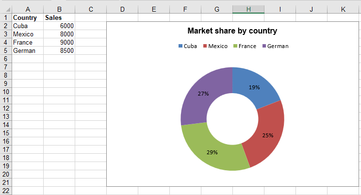
Chart Type Reference
The examples above covered column charts, pie charts, and doughnut charts. In addition, Spire.XLS supports all standard Excel chart types, which are defined in the Spire.Xls.ExcelChartType enumeration. The complete list of 81 chart types is as follows:
| Chart Type | Description |
|---|---|
| 1. ColumnClustered | Represents Clustered Column Chart |
| 2. ColumnStacked | Represents Stacked Column Chart |
| 3. Column100PercentStacked | Represents 100% Stacked Column Chart |
| 4. Column3DClustered | Represents 3D Clustered Column Chart |
| 5. Column3DStacked | Represents 3D Stacked Column Chart |
| 6. Column3D100PercentStacked | Represents 3D 100% Stacked Column Chart |
| 7. Column3D | Represents 3D Column Chart |
| 8. BarClustered | Represents Clustered Bar Chart |
| 9. BarStacked | Represents Stacked Bar Chart |
| 10. Bar100PercentStacked | Represents 100% Stacked Bar Chart |
| 11. Bar3DClustered | Represents 3D Clustered Bar Chart |
| 12. Bar3DStacked | Represents 3D Stacked Bar Chart |
| 13. Bar3D100PercentStacked | Represents 100% 3D Stacked Bar Chart |
| 14. Line | Represents Line Chart |
| 15. LineStacked | Represents Stacked Line Chart |
| 16. Line100PercentStacked | Represents 100% Stacked Line Chart |
| 17. LineMarkers | Represents Markers Line Chart |
| 18. LineMarkersStacked | Represents Stacked Markers Line Chart |
| 19. LineMarkers100PercentStacked | Represents 100% Stacked Markers Line Chart |
| 20. Line3D | Represents 3D Line Chart |
| 21. Pie | Represents Pie Chart |
| 22. Pie3D = 21 | Represents 3D Pie Chart |
| 23. PieOfPie | Represents Pie of Pie chart |
| 24. PieExploded | Represents Exploded Pie Chart |
| 25. Pie3DExploded | Represents 3D Exploded Pie Chart |
| 26. PieBar | Represents Bar Pie Chart |
| 27. ScatterMarkers | Represents Markers Scatter Chart |
| 28. ScatterSmoothedLineMarkers | Represents ScatterSmoothedLineMarkers Chart |
| 29. ScatterSmoothedLine | Represents ScatterSmoothedLine Chart |
| 30. ScatterLineMarkers | Represents ScatterLineMarkers Chart |
| 31. ScatterLine | Represents ScatterLine Chart |
| 32. Area | Represents Area Chart |
| 33. AreaStacked | Represents AreaStacked Chart |
| 34. Area100PercentStacked | Represents Area100PercentStacked Chart |
| 35. Area3D | Represents Area3D Chart |
| 36. Area3DStacked | Represents Area3DStacked Chart |
| 37. Area3D100PercentStacked | Represents Area3D100PercentStacked Chart |
| 38. Doughnut | Represents Doughnut Chart |
| 39. DoughnutExploded | Represents DoughnutExploded Chart |
| 40. Radar | Represents Radar Chart |
| 41. RadarMarkers | Represents RadarMarkers Chart |
| 42. RadarFilled | Represents RadarFilled Chart |
| 43. Surface3D | Represents Surface3D Chart |
| 44. Surface3DNoColor | Represents Surface3DNoColor Chart |
| 45. SurfaceContour | Represents SurfaceContour Chart |
| 46. SurfaceContourNoColor | Represents SurfaceContourNoColor Chart |
| 47. Bubble | Represents Bubble Chart |
| 48. Bubble3D | Represents Bubble3D Chart |
| 49. StockHighLowClose | Represents StockHighLowClose Chart |
| 50. StockOpenHighLowClose | Represents StockOpenHighLowClose Chart |
| 51. StockVolumeHighLowClose | Represents StockVolumeHighLowClose Chart |
| 52. StockVolumeOpenHighLowClose | Represents StockVolumeOpenHighLowClose Chart |
| 53. CylinderClustered | Represents CylinderClustered Chart |
| 54. CylinderStacked | Represents CylinderStacked Chart |
| 55. Cylinder100PercentStacked | Represents Cylinder100PercentStacked Chart |
| 56. CylinderBarClustered | Represents CylinderBarClustered Chart |
| 57. CylinderBarStacked | Represents CylinderBarStacked Chart |
| 58. CylinderBar100PercentStacked | Represents CylinderBar100PercentStacked Chart |
| 59. Cylinder3DClustered | Represents Cylinder3DClustered Chart |
| 60. ConeClustered | Represents ConeClustered Chart |
| 61. ConeStacked | Represents ConeStacked Chart |
| 62. Cone100PercentStacked | Represents Cone100PercentStacked Chart |
| 63. ConeBarClustered | Represents ConeBarClustered Chart |
| 64. ConeBarStacked | Represents ConeBarStacked Chart |
| 65. ConeBar100PercentStacked | Represents ConeBar100PercentStacked Chart |
| 66. Cone3DClustered | Represents Cone3DClustered Chart |
| 67. PyramidClustered | Represents PyramidClustered Chart |
| 68. PyramidStacked | Represents PyramidStacked Chart |
| 69. Pyramid100PercentStacked | Represents Pyramid100PercentStacked Chart |
| 70. PyramidBarClustered | Represents PyramidBarClustered Chart |
| 71. PyramidBarStacked | Represents PyramidBarStacked Chart |
| 72. PyramidBar100PercentStacked | Represents PyramidBar100PercentStacked Chart |
| 73. Pyramid3DClustered | Represents Pyramid3DClustered Chart |
| 74. CombinationChart | Represents Combination Chart |
| 75. Funnel | Represents Funnel Chart |
| 76. WaterFall | Represents Waterfall Chart |
| 77. BoxAndWhisker | Represents Box and Whisker Chart |
| 78. Histogram | Represents Histogram Chart |
| 79. Pareto | Represents Pareto Chart |
| 80. TreeMap | Represents Tree Map Chart |
| 81. SunBurst | Represents Sunburst Chart |
FAQ
How to show values or percentages on pie/doughnut chart labels
Solution: Choose the appropriate label property based on your needs:
// Show value labels
cs.DataPoints.DefaultDataPoint.DataLabels.HasValue = true; // Show value labels
// Or show percentage labels
cs.DataPoints.DefaultDataPoint.DataLabels.HasPercentage = true;
Legend in the generated Excel file is truncated or not fully displayed
Cause: The chart area is too small to accommodate all legend items, or the legend position setting causes overlap with the chart data area.
Solution: Increase the vertical range of the chart or adjust the legend position:
// Increase chart height
chart.BottomRow = 35;
// Or adjust legend position
chart.Legend.Position = xlsModule.LegendPositionType.Bottom;
Get a Free License
Spire.XLS for JavaScript offers a 30-day full-featured free trial license with no functional limitations. Apply here to evaluate before purchasing.
