
Knowledgebase (2370)
Children categories
Word documents often contain valuable data in the form of tables, which can be used for reporting, data analysis, and record-keeping. However, manually extracting and transferring these tables to other formats can be a time-consuming and error-prone task. By automating this process using Python, we can save time, ensure accuracy, and maintain consistency. Spire.Doc for Python provides a seamless solution for the table extraction task, making it effortless to create accessible and manageable files with data from Word document tables. This article will demonstrate how to leverage Spire.Doc for Python to extract tables from Word documents and write them into text files and Excel worksheets.
- Extract Tables from Word Documents to Text Files with Python
- Extract Tables from Word Documents to Excel Workbooks with Python
Install Spire.Doc for Python
This scenario requires Spire.Doc for Python and plum-dispatch v1.7.4. They can be easily installed in your Windows through the following pip command.
pip install Spire.Doc
If you are unsure how to install, please refer to: How to Install Spire.Doc for Python on Windows
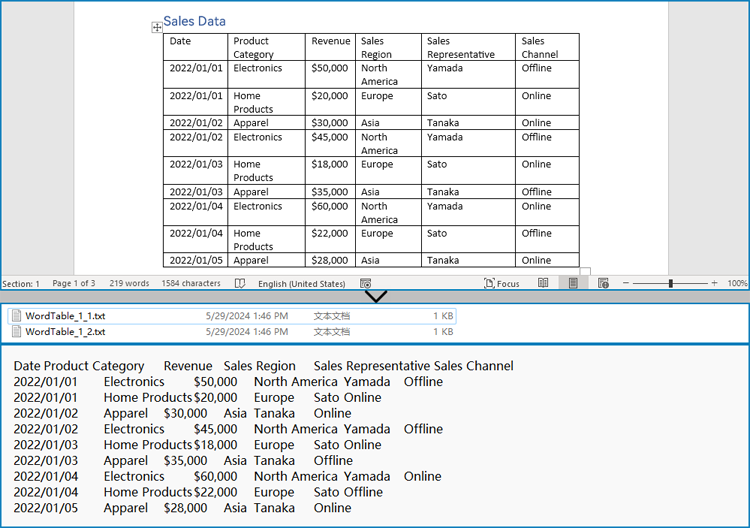
Extract Tables from Word Documents to Text Files with Python
Spire.Doc for Python offers the Section.Tables property to retrieve a collection of tables within a section of a Word document. Then, developers can use the properties and methods under the ITable class to access the data in the tables and write it into a text file. This provides a convenient solution for converting Word document tables into text files.
The detailed steps for extracting tables from Word documents to text files are as follows:
- Create an object of Document class and load a Word document using Document.LoadFromFile() method.
- Iterate through the sections in the document and get the table collection of each section through Section.Tables property.
- Iterate through the tables and create a string object for each table.
- Iterate through the rows in each table and the cells in each row, get the text of each cell through TableCell.Paragraphs[].Text property, and add the cell text to the string.
- Save each string to a text file.
- Python
from spire.doc import *
from spire.doc.common import *

# Create an instance of Document
doc = Document()

# Load a Word document
doc.LoadFromFile("Sample.docx")

# Loop through the sections
for s in range(doc.Sections.Count):
    # Get a section
    section = doc.Sections.get_Item(s)
    # Get the tables in the section
    tables = section.Tables
    # Loop through the tables
    for i in range(0, tables.Count):
        # Get a table
        table = tables.get_Item(i)
        # Initialize a string to store the table data
        tableData = ''
        # Loop through the rows of the table
        for j in range(0, table.Rows.Count):
            # Loop through the cells of the row
            for k in range(0, table.Rows.get_Item(j).Cells.Count):
                # Get a cell
                cell = table.Rows.get_Item(j).Cells.get_Item(k)
                # Get the text in the cell
                cellText = ''
                for para in range(cell.Paragraphs.Count):
                    paragraphText = cell.Paragraphs.get_Item(para).Text
                    cellText += (paragraphText + ' ')
                # Add the text to the string
                tableData += cellText
                if k < table.Rows.get_Item(j).Cells.Count - 1:
                    tableData += '\t'
            # Add a new line
            tableData += '\n'

        # Save the table data to a text file
        with open(f'output/Tables/WordTable_{s+1}_{i+1}.txt', 'w', encoding='utf-8') as f:
            f.write(tableData)
doc.Close()
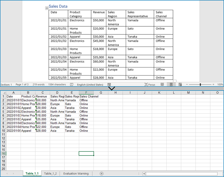
Extract Tables from Word Documents to Excel Workbooks with Python
Developers can also utilize Spire.Doc for Python to retrieve table data and then use Spire.XLS for Python to write the table data into an Excel worksheet, thereby enabling the conversion of Word document tables into Excel workbooks.
Install Spire.XLS for Python via PyPI:
pip install Spire.XLS
The detailed steps for extracting tables from Word documents to Excel workbooks are as follows:
- Create an object of Document class and load a Word document using Document.LoadFromFile() method.
- Create an object of Workbook class and clear the default worksheets using Workbook.Worksheets.Clear() method.
- Iterate through the sections in the document and get the table collection of each section through Section.Tables property.
- Iterate through the tables and create a worksheet for each table using Workbook.Worksheets.Add() method.
- Iterate through the rows in each table and the cells in each row, get the text of each cell through TableCell.Paragraphs[].Text property, and write the text to the worksheet using Worksheet.SetCellValue() method.
- Save the workbook using Workbook.SaveToFile() method.
- Python
from spire.doc import *
from spire.doc.common import *
from spire.xls import *
from spire.xls.common import *

# Create an instance of Document
doc = Document()

# Load a Word document
doc.LoadFromFile('Sample.docx')

# Create an instance of Workbook
wb = Workbook()
wb.Worksheets.Clear()

# Loop through sections in the document
for i in range(doc.Sections.Count):
    # Get a section
    section = doc.Sections.get_Item(i)
    # Loop through tables in the section
    for j in range(section.Tables.Count):
        # Get a table
        table = section.Tables.get_Item(j)
        # Create a worksheet
        ws = wb.Worksheets.Add(f'Table_{i+1}_{j+1}')
        # Write the table to the worksheet
        for row in range(table.Rows.Count):
            # Get a row
            tableRow = table.Rows.get_Item(row)
            # Loop through cells in the row
            for cell in range(tableRow.Cells.Count):
                # Get a cell
                tableCell = tableRow.Cells.get_Item(cell)
                # Get the text in the cell
                cellText = ''
                for paragraph in range(tableCell.Paragraphs.Count):
                    paragraph = tableCell.Paragraphs.get_Item(paragraph)
                    cellText = cellText + (paragraph.Text + ' ')
                # Write the cell text to the worksheet
                ws.SetCellValue(row + 1, cell + 1, cellText)

# Save the workbook
wb.SaveToFile('output/Tables/WordTableToExcel.xlsx', FileFormat.Version2016)
doc.Close()
wb.Dispose()
Apply for a Temporary License
If you'd like to remove the evaluation message from the generated documents, or to get rid of the function limitations, please request a 30-day trial license for yourself.
Reordering columns or rows in Excel is a simple process that allows you to change the arrangement of data within your spreadsheet. This can be useful for better organizing your data or aligning it with other columns or rows. You can reorder by using drag-and-drop, cut and paste, or keyboard shortcuts depending on the version of Excel you are using.
This article focus on introducing how to programmatically reorder columns or rows in an Excel worksheet in Python using Spire.XLS for Python.
Install Spire.XLS for Python
This scenario requires Spire.XLS for Python and plum-dispatch v1.7.4. They can be easily installed in your system through the following pip command.
pip install Spire.XLS
If you are unsure how to install, please refer to this tutorial: How to Install Spire.XLS for Python on Windows
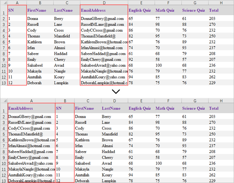
Reorder Columns in Excel in Python
Spire.XLS does not provide a straightforward way to reorganize the order of columns or rows within an Excel worksheet. The solution requires creating a duplicate of the target worksheet. Then, you can copy the columns or rows from the copied worksheet and paste them into the original worksheet in the new preferred column or row sequence.
The following are the steps to reorder columns in an Excel worksheet using Python.
- Create a Workbook object.
- Load an Excel document from the specified file path.
- Get the target worksheet using Workbook.Worksheets[index] property.
- Specify the new column order within a list.
- Create a temporary sheet and copy the data from the target sheet into it.
- Copy the columns from the temporary worksheet to the target worksheet in the desired order using Worksheet.Columns[index].Copy() method.
- Remove the temporary sheet.
- Save the workbook to a different Excel document.
- Python
from spire.xls import *
from spire.xls.common import *

# Create a Workbook object
workbook = Workbook()

# Load the Excel document
workbook.LoadFromFile("C:\\Users\\Administrator\\Desktop\\Input.xlsx")

# Get a specific worksheet
targetSheet = workbook.Worksheets[0]

# Specify the new column order in a list (the column index starts from 0)
newColumnOrder = [3, 0, 1, 2, 4, 5 ,6, 7]

# Add a temporary worksheet
tempSheet = workbook.Worksheets.Add("temp")

# Copy data from the target worksheet to the temporary sheet
tempSheet.CopyFrom(targetSheet)

# Iterate through the newColumnOrder list
for i in range(len(newColumnOrder)):

    # Copy the column from the temporary sheet to the target sheet in the new order
    tempSheet.Columns[newColumnOrder[i]].Copy(targetSheet.Columns[i], True, True)

    # Reset the column width in the target sheet
    targetSheet.Columns[i].ColumnWidth = tempSheet.Columns[newColumnOrder[i]].ColumnWidth

# Remove the temporary sheet
workbook.Worksheets.Remove(tempSheet)

# Save the workbook to another Excel file
workbook.SaveToFile("output/ReorderColumns.xlsx", FileFormat.Version2016)

# Dispose resources
workbook.Dispose()
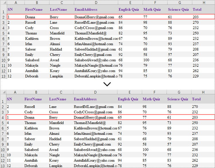
Reorder Rows in Excel in Python
Rearranging the rows in an Excel spreadsheet follows a similar approach to reorganizing the columns. The steps to reorder the rows within an Excel worksheet are as outlined below.
- Create a Workbook object.
- Load an Excel document from the specified file path.
- Get the target worksheet using Workbook.Worksheets[index] property.
- Specify the new row order within a list.
- Create a temporary sheet and copy the data from the target sheet into it.
- Copy the rows from the temporary worksheet to the target worksheet in the desired order using Worksheet.Rows[index].Copy() method.
- Remove the temporary sheet.
- Save the workbook to a different Excel document.
- Python
from spire.xls import *
from spire.xls.common import *

# Create a Workbook object
workbook = Workbook()

# Load the Excel document
workbook.LoadFromFile("C:\\Users\\Administrator\\Desktop\\Input.xlsx")

# Get a specific worksheet
targetSheet = workbook.Worksheets[0]

# Specify the new row order in a list (the row index starts from 0)
newRowOrder = [0, 2, 3, 1, 4, 5 ,6, 7, 8, 9, 10, 11, 12]

# Add a temporary worksheet
tempSheet = workbook.Worksheets.Add("temp")

# Copy data from the first worksheet to the temporary sheet
tempSheet.CopyFrom(targetSheet)

# Iterate through the newRowOrder list
for i in range(len(newRowOrder)):

    # Copy the row from the temporary sheet to the target sheet in the new order
    tempSheet.Rows[newRowOrder[i]].Copy(targetSheet.Rows[i], True, True)

    # Reset the row height in the target sheet
    targetSheet.Rows[i].RowHeight = tempSheet.Rows[newRowOrder[i]].RowHeight

# Remove the temporary sheet
workbook.Worksheets.Remove(tempSheet)

# Save the workbook to another Excel file
workbook.SaveToFile("output/ReorderRows.xlsx", FileFormat.Version2016)

# Dispose resources
workbook.Dispose()
Apply for a Temporary License
If you'd like to remove the evaluation message from the generated documents, or to get rid of the function limitations, please request a 30-day trial license for yourself.
Markdown is a popular format among writers and developers for its simplicity and readability, allowing content to be formatted using easy-to-write plain text syntax. However, converting Markdown files to universally accessible formats like Word documents and PDF files is essential for sharing documents with readers, enabling complex formatting, and ensuring capability and consistency across devices and platforms. This article demonstrates how to convert Markdown files to Word and PDF files with the powerful library Spire.Doc for Java, enhancing the versatility and distribution potential of your written content.
- Convert a Markdown File to a Word Document with Java
- Convert a Markdown File to a PDF Document with Java
- Customizing Page Settings of the Result Document
Install Spire.Doc for Java
First of all, you're required to add the Spire.Doc.jar file as a dependency in your Java program. The JAR file can be downloaded from this link. If you use Maven, you can easily import the JAR file in your application by adding the following code to your project's pom.xml file.
<repositories>
    <repository>
        <id>com.e-iceblue</id>
        <name>e-iceblue</name>
        <url>https://repo.e-iceblue.com/nexus/content/groups/public/</url>
    </repository>
</repositories>
<dependencies>
    <dependency>
        <groupId>e-iceblue</groupId>
        <artifactId>spire.doc</artifactId>
        <version>14.7.0</version>
    </dependency>
</dependencies>
Convert a Markdown File to a Word Document with Java
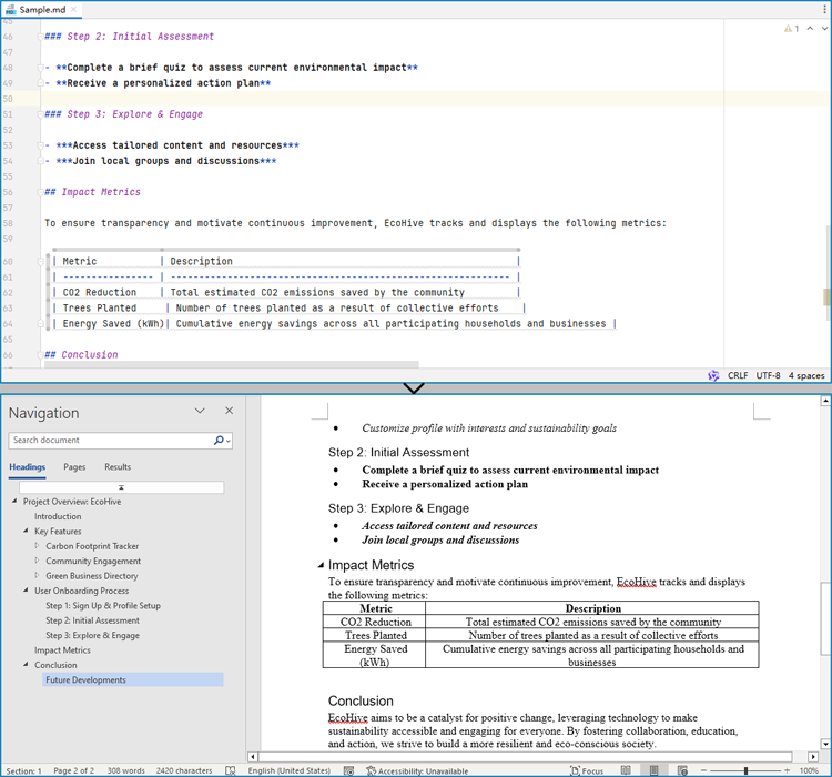
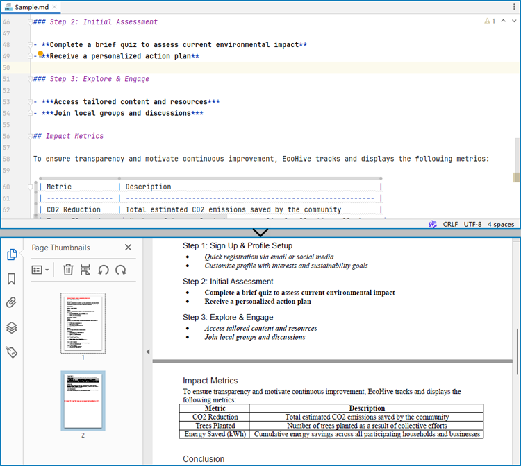
Spire.Doc for Java provides a simple way to convert Markdown format to Word and PDF document formats by using the Document.loadFromFile(String: fileName, FileFormat.Markdown) method to load the Markdown file and the Document.saveToFile(String: fileName, FileFormat: fileFormat) method to save the file as a Word or PDF document.
It should be noted that since images are stored as links in Markdown files, they need to be further processed after conversion if they are to be retained.
The detailed steps for converting a Markdown file to a Word document are as follows:
- Create an instance of Document class.
- Load a Markdown file using Document.loadFromFile(String: fileName, FileFormat.Markdown) method.
- Save the Markdown file as Word document using Document.saveToFile(String: fileName, FileFormat.Docx) method.
- Java
import com.spire.doc.Document;
import com.spire.doc.FileFormat;

public class MarkdownToWord {
    public static void main(String[] args) {
        // Create an instance of Document
        Document doc = new Document();

        // Load a Markdown file
        doc.loadFromFile("Sample.md", FileFormat.Markdown);

        // Save the Markdown file as Word document
        doc.saveToFile("output/MarkdownToWord.docx", FileFormat.Docx);
        doc.dispose();
    }
}
Convert a Markdown File to a PDF Document with Java
By using the FileFormat.PDF Enum as the format parameter of the Document.saveToFile() method, the Markdown file can be directly converted to a PDF document.
The detailed steps for converting a Markdown file to a PDF document are as follows:
- Create an instance of Document class.
- Load a Markdown file using Document.loadFromFile(String: fileName, FileFormat.Markdown) method.
- Save the Markdown file as PDF document using Document.saveToFile(String: fileName, FileFormat.PDF) method.
- Java
import com.spire.doc.Document;
import com.spire.doc.FileFormat;

public class MarkdownToPDF {
    public static void main(String[] args) {
        // Create an instance of the Document class
        Document doc = new Document();

        // Load a Markdown file
        doc.loadFromFile("Sample.md");

        // Save the Markdown file as a PDF file
        doc.saveToFile("output/MarkdownToPDF.pdf", FileFormat.PDF);
        doc.dispose();
    }
}
Customizing Page Settings of the Result Document
Spire.Doc for Java also provides methods under PageSetup class to do page setup before the conversion, allowing control over page settings such as page margins and page size of the resulting document.
The following are the steps to customize the page settings of the resulting document:
- Create an instance of Document class.
- Load a Markdown file using Document.loadFromFile(String: fileName, FileFormat.Markdown) method.
- Get the first section using Document.getSections().get() method.
- Set the page size, page orientation, and page margins using methods under PageSetup class.
- Save the Markdown file as PDF document using Document.saveToFile(String: fileName, FileFormat.PDF) method.
- Java
import com.spire.doc.Document;
import com.spire.doc.FileFormat;
import com.spire.doc.PageSetup;
import com.spire.doc.Section;
import com.spire.doc.documents.MarginsF;
import com.spire.doc.documents.PageOrientation;
import com.spire.doc.documents.PageSize;

public class PageSettingMarkdown {
    public static void main(String[] args) {
        // Create an instance of the Document class
        Document doc = new Document();

        // Load a Markdown file
        doc.loadFromFile("Sample.md");

        // Get the first section
        Section section = doc.getSections().get(0);

        // Set the page size, orientation, and margins
        PageSetup pageSetup = section.getPageSetup();
        pageSetup.setPageSize(PageSize.Letter);
        pageSetup.setOrientation(PageOrientation.Landscape);
        pageSetup.setMargins(new MarginsF(100, 100, 100, 100));

        // Save the Markdown file as a PDF file
        doc.saveToFile("output/MarkdownToPDF.pdf", FileFormat.PDF);
        doc.dispose();
    }
}
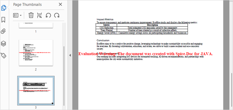
Apply for a Temporary License
If you'd like to remove the evaluation message from the generated documents, or to get rid of the function limitations, please request a 30-day trial license for yourself.